Let’s start with the riddle: What element of website design influences the content balance, alignment, hierarchy, contrast, rhythm, proximity, and space? That’s all about typography and fonts in particular.
There are 550,000+ great fonts; even some sites propose font galleries or even hold competitions for the best font. All these great fonts with incorrect combinations can either make a site look fantastic or bury a project.
Although typography has a crucial meaning for site perception, its selection can be an exciting design stage. On the one hand, an attempt to apply all beauty elements on the same site is a schtick of a beginner. On the other hand, inappropriate fonts are glaringly unsound.
Let’s talk about how to choose the best font combinations for websites. Here I collected some life hacks and rules to make your website picturesque and attractive.
Why Do Fonts Matter?
Readability and the sense of the content are the two sides of the same coin. Typography (i.e., fonts and their positions) is visuals, too. Good fonts and font pairings brighten the site and create accents while reading. It can be the cornerstone of a design. Font sizes, width, and colors impact users’ interaction with the site in the following ways:
- contribute to the brand style;
- highlight the crucial info by making the accents;
- complement graphic balance;
- draw attention to some sections of the site.
Sharing the Font Basics
What is the font? Let’s look at the main font styles and how people usually perceive them. There are the following font families:
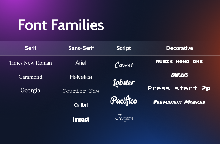
The incredible thing here is that most sites use basic fonts, although there are many options to make any text stylish. One can try many font combinations, use a font pairing chart, and check its appearance through CMS platforms, website builders, font selection services, font pairing collections, or font pairing generators.
Font Pairing Best Practices
How to find the font? Web design considers fonts and font combinations as design elements, and the Awwwards nominees confirm this. Here are the best practices in this area:
- Typography fonts should contribute to the general site design and the company’s business profile, as this brick-like font on the site of a construction company.

- All fonts must be of sufficient size and visible in the background.

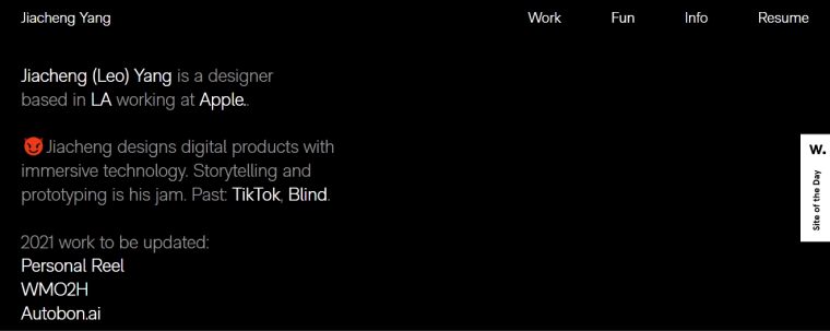
- Even standard fonts are OK. Arial is a good font for this designer’s site.
- There is no need to use many fonts; two fonts are enough.

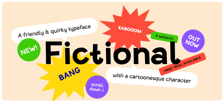
- Weird fonts are great for promotion only.
Font Combination Rules
The general recommendations here are the following:
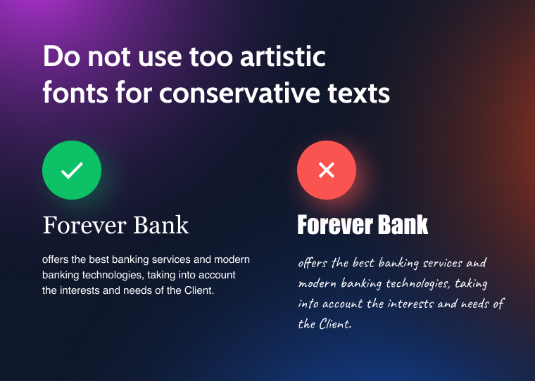
- Consider the target audience and do not use too artistic fonts for a conservative audience (i.e., do not use comic fonts or acid colors for legal firms, banks, etc.).
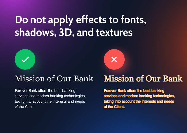
- Do not apply effects to fonts since shadows, 3D, and textures interfere with the perception of the text.
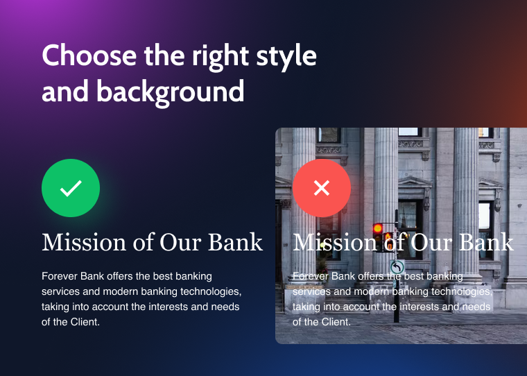
- Use a uniform style of the content and choose the right background.
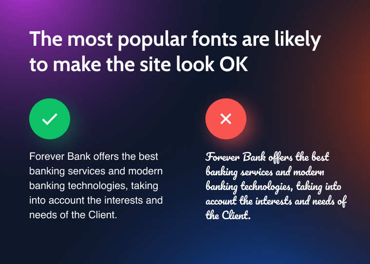
- The most popular fonts are the proven way to make your site OK.
The more detailed recommendations:
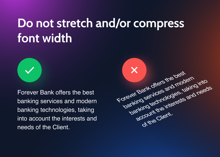
- Do not stretch or compress font width.
- Do not increase or decrease the space between letters or make rows too dense.
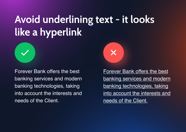
- Underlined text looks like a hyperlink and decreases readability.
- A single word at the end of a paragraph or the beginning of the next column looks bad.
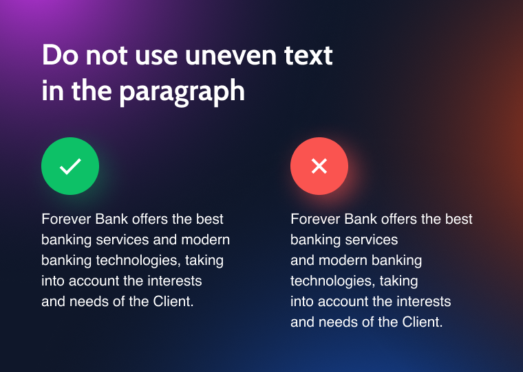
- Too much uneven text in the paragraph looks distracting.
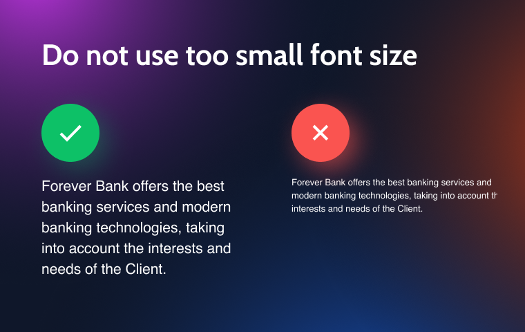
- Too small font size makes the text illegible.
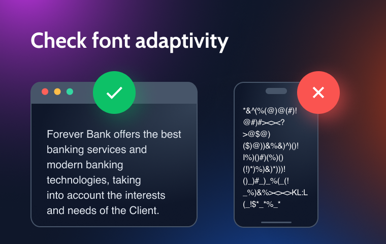
- Consider font adaptivity to different browsers and devices, and use system and web fonts, as well as font libraries.
It was information on the one font usage. Now I’ll talk about the mutual position, font pairings, and font combinations.
Successful font combinations use the principle of harmony or contrast. The fonts should have some standard features or be completely different.
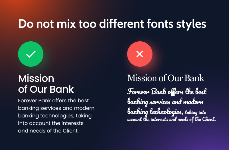
Bad font combinations mean mixing overly different fonts and font families and mixing too different styles.
The images below illustrate the good (right) and bad (left) font combinations.
- Combining a serif font for the headlining and a sans serif font for texts looks great.
- Balance the font size on the page, as people are more likely to close the page than zoom it on the browser. Besides, the preferred font size ranges from 14 pt (text) to 25 pt (headings).
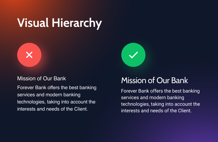
- Provide visual hierarchy: the bigger font size refers to the more significant heading. For example, the H1 title is 300% of the font size used in the body text, and the H2 title is 200% of the body text font size.
- Use only two fonts, including bold and italic options, to provide enough contrast to the text. Do not apply italic options to headings and text; use a script font for the title and italic options for the main text.

Conclusions
Nothing hurts the eye like a lousy font combination. Therefore, correct font combinations are the key to making the site more stylish, usable, and attractive. Any font can be as beautiful as you like, high quality, or suitable for your task.
Before choosing fonts, figure out the tasks the font should perform in the site’s purpose frame. Maybe it will call visitors to action, highlight issues, and emphasize the text’s aggressiveness or lyricism. If you want to achieve expressiveness, use fonts of different families (serifs and sans serifs). If you seek to make the text more visually connected, use fonts of the same family.
Fonts have different options. Therefore font combinations make your design more effective and highlight the essential info. But the wrong font, width, or spacing can scare users away from the site. Good font pairings envisage no more than two or three harmonious sets. Often, fonts compliment each other but do not compete. Any font combination should include only one unusual, extravagant or defiant font. This approach will make the typography readable and balanced.