Are you looking to inject some nostalgia into your branding? 90s website design is the place to look. Since the 90s provided the first websites of the World Wide Web, the decade was full of experimentation and bold aesthetics. 🌈💿📟
That’s why it’s a great idea to infuse your website with some classic 90s website design features that are sure to impress your visitors. For example, you can make use of playful designs, loud colors, asymmetry, and fun animations.
👉 In this post, we’ll discuss twelve of the most iconic examples of 90s website design. Let’s get started! 🎨
Our curated list of 90s website design
1. Tennant Brown Architects
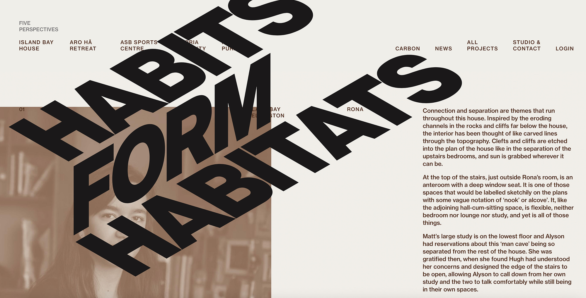
One of the defining features of 90s website design is the use of asymmetry. Rather than lining up every element, the 90s was all about that raw, unpolished aesthetic.
As you can see, the Tennant Brown website features bold sloping typography that bulldozes its way across the page. However, the size of the typography is also a signature of the era.
In fact, 90s website design was all about exaggerated fonts that become the focal point of the design. Although you can still view text and images, it’s safe to say that Tennant Brown’s heading strongly demands your attention.
2. Space Jam

The Spam Jam website was established to promote the 1996 movie and it invited fans to learn more about the universe. Better yet, the site hasn’t been updated since the 90s, so if you’re looking for a true example of 90s website design, this is a great one to check out.
This vintage site is full of chunky designs, excessive animations, and clip art graphics. You’ll also find misaligned elements and interactive objects that create a super memorable browsing experience.
3. Pitchfork

Within such an experimental period of website design, people were used to engaging with sites that opted for busy designs and mixed fonts. Pitchfork was introduced in the late 90s and although the website has undergone a few redesigns, the initial concept remains the same.
As you can see, even the layout of the page is inconsistent. Your eyes are immediately drawn to the wide centre column. However, switch over to the narrow outer columns and you’ll find new typography and a mix of font sizes. This helps the website to look a little rough around the edges.
4. National Aeronautics and Space Administration (NASA)

While the NASA website has undergone a few design overhauls, it’s stuck with some of the original elements from its 1994 launch. First, the NASA logo remains the same, lending a retro feel to the website.
What’s more, you’re treated to a jam-packed layout that makes the site feel fun and busy. Additionally, drop shadows appear behind text and links, and the sub-menu stays faithful to the grainy grey background of the original site.
5. Locomotive Digital-First Design Agency

Although 90s website design was not big on color, the one shade you can expect to see often is red. Not only is red the color of passion, it can also be associated with lust, danger, and energy. Therefore, it’s a surefire way to add vibrancy to your website.
Most 90s websites have an obvious focal point on the page. While this can be an over-the-top headline, it can also be a color dominant enough to hold your attention. As you can see, with conservative typography and a small navigation menu, this website really lets the color do all the talking.
6. Davide Perozzi

Davide Perozzi is a creative development website that oozes with 90s website design. As you can see, even the paragraph text is oversized. Plus, the typography is bold, with some parts underlined, which adds texture and style to the page.
Better yet, the page is populated with a handful of grainy images that create a raw, rugged aesthetic. Meanwhile, although on a much smaller scale, we see red being used once. However, this pop of color is more reminiscent of traditional 90s website design, used to highlight an important detail.
7. BAM

Ben and Martin (BAM) is another creative website that’s sure to invoke nostalgia. The User Interface (UI) constantly shifts as you scroll down the page. For example, you’ll see big bold fonts splashed across images, auto-play videos, and flashing links.
There’s more of the 90s classic red being used in menus, headings, and even in the cookie notice. Plus, there are plenty of overlapping images and misaligned elements scattered across the site.
And although 90s website design is known for its big, blocky headings, many websites also preferred very small fonts for other text items. As you can see, BAM adopts this trend, keeping paragraph text and menu links very small.
8. Louis Ansa

Louis Ansa uses bold animations and red lettering to really nail the 90s aesthetic. When you hover over an image, it changes shape, applying the liquid hover effect.
Better yet, as you scroll through the portfolio, you’ll notice that misaligned images tip upwards, the cursor changes shape, and the letters and numbers transition in a cascading movement.
However, it’s important to note that while the 90s aesthetic favours some exaggerated items, the rest of the design remains pretty minimalistic. This is evident in the above example since the remaining layout is kept clean and simple.
9. The New York Times

The New York Times is another classic example of 90s website design. As we mentioned, the 90s was the first time that people really got to experiment with the World Wide Web since it was only introduced in 1989.
As such, you’d find plenty of news/ encyclopedia style websites that featured hundreds of links and blocky sections. You can see that the NYT website has a sense of this, dividing the page vertically and horizontally. Here, there’s also plenty of examples of mismatched fonts.
10. A Gauche de la Lune

A Gauche de la Lune is an ideal example of 90s website design. Straight away, you’ve got the flash of red, the striking font, and the overlapping image.
Again, we’re treated to a mix of different font types. You can see the sloping, hand-writing style of the website name that injects creativity and flair into the site. Meanwhile, the project names are displayed in hollow fonts that are filled black when hovered over.
This lends a dynamic feel to the website as though it’s constantly moving. For example, you’ll also find that images appear automatically when you hover over a menu item. Plus, as you hold your position, the image zooms inwards, creating a sensation of being drawn into the website.
11. Bloomberg

What’s great about 90s website design is that because it was such a heavy period of experimentation, there are so many ways to adopt the aesthetic in your own website design. If you run a blog or news website, Bloomberg can serve as inspiration.
As you can see, the website is pretty devoid of color with the exception of a featured image, advertisements, and the use of red to draw your attention towards important details. Additionally, there’s tons of heavy-weight fonts that immediately create a clear visual hierarchy with the other text on screen.
12. Burnish Creative

Burnish Creative is another constantly flowing website that uses displacement, asymmetry, and animation to pin down the 90s website aesthetic. For example, typography appears on the page as you scroll and becomes narrower as you move towards the section.
Additionally, you’re treated to tiny snippets of red in the section headings, the logo, and the email address. The use of red in moderation is super reminiscent of 90s website design.
The use of outlined typography is also reflective of the era, especially on image-based websites. Since the creator doesn’t want the classic 90s style headings to overpower the images, hollow fonts offer an excellent solution.
Conclusion 🧐
If you’re looking for some website design inspiration, the 90s aesthetic promises nostalgia and style 🧜♀️ 📻 👾. Better yet, many of the 90s website design trends are on their way back. Therefore, you can get ahead of the game and start implementing some of the main traits.
For example, the bigger the better with your website headlines. Plus, you’ll score extra points for bold typography and hollow fonts. Additionally, asymmetry is a key signature of the 90s so you can get started with overlapping images, moving letters, and displacements for a super refreshing effect. 🎨
Do you have any questions about how to adopt the 90s website design aesthetic? Let us know in the comments section below!