Creating a Dynamic Events Website with JetPlugins
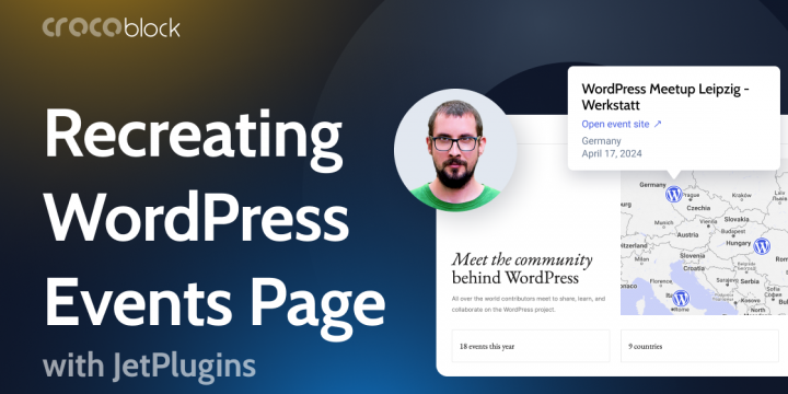
Most WordPress developers probably know about the community of this CMS and the events that take place pretty often. There’s an official WordPress.org event page with a list of these events, the information about them, and the location, so people can find what’s going on in their region. I’ve recreated it using Crocoblock plugins and will give you a step-by-step guide on how to do it in this article. Check the live demo here. Table of ContentsThe Scope of WorkThe event page of WordPress events for 2024 has the following components: Interactive map with pop-ups that display the information about events and a link to the event’s page.A list of events. Filters for this list (search field and sorting by month, format, and type).A dynamic counter for the events.A dynamic counter of the countries…