As smartphones became omnipresent, web designers quickly caught on that squeezing the same full-sized web designs onto those small screens just wasn’t cutting it. Sure, you technically could, but convenience took a nosedive: on a small screen, those links become microscopic and impossible to tap accurately with a finger. And if you decide to beef them up to be more touch-friendly, well, they end up hogging too much space, pushing everything else off the screen.
Enter the savior of small screens – the hamburger menu. This nifty concept of a universal button that opens a full menu, sporting an icon eerily reminiscent of a hamburger (fun fact: it was proposed 20+ years prior but didn’t catch on until the 2010s), came at just the right moment.
This article delves into the popularity of this convenient navigation tool. It explores typical and unique ways to incorporate it into web design, drawing examples from websites built with Crocoblock plugins.
Table of Contents
Today, the use of the hamburger menu has skyrocketed, with its telltale three horizontal lines indicating a hidden menu. Why has it become such a rockstar in the design world? Two words: functionality and universal recognition.
Firstly, let’s talk functionality. The hamburger menu streamlines the layout, letting users focus on what interests them rather than wrestling with a menu they don’t need right that second.
Secondly, the universal recognition of the hamburger icon is a game-changer. Even if users aren’t consciously thinking, “Hey, that looks like a hamburger,” they’re instinctively reaching for that button because it’s become the go-to spot for essential navigation options. The functionality would still be a tough nut to crack without this universally accepted convention.
Using the hamburger menu on small devices has become nearly universal for websites and applications, including messengers, YouTube, and Google Search.
As you’ll observe in examples featuring Crocoblock’s plugins, it extends beyond small screens to full-screen websites. Some use it for secondary navigation options, especially when the primary navigation bar is already packed. Many web designers take a bolder approach, making it the main navigation button. It ensures a cleaner design and focuses exclusively on the page content. A striking example features a background video that owes its impact to the hamburger’s functionality.
Here are best practices for creating effective hamburger menus:
- When utilizing the hamburger menu, ensure it retains all necessary functionality without sacrificing design. This goal is effortlessly achievable with the JetMenu plugin, including videos, images, social media buttons, or dynamic data and creating complex multilevel menus with subcategories.
- Implement clear navigation tools for discovering and clicking the hamburger menu and navigating within it. Facilitate easy exits through a prominent X button in the usual top corner, clicking outside the menu, or both.
- Infuse your style – don’t just follow the crowd! The JetMenu plugin provides control over hamburger menu CSS, allowing you to choose from different entrance animation effects that significantly contribute to both user engagement and overall website design.
Study in North Cyprus
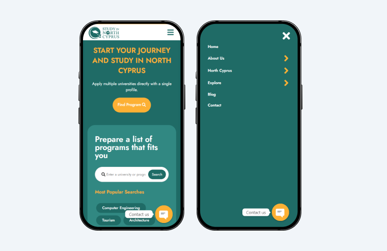
This website is built in different shades of teal, resembling websites used by medical facilities, healthcare services, etc. Most buttons, thumbnails, image borders, and other shapes have rounded edges, making the design feel safe and trustworthy, as if the website offered skincare products.
The hamburger menu icon (surprise! – three rectangles with sharp edges) is used in the mobile incarnation of the website, located in the top right corner of a webpage. Clicking it unrolls the navigation menu from the right side, covering the entire screen of most phones. Initially, the menu has only six options (an X-shaped close button with rounded edges!), but three lead to many suboptions. The ease of hamburger navigation is facilitated by large arrow pointers and return buttons.
This type of hamburger menu usage is typical for many mobile websites. The menu button is easily identifiable and recognized as the primary gateway to the navigation labyrinth.
Jävligt Gott
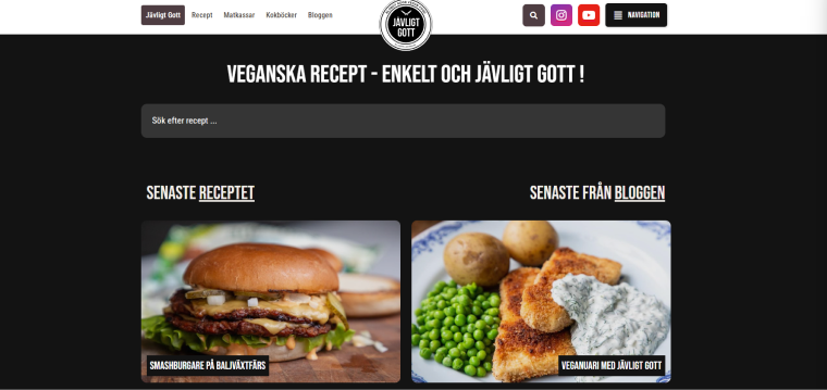
This website propagates vegan food and features a tasty-looking hamless hamburger as the first thing visitors see on the home page. This recipe apparently calls for two juicy patties in the middle – and so does the hamburger menu icon in the top right corner, which has an extra element.
A navigation top bar on the page contains several menu items, social media buttons, and a hamburger menu icon. Clicking the hamburger menu icon unrolls a menu from the right side, duplicating the navigation tools already displayed and adding several more. Interestingly, the designers also used the word “Navigation” with the icon to clarify that their hamburgers are also hamburgers!
The Shaw University Campus Calendar
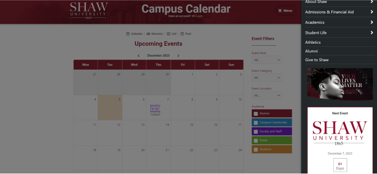
This simple-looking campus calendar page provides a multitude of functionality through an array of Crocoblock tools. For example, users can access events that dynamically populate the calendar using JetEngine’s Calendar widget, various types of JetSmartFilters filters, and a header modified with JetBlocks to include sign-in functionality.
The hamburger menu icon is the sole pathway leading to the navigation options. Upon activation, the menu unveils links to other sections of the university website, along with a post about the upcoming feature event, complete with an image and titles. The ability to incorporate dynamic data and automatically display it in the menu is available with the JetMenu plugin.
SunVest

The home page of SunVest Solar LLC’s website showcases a captivating full-screen video of our rotating planet. The impact is truly remarkable, with minimal distractions from the stunning visuals.
To achieve this effect, designers concealed links to various website sections behind a large hamburger menu button in the top left corner. Clicking on it reveals a menu that covers the entire screen. Scrolling down the homepage, the menu icon remains fixed in the corner. Interestingly, clicking on it at this point resizes the menu to about one-third of the screen, allowing you to continue scrolling.
Nomadea Evasion
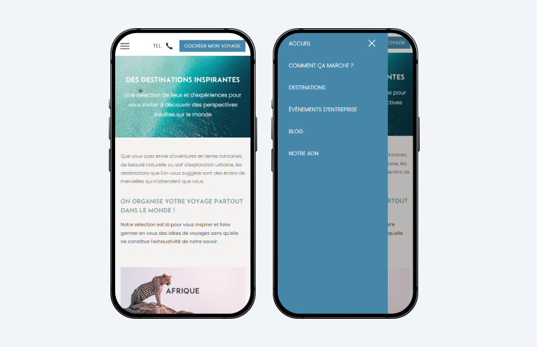
Nomadea Evasion stands out as a typical travel website, organizing its blog posts by regions across the globe and presenting them on the homepage through vibrant thumbnails. While the design may appear overly simplistic on larger screens, it looks perfect on mobile devices. The mobile version offers just the right amount of white space between data blocks, providing a sense of lightness while ensuring every scroll remains informative.
On the mobile interface, the hamburger icon is one of the three buttons in the top floating bar. Upon clicking, the menu unfolds from the same side as the button, occupying about three-quarters of the width of a standard mobile phone screen. This usage of the website hamburger menu aligns with popular design trends, offering ample space for menu items while leaving a portion of the screen uncovered, allowing users to tap outside the menu to exit quickly.
ISL Design
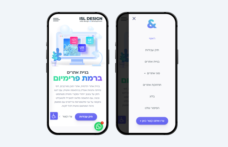
This website boasts a sleek design with an all-white background and subtle bluish shadowing. A mobile hamburger menu icon appears in the top left corner of the page. Notably, clicking this button triggers the menu sheet to emerge from the opposite side of the screen, offering a somewhat unconventional approach. Initially, this might seem counterintuitive, given that most users expect a button to reveal what’s behind it. However, on the current page, the logic appears more aligned with “clicking the button to activate specific website functionalities.“
The strategic benefit of this layout becomes evident in its practicality – it facilitates easier one-handed opening and closing of the menu. With the uncovered part of the screen situated on the same side as the menu icon, users can seamlessly navigate with their fingers on a single side of the screen.
On the House Digital
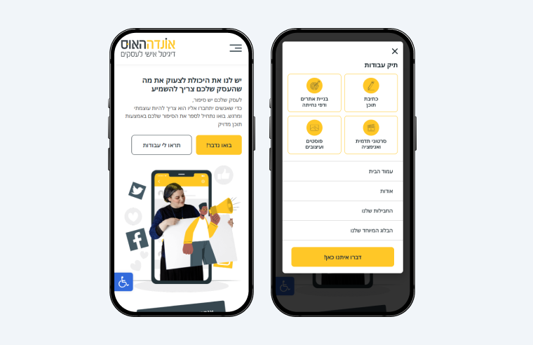
Similarly to a previous example, the hamburger menu icon is used only in a mobile website version and is in the top floating bar. However, the menu appears from the bottom of the screen, graciously floating over the page content and stopping at the top.
This entrance motion effect adds an extra point to the site design, making it look more interactive. It would be more effective if users could dismiss the menu by swiping it down. Unfortunately, the opening process takes over one second, which becomes irritating after a few minutes of browsing the website.
Partopia
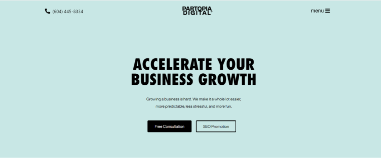
Partopia is a business consulting agency, and its website employs a distinctive navigation approach. Instead of a regular navigation menu, it utilizes a hamburger button. Upon clicking this button, the entire screen transforms into black, with prominent white letters forming the navigation options shining in the middle. This bold design choice, complemented by using bold fonts throughout the website, encourages visitors to click on landing page titles and actively engage with the content.
La Fermiere
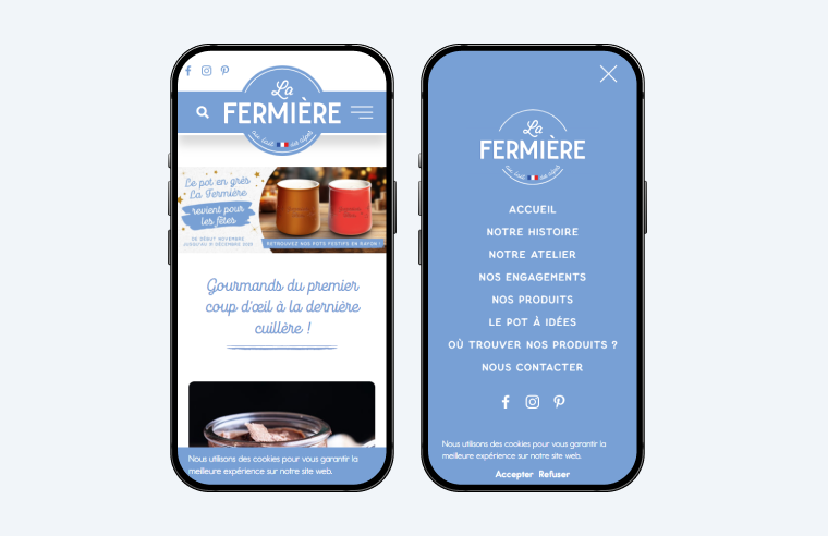
This company specializes in dairy products, and remarkably, the website design subtly conveys this focus. The predominant color scheme, featuring shades of blue, symbolizes a commitment to freshness and healthiness.
The mobile website version, in particular, showcases an eye-catching top bar that includes the hamburger menu icon. It seamlessly integrates with the overall aesthetic by utilizing white lines, matching the thickness of various letters on the site, and positioning symmetrically to the search button within the branded top bar.
Upon clicking the button, a full-screen menu unfolds, presenting a large brand logo, essential links, and social media buttons. The hamburger navigation functionality not only aligns seamlessly with the company’s brand but also imparts a sense of professionalism and user-friendliness.
Coach Lab
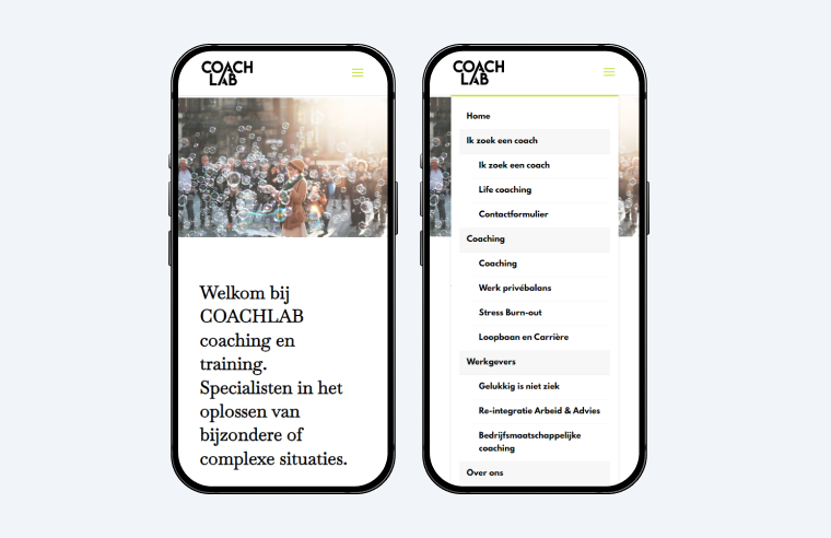
This website may not showcase any innovations in web design, but it brings a refreshing perspective to some of the website hamburger menu functionalities. The triple-bar icon is situated in the top right corner of the mobile version, and clicking it unrolls the menu from the top to the bottom. Users can select a navigation choice, swipe the menu upward, and proceed to the page content.
While not particularly groundbreaking, this design is just as practical as more commonly used methods, all the while adding a touch of uniqueness to the overall style.
Kreate Agency
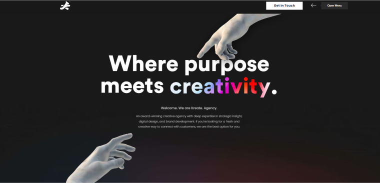
Once again, we encounter a website relying exclusively on the hamburger button for accessing the navigation menu. After over a decade of use, web designers are unhesitant to adopt it as the primary navigation tool.
In this instance, designers have incorporated additional hints to indicate its role as the navigation link. Hovering over the icon prompts the appearance of an additional label, “Open Menu.” Upon deciding to click the hamburger sign, the menu bar emerges from the side of the screen, causing the rest of the content to blur. This approach, which resembles the one typically used on mobile screens, allows users to exit the menu by clicking on the blurred part of the screen.
Iamproperty
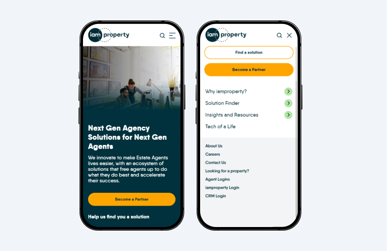
This website, catering to real estate agents, stands out for its rich content and unconventional navigation, particularly with the hamburger menu on smaller screens.
Upon clicking the hamburger icon, a full-screen menu unfolds, featuring a top bar with three buttons, a search bar, a link to a registration form, three links to sub-menus containing multiple landing pages, and additional links usually found in webpage footers.
The standout feature, however, lies in the ability to navigate within this menu, exit by clicking the X button, and then return to precisely where you left off when deciding to reopen the hamburger menu. This unique functionality adds a distinctive and user-friendly touch to the website’s navigation system.
Emerald Guitars
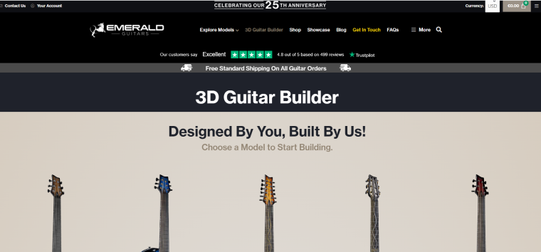
Emerald Guitars, a unique musical instrument retailer, employs unconventional navigation methods on its website. The main navigation bar features links to pages showcasing commercial products and also includes a hamburger menu button. Upon activation, this button opens an additional menu on the right side of the screen, containing some of the same links along with new ones, contact information, and social media buttons. But the intricacy doesn’t end there. A smaller hamburger button in the far right corner of the page reveals yet another menu on the left, featuring nine more links, most of which were previously encountered in the other navigation options.
The benefits of such an abundance of navigation tools remain unclear, but one possibility is that they are conducting A/B testing on the site interface. Interestingly, in the mobile site version, all the navigation elements conveniently consolidate under a single hamburger menu.
AG Global Designs
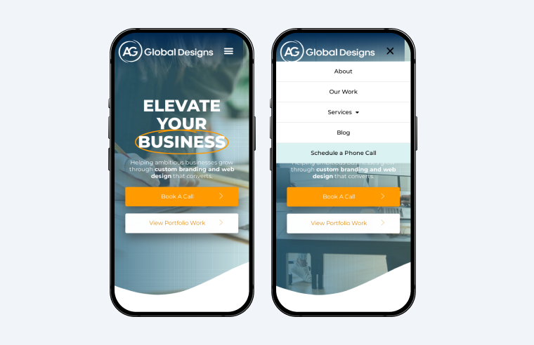
This last website in the list adopts a conventional approach with the hamburger menu but refines its details to create a polished, light, and user-friendly interface.
The hamburger button is positioned within the transcendent sticky top bar in mobile screen mode, and when activated, it reveals a compact accordion menu that covers one-third of the screen. This cool menu design enables users to scroll through the page while keeping the menu open. The result is a clean and efficient interface that enhances user experience.
FAQ
A hamburger menu, often represented by three horizontal lines, is a common navigation feature used on websites and mobile applications. It typically conceals a menu that can be expanded for easy access to various navigation options.
The hamburger menu streamlines website layouts, offering a clean and uncluttered appearance. Its compact nature allows for a more focused user experience while retaining access to essential navigation options.
Use a premium navigation menu plugin to create a hamburger menu in WordPress. One of the highly regarded plugins with a complete hamburger menu functionality is JetMenu by Crocoblock.
Access hamburger menu CSS using the JetMenu plugin to customize the hamburger menu placement on mobile. In the WordPress dashboard, navigate to Appearance > Menu > Add menu items tab, and choose options in the JetMenu Location Settings. When editing the page in Elementor, drag and drop the relevant JetMenu widget onto the page where you want it to appear.
Sum Up
These examples demonstrate how the hamburger menu, coupled with Crocoblock’s JetMenu, elevates website layouts, crafting sleek designs without compromising the functionalities of intricate navigation systems. Simultaneously, this menu type enables diverse implementations and unique stylings, introducing a dynamic and personalized user experience.