Do you ever struggle to find the perfect font that conveys the right message for your construction projects? Are you tired of using the same old fonts that don’t quite capture the essence of your designs?
Well, search no further! In this blog post, we will explore the best construction fonts that will take your projects to the next level.
When it comes to design, the right font can make all the difference. It can evoke a sense of strength, stability, and professionalism. And in the world of construction, these qualities are essential.
Did you know that using the right font can increase the legibility of your designs by up to 27%? That’s a significant improvement that can greatly enhance the impact of your work.
In this article, we will dive into the world of construction fonts, discussing their unique characteristics and how they can elevate your projects. We will explore fonts that are bold, clean, and easy to read, making them perfect for logos, signage, and promotional materials.
So whether you’re working on a construction company’s branding or creating visually striking designs for architectural plans, we’ve got you covered. Let’s get started on our quest for the best construction fonts!
Best Premium Construction Fonts
Looking to elevate the design of your construction projects? Look no further than our carefully curated selection of the best premium construction fonts.
Get ready to add a touch of sophistication and professionalism to your creations. Dive in to discover the perfect font for your next project!
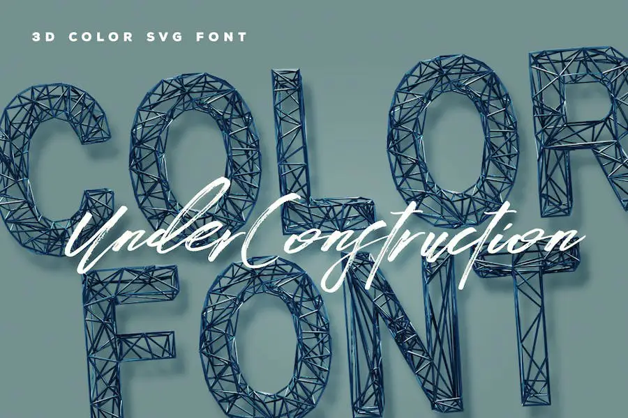
Under Construction is a unique and versatile font designed specifically for graphic designers working on construction-related projects. This font, available in both color and SVG opentype formats, adds a dynamic and modern touch to any design.
With its bold and eye-catching letterforms, Under Construction is perfect for creating attention-grabbing headlines, logos, and signage.
This font brings a sense of strength and solidity to your designs, truly capturing the essence of the construction industry. Its flexibility allows it to be used in various contexts, making it a valuable asset for any designer in need of a standout font option.
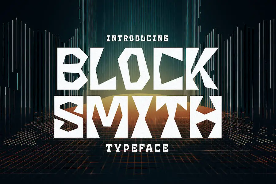
Blocksmith is the ultimate font for graphic designers looking to enhance their project designs. With its bold and robust characteristics, this font stands out in the world of typography. It brings a sense of strength and impact to any project it is used in.
The clean and geometric shapes of Blocksmith make it perfect for construction-themed designs. Its bold strokes and solid structure exude confidence and professionalism, instantly capturing the attention of viewers.
Whether it’s a logo, website, or signage, this font adds a touch of power and authority.
In addition to its visual impact, Blocksmith is incredibly versatile. It can be easily scaled up or down without losing its clarity, ensuring that it looks great on both large and small applications.
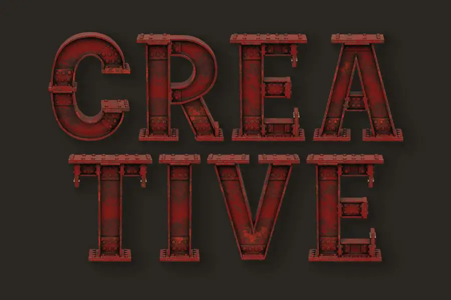
Steel Construction is a versatile font that offers both color and SVG opentype options. With its bold and industrial design, this font is perfect for graphic designers in search of a font that will enhance their project designs.
The font’s attributes include its eye-catching colors and crisp lines, making it an excellent choice for construction-related design work. Whether you’re creating a logo, brochure, or website, Steel Construction will undoubtedly add a touch of professionalism and style to your project.
With its unique blend of aesthetics and functionality, this font is a must-have for any designer looking to make a statement.
Under Construction is a unique and versatile font that adds a touch of creativity and style to any graphic design project. With its bold and eye-catching letters, this color or SVG opentype font is perfect for conveying a sense of strength and innovation.
Whether you’re working on a logo, a website design, or any other visual project, Under Construction is sure to elevate your work and capture the attention of your audience.
The font’s attributes are what set it apart from other options out there. Its vibrant colors and dynamic SVG opentype format allow for a truly immersive and visually striking experience.
Each letter is meticulously designed to resemble various construction elements, such as beams, bolts, and scaffolding, creating a sense of building and progress.
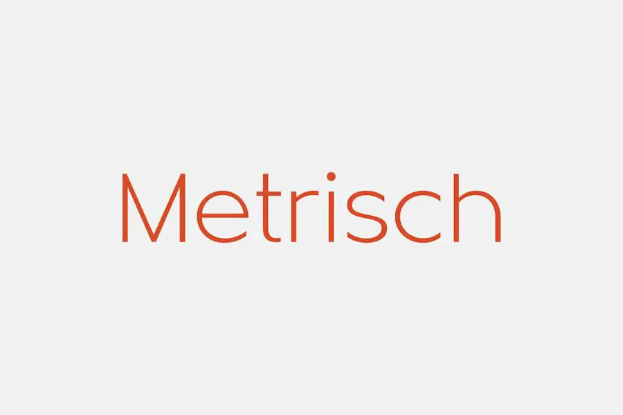
Metrisch is a modern sans serif type family that offers a total of seven weights and corresponding italics in each weight. This versatile font is perfect for graphic designers who want to elevate their projects with a sleek and contemporary touch.
With its clean lines and sophisticated look, Metrisch brings a sense of professionalism and elegance to any design. It offers a wide range of weights, allowing designers to create eye-catching contrasts and hierarchy in their typography.
Whether you’re working on a logo, website, or printed materials, Metrisch has you covered. Its variety of weights and italics give you the flexibility to experiment and find the perfect balance for your design.
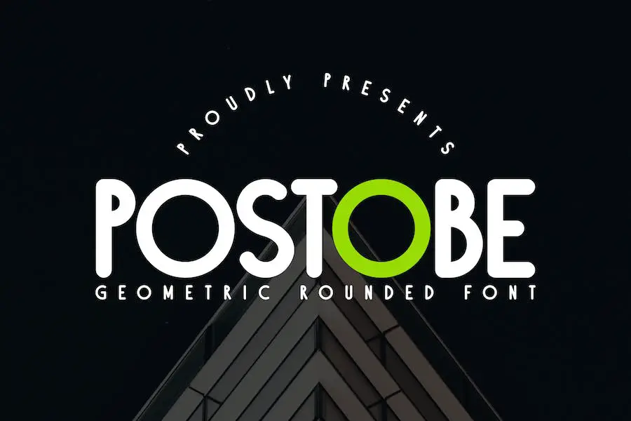
Postobe is a versatile font that offers a range of sizes and styles for graphic designers. Within its glyph collection, you’ll find variations in height and width, allowing for greater design flexibility. With three distinct sizes to choose from, Postobe enhances the overall aesthetics of any project.
The unique feature of Postobe lies in its tailored glyph sizes. Some glyphs are intentionally shorter, while others maintain a standard height. Additionally, certain glyphs are wider, adding a dynamic touch to your typography.
These variations provide an opportunity for designers to experiment and create visually captivating designs.
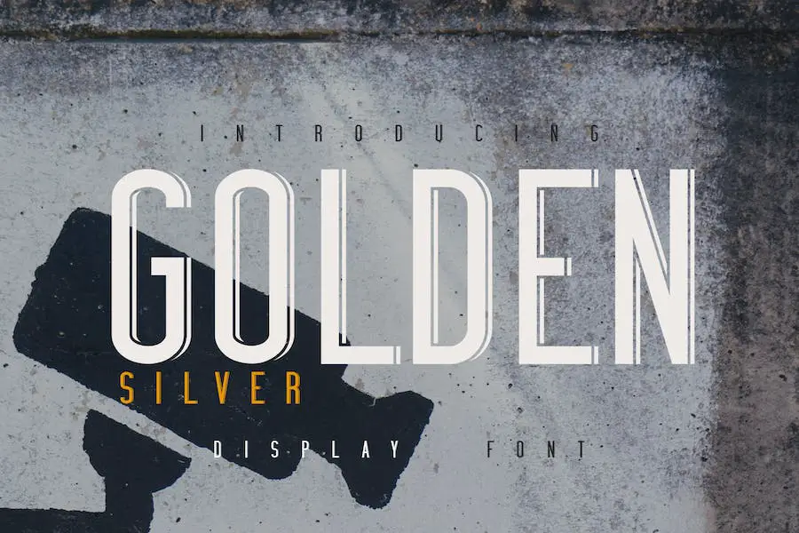
Golden Silver is a font that brings a touch of elegance and sophistication to any graphic design project. Designed specifically with construction and heavy work in mind, this font is bold and courageous, just like the industry it represents.
One of its standout features is the special side like shadow in its character lineup, adding a unique and eye-catching element to your designs.
With Golden Silver, you can instantly elevate your projects by giving them a polished and professional feel.
Whether you’re creating a logo for a construction company or designing promotional materials for a heavy machinery brand, this font is sure to make a lasting impression. Its bold and commanding appearance demands attention and exudes a sense of strength and reliability.
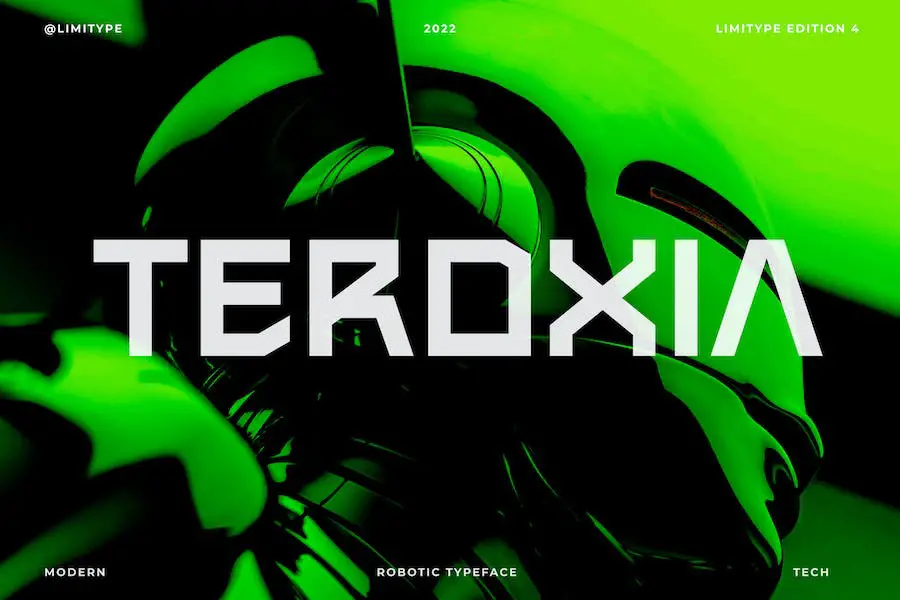
Teroxia Pro is a unique typeface that draws inspiration from the sleek and strong shapes found in robots and machines.
With its modern and futuristic design, it adds a touch of sophistication to any graphic design project. The sharp and bold form of Teroxia Pro captivates the eye and enhances the overall visual appeal.
Its carefully crafted curves and constructions make it a versatile font that can be used for a variety of purposes. Whether you’re working on a logo, poster, or website, Teroxia Pro is sure to elevate the design to new heights.
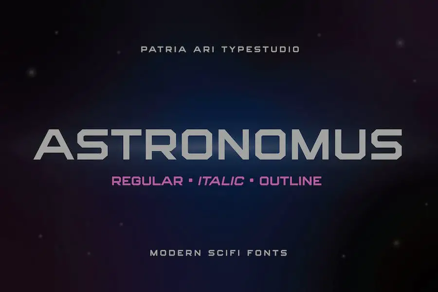
Astronomus is a sci-fi tech modern font that brings a futuristic touch to your designs. With its unique shapes and styles, it sets itself apart from traditional fonts.
The uppercase and lowercase letters in Astronomus have distinctive variations, adding an element of creativity to your projects. Its sleek and modern look makes it perfect for sci-fi or tech-themed designs, giving them a cutting-edge feel.
Whether you’re designing a logo, creating a poster, or working on a website, Astronomus will help elevate your project and make it stand out from the crowd. Its sci-fi vibe adds a sense of sophistication and futurism to any design.
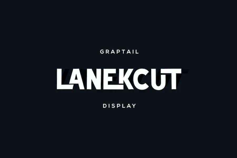
Lanekcut is a ligature font that combines character and functionality in a unique way. With its concept of ligature fonts, it brings a distinctive touch to any design project.
One of the standout attributes of Lanekcut is its ability to exude character. The font has a distinct personality and adds a touch of flair to any design. Whether you’re working on a logo, website, or packaging, Lanekcut will help create a memorable and eye-catching look.
But Lanekcut doesn’t sacrifice usability for style. It remains practical and easy to read, ensuring that your message gets across effectively. The font strikes a perfect balance between creativity and functionality, making it a versatile choice for graphic designers.
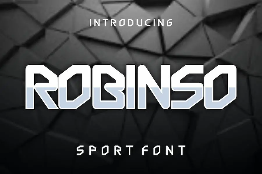
Robinso is an incredibly versatile font that can enhance the design of your projects. Whether you’re working on branding, name cards, posters, logos, magazines, covers, banners, t-shirts, headers, or even large-scale artwork, this font is perfectly suited for both print and screen use.
With its clean and modern aesthetic, Robinso adds a touch of sophistication to any design. Its sleek and stylish letterforms create a strong visual impact, making your text stand out and grab attention. This font is particularly well-suited for projects that require a professional and polished look.
One of the standout features of Robinso is its excellent readability. Each letter is carefully crafted to ensure legibility, even at smaller sizes. This makes it ideal for projects where you need to convey information clearly and effectively.
Whether you’re designing a magazine layout or a logo, Robinso will ensure that your message is easily understood.
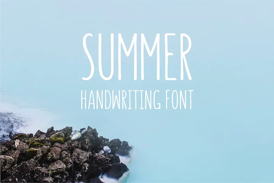
Summer is a delightful handwriting font with a solid construction that adds a touch of charm to any design project. Its unique attributes make it a must-have for graphic designers seeking to enhance their projects.
With Summer, you get the best of both worlds: a handwritten look combined with a sturdy foundation. Its solid construction lends strength and stability to the font, making it perfect for conveying a sense of reliability and professionalism.
This font exudes an air of authenticity, as if it were penned by hand with care and attention to detail. Its smooth lines and balanced proportions make it pleasing to the eye, while its strong construction ensures legibility in various sizes and contexts.
Best Free Construction Fonts
Looking to add an extra touch of creativity to your construction projects? Look no further than our selection of the best free construction fonts. These fonts are not only visually appealing but also incredibly versatile, allowing you to elevate your designs to new heights.
Don’t miss out on this opportunity to enhance your projects – check out the following products in this article!
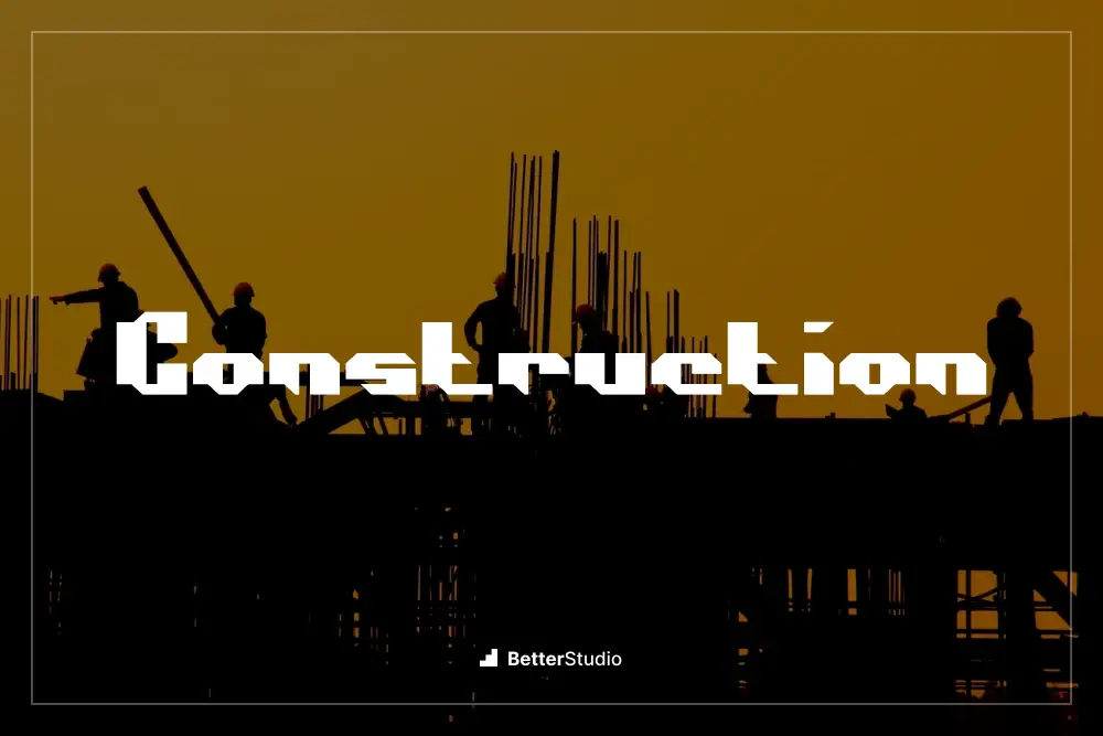
Construction is a font designed specifically for graphic designers who want to enhance the design of their projects. It is a versatile and stylish font that can be used in a variety of construction-related designs.
With its bold and clean lines, Construction adds a modern and professional touch to any project.
This font features strong, solid letters that exude a sense of strength and stability. Whether you’re creating a logo for a construction company or designing a flyer for a building project, Construction is the perfect choice.
Its bold and powerful appearance instantly captures attention and makes a strong impression.
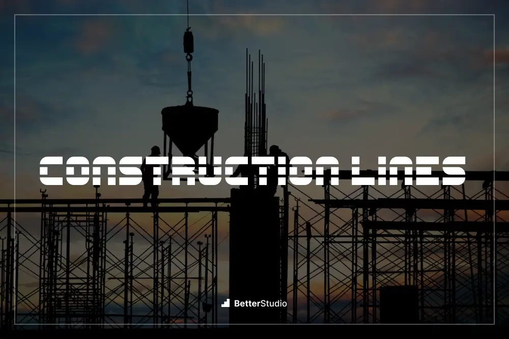
Construction Lines is a font created by Chequered Ink that is perfect for graphic designers looking to enhance their project designs. This versatile font adds a unique and professional touch to any construction-themed design, making it stand out from the competition.
With its clean lines and bold appearance, Construction Lines lends itself well to various construction-related projects, including logos, infographics data, and advertisements.
The font’s crisp edges and strong presence make it visually appealing and easily legible, ensuring that your message is effectively communicated to your audience.
The attributes of Construction Lines truly make it a standout font choice. Its sturdy and bold letterforms give off a sense of reliability and strength, perfectly reflecting the essence of the construction industry.
The font also maintains a sleek and modern aesthetic, giving your designs a contemporary edge.
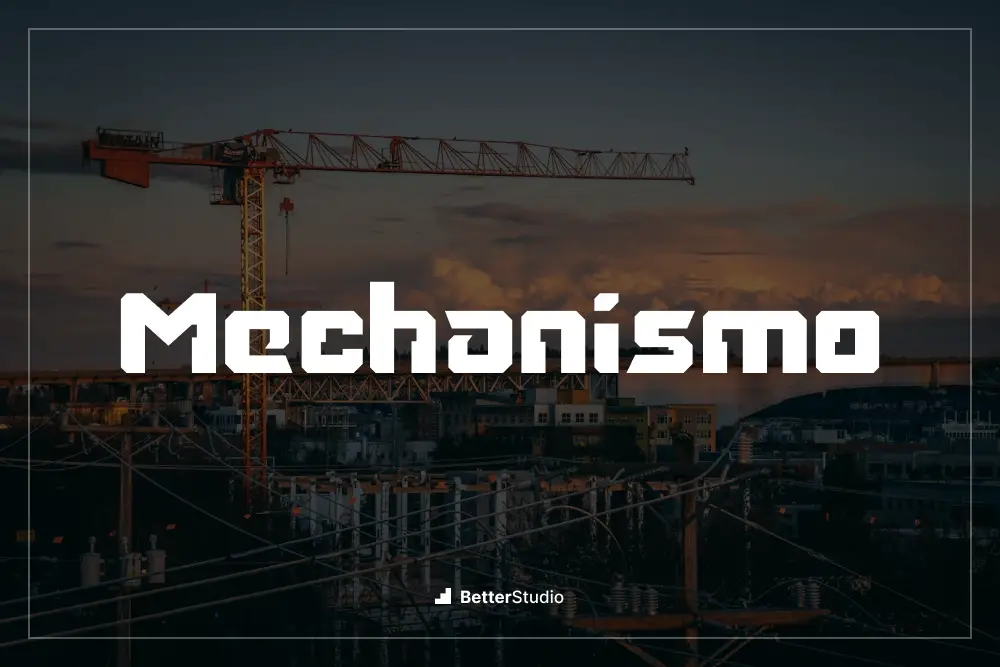
Mechanismo by sdotype is a fantastic font choice for graphic designers who want to elevate the design of their projects. This construction-themed font adds a unique touch and brings a sense of strength and precision to any design.
With its bold and angular letterforms, Mechanismo is perfect for creating eye-catching headlines, logos, and signage.
The attributes of Mechanismo make it an excellent choice for any design project. Its bold and geometric shapes make a strong visual impact, while its clean lines ensure legibility even at small sizes.
The distinct construction-inspired elements add a sense of industrial sophistication to any design, making it the perfect choice for construction-related projects or any design that aims to convey strength and stability.
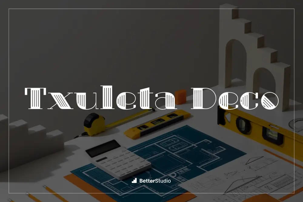
Txuleta Deco is a fantastic font that can greatly enhance the design of your construction projects. Created by deFharo, this font’s unique and stylish attributes make it a must-have for any graphic designer looking to add a touch of elegance to their work.
With Txuleta Deco, you’ll have access to a wide range of features that will make your designs truly stand out.
The font’s sleek and modern lines give it a sophisticated look, perfect for showcasing the professionalism and creativity of your construction projects. Its bold and clean design ensures that your text will be clear and legible, even at smaller sizes.
One of the standout features of Txuleta Deco is its versatility. Whether you’re working on a brochure, or a website, this font will adapt seamlessly to any project.
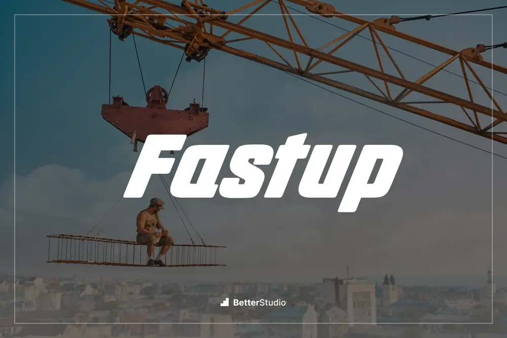
Fastup is a fantastic font created by deFharo that is perfect for graphic designers looking to enhance the design of their projects. This font has a sleek and modern look that adds a professional touch to any design.
Its clean lines and bold style make it ideal for construction-themed projects. With Fastup, you can easily create eye-catching logos, signage, and promotional materials that stand out from the crowd.
This font offers a range of attributes that make it a must-have for graphic designers. Its versatility allows it to work well in both large and small sizes, ensuring readability and visual impact in various applications.
The bold nature of Fastup also guarantees legibility, even from a distance. In addition, the font’s clean design makes it easy to pair with other typefaces, allowing for endless creative possibilities.
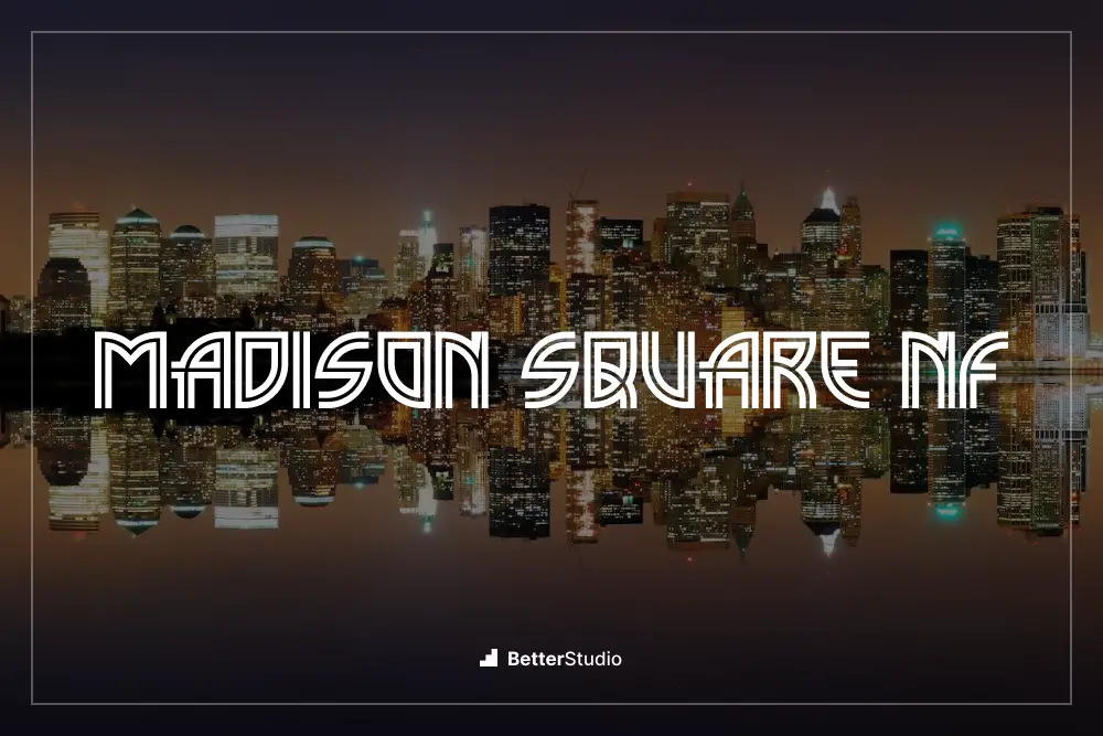
Madison Square NF by Nick’s Fonts is a font that is perfect for graphic designers looking to enhance the design of their projects. This font has a unique and eye-catching style that can bring a touch of sophistication to any design.
With its clean lines and bold aesthetic, Madison Square NF is an excellent choice for projects in the construction industry.
The attributes of Madison Square NF make it stand out among other fonts. Its strong and bold letterforms command attention, making it a great choice for headlines and titles. The font also has a distinctive geometric shape, which adds a modern and sleek feel to any design.
Additionally, Madison Square NF offers a variety of weights and styles, allowing designers to experiment and find the perfect fit for their projects.
Frequently Asked Questions
Construction fonts are a collection of typefaces specifically designed for the construction industry. These fonts often feature bold, strong letters that convey a sense of strength, durability, and professionalism.
They are commonly used in construction company logos, signage, and marketing materials to create a visual identity that aligns with the industry’s values.
Using construction fonts can greatly enhance the visual appeal and effectiveness of your brand in the construction industry. These fonts help create a strong and memorable brand identity that resonates with your target audience.
By using fonts that are tailored to the construction industry, you can convey professionalism, trustworthiness, and expertise. Additionally, construction fonts can help your business stand out from competitors and make a lasting impression on potential clients.
When choosing a construction font, it’s important to consider factors such as legibility, brand personality, and compatibility with other design elements. Look for fonts that are easy to read, have a strong presence, and align with your brand’s values and target audience.
Don’t be afraid to experiment and seek feedback from others to find the perfect font for your project.
Conclusion
In conclusion, we have explored the best construction fonts that can greatly enhance your projects’ design.
From bold and impactful fonts to sleek and modern ones, there is a font for every construction project. By using these fonts, you can add a professional and polished touch to your designs.
If you found this article helpful, be sure to check out the BetterStudio blog for more related tutorials and resources. We regularly update our blog with useful information to help graphic designers like you improve their skills and stay updated with the latest trends in the industry.
To stay connected and receive updates on our latest tutorials, make sure to follow BetterStudio on Facebook and Twitter. Our social media channels are a great way to stay in the loop and discover even more valuable resources.
Thank you for taking the time to read this article. We hope you found it informative and inspiring for your future design projects.
If you have any questions or are facing any problems related to the topics discussed in this article, please feel free to leave a comment below. We are here to help and would love to hear from you!
Remember, with the right construction fonts, you can take your designs to new heights and make them truly stand out.