Updated: Jul 06, 2023 By: Dessign Team
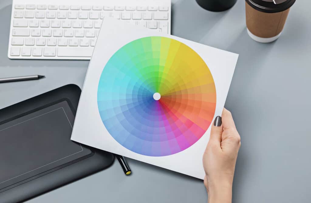
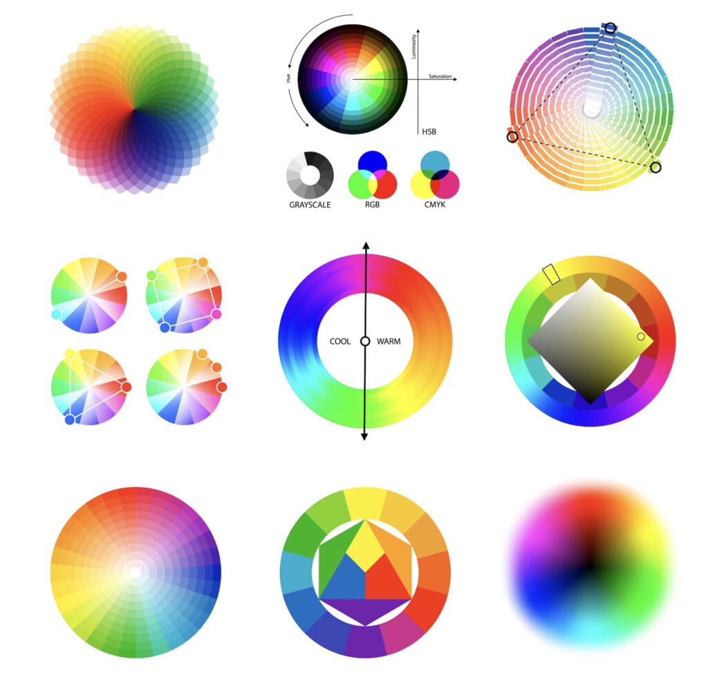
The color wheel is a visual representation of colors arranged in a circular format, which allows artists and designers to easily understand and utilize color relationships in their work. Developed by Sir Isaac Newton around 1666, the color wheel is a fundamental tool for understanding color theory and creating harmonious color schemes.
Newton’s original color wheel consisted of a circle divided into seven segments, each representing a primary color found in the visible spectrum of light. Over time, the concept has evolved into a more intricate system, incorporating secondary and tertiary colors to enhance its utility. Today, there are various types of color wheels designed for different purposes, such as hue-based, value-based, and chroma-based wheels.
Color wheels allow users to explore complementary, analogous, and triadic color schemes, by displaying the relationships between colors and offering a logical, visual structure. Understanding these color relationships can greatly enhance the visual impact of artistic and design projects.
Color Theory Fundamentals
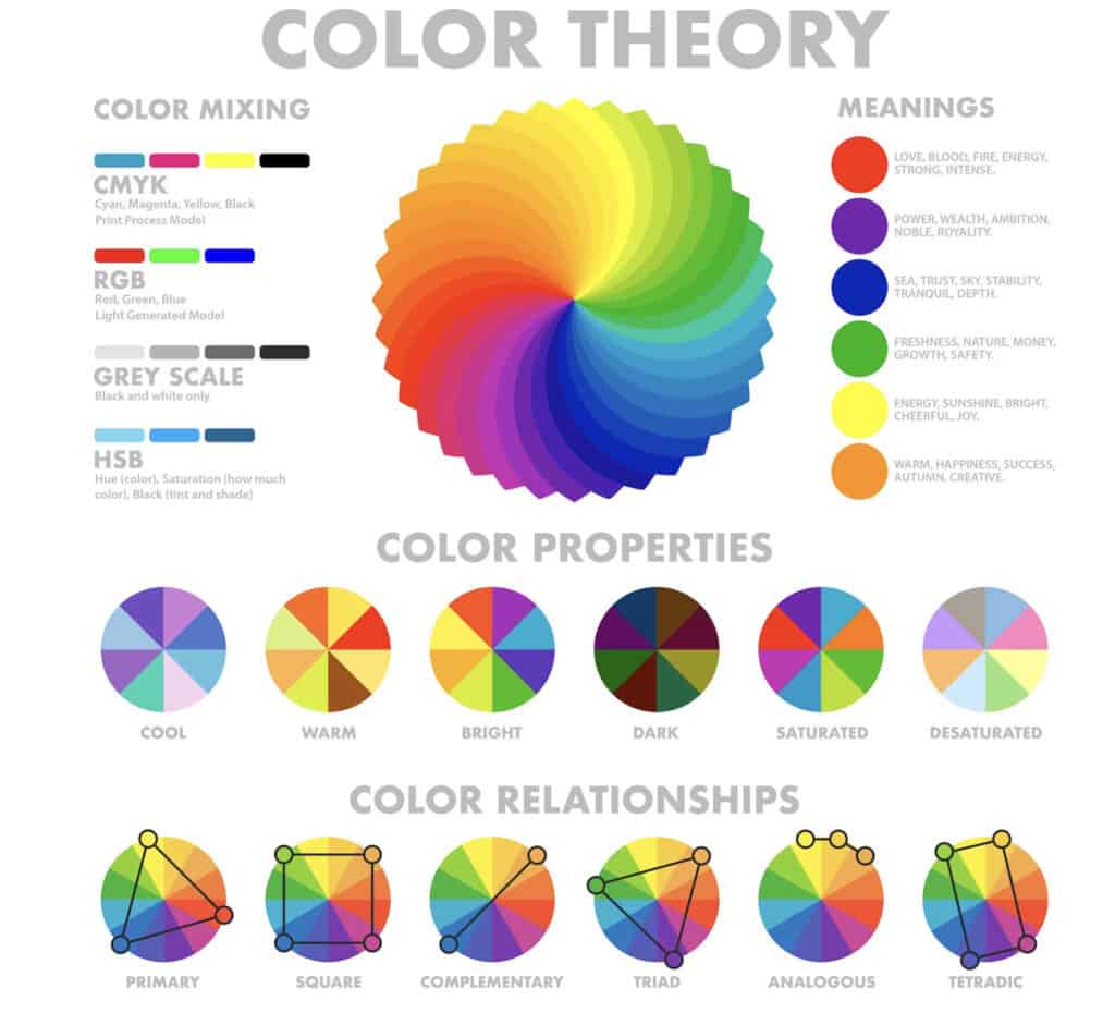
In the world of color theory, there are three primary colors: red, blue, and yellow. These colors cannot be created by mixing other colors, hence their uniqueness. When combined in varying proportions, the primary colors give rise to secondary colors, namely green, orange, and purple. These secondary colors are created by mixing equal parts of two adjacent primary colors.
Taking it a step further, tertiary colors result from blending equal parts of a primary and an adjacent secondary color. Examples of tertiary colors include red-orange, yellow-green, and blue-purple. These colors add depth and variety to the color wheel, allowing for a wider range of color options.
Hue refers to the pure color element itself, devoid of any tints or shades. It is the aspect of color that differentiates one color from another, such as red, yellow, or blue. Manipulating hues can create different combinations and generate differing emotional responses.
Saturation, on the other hand, speaks to the intensity or purity of a color. Colors with high saturation are vivid and full of chromatic strength, while those with low saturation appear more subdued and muted. By adjusting saturation levels, artists and designers can control the expressiveness and vibrancy of a hue.
In conclusion, a firm grasp of color theory fundamentals, including primary, secondary, and tertiary colors, along with hue and saturation, is essential for anyone aiming to effectively use color in their work. With this knowledge, one can confidently create harmonious and engaging color schemes tailored to their specific needs.
Warm and Cool Colors
Warm and cool colors play an important role in the color wheel. Warm colors, consisting of red, yellow, and orange, evoke feelings of warmth, comfort, and energy. These colors are typically associated with sunlight and fire. In contrast, cool colors, such as blue, green, and violet, have a calming effect and are reminiscent of water, sky, and nature.
In the color wheel, warm and cool colors are located opposite to each other, creating a balance. Red, yellow, and blue are the primary colors, while orange, green, and purple are secondary colors, created by mixing two primary colors. Warm and cool colors can be used effectively in design, art, and fashion to create appealing contrasts and evoke desired emotions.
For example, using warm colors like red and orange in a room can promote a sense of energy and enthusiasm, making it an ideal choice for communal spaces like living rooms and kitchens. On the other hand, cool colors like blue and green can create a tranquil atmosphere, perfect for bedrooms and bathrooms where relaxation is key.
It is important to note that variations in the intensity and hue of each color can impact the warm or cool effect. Lighter shades, such as pastel yellow or soft green, might create a more soothing environment than their brighter counterparts. Similarly, deep purple or dark blue can exude a sense of elegance and sophistication.
When selecting colors for a design or space, it is crucial to consider the emotional response that warm and cool colors can elicit, as well as their interactions with other colors on the color wheel. Through thoughtful combinations and contrasts, warm and cool colors can be used to create visually engaging and emotionally resonant designs.
Color Schemes

Monochromatic Color Scheme
A monochromatic color scheme is based on a single color, also known as the base color. It consists of various shades, tones, and tints of that base color, providing a harmonious and cohesive look. This type of color scheme is often used in design for its simplicity, as it creates a visually balanced and unified effect.
Analogous Color Scheme
An analogous color scheme uses colors that are close together on the color wheel. This type of color combination typically consists of three colors: the base color and two neighboring hues. Analogous color schemes produce a pleasing, harmonious effect. They are commonly used in design because they easily create a sense of harmony and unity without being too monotonous.
Complementary Color Scheme
A complementary color scheme is created by utilizing colors that are opposite each other on the color wheel. This type of color combination offers a strong contrast, making each color stand out more vividly. Complementary color schemes can produce a visually striking and lively design when used appropriately. However, it is essential to balance the colors to avoid overwhelming the viewer.
Triadic Color Scheme
A triadic color scheme involves three colors that are evenly spaced on the color wheel. This type of color combination provides a high level of contrast while maintaining color harmony. As it offers a more diverse and lively color palette, a triadic color scheme is often used when designers seek to create an energetic and dynamic effect. To ensure that the design remains balanced, it is essential to carefully select the intensities and proportions of the colors used.
Color Harmonies
Color harmonies refer to the pleasing arrangement of colors in design, art, and other visual settings. They are essential for creating a balanced color palette, allowing for easy visual perception and a sense of cohesion. Knowledge of color harmonies helps artists and designers choose colors that work well together and enhance the overall aesthetic.
Complementary Colors are colors that sit opposite each other on the color wheel. These combinations create vibrant contrast and make each color appear more vivid. Examples include red and green, or blue and orange.
Analogous Colors consist of colors that are adjacent to each other on the color wheel. They create a harmonious and calming effect, as these colors are closely related. For example, yellow, yellow-green, and green form an analogous harmony.
Triadic Colors involve three colors evenly spaced around the color wheel. This harmony offers a balanced contrast while maintaining a cohesive color scheme. An example is the combination of red, yellow, and blue.
Tetradic Colors use a combination of two complementary color pairs. This harmony provides a full range of chromatic contrast while maintaining balance. An example is the pairing of red with green, and blue with orange.
When creating a color palette, it is essential to consider the harmony of colors in relation to the desired visual outcome. Understanding color harmonies can greatly enhance the effectiveness of one’s work, ensuring a visually appealing and cohesive result.
Color Models and Formats
RGB and Hex
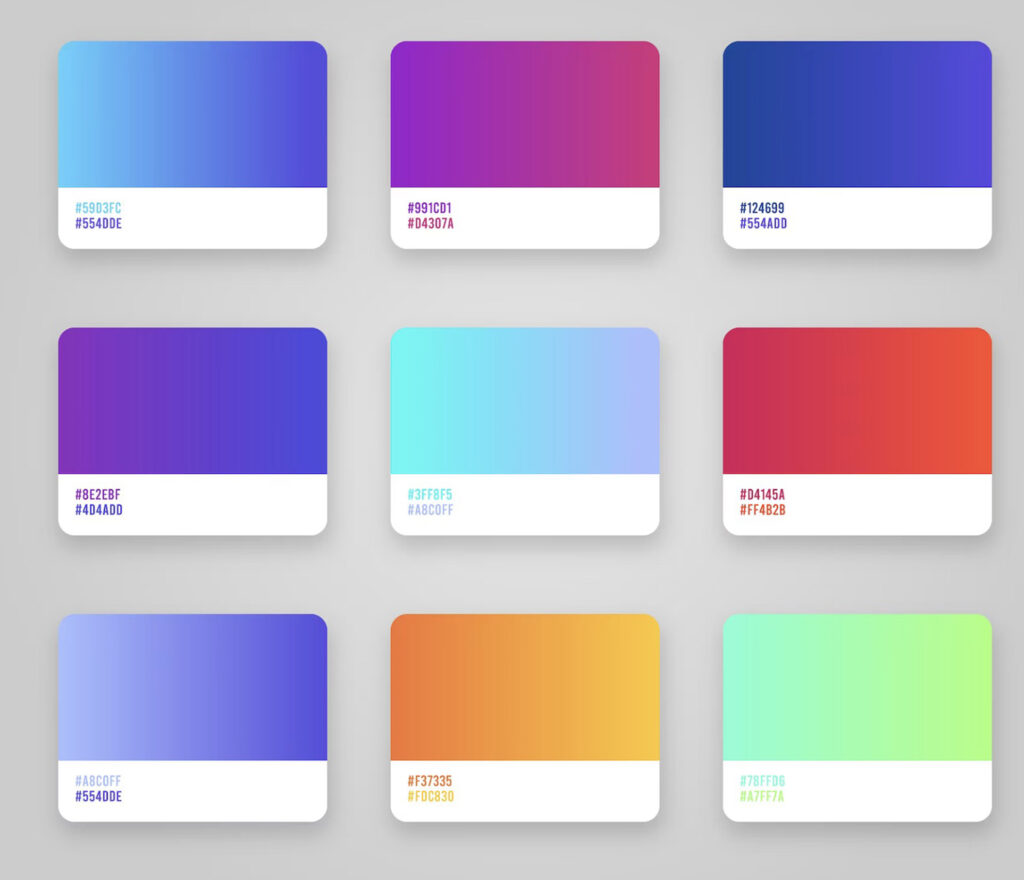
Understanding color in digital design involves working with various color models and formats. RGB is a widely used model that stands for Red, Green, and Blue. These three primary colors represent a value ranging from 0 to 255, where 0 means there is no presence of the color and 255 indicates full intensity. When combined, they create a vast spectrum of colors. An RGB color can be represented as (R, G, B).
Hexadecimal or Hex codes are another format to express RGB colors. Hex values range from 00 to FF and represent the intensity of red, green, and blue channels. Each Hex code consists of a # symbol followed by a six-digit alphanumeric code. The first two digits represent red, the next two represent green, and the last two represent blue.
| RGB | Hex |
|---|---|
| (255, 0, 0) | #FF0000 |
| (0, 255, 0) | #00FF00 |
| (0, 0, 255) | #0000FF |
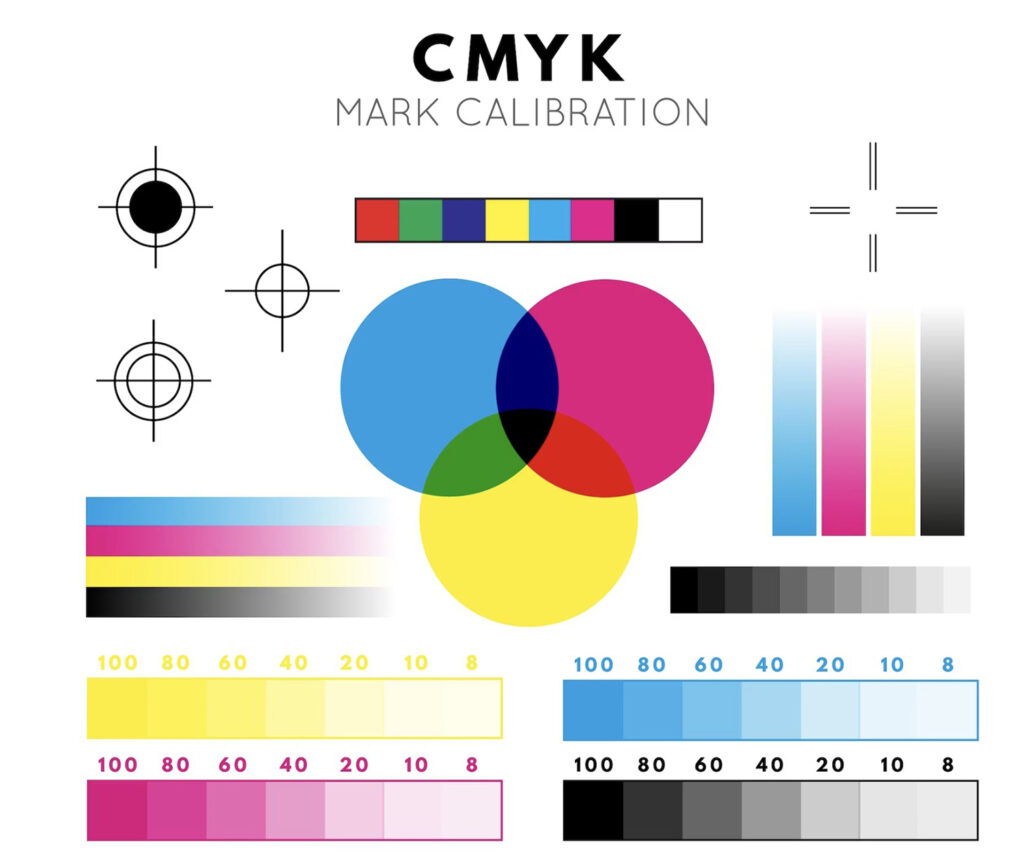
CMYK
While RGB is primarily used in digital and screen-based design, the CMYK model is often employed for print media. CMYK stands for Cyan, Magenta, Yellow, and Key (Black). It is a subtractive color model, meaning that colors are formed by subtracting or absorbing certain wavelengths of light. In this model, higher values indicate less presence of the color, and a value of 100 percent means that no light is reflected.
The CMYK model is generally less vibrant compared to the RGB model as it creates colors by layering ink on paper, unlike RGB, which directly controls emitted light. A CMYK color can be represented as (C, M, Y, K).
Both RGB and CMYK serve different purposes depending on the platform they are used in, and understanding their nuances allows designers to effectively create visually appealing content across different media.
Shades, Tints, and Tones
Shades, tints, and tones are essential components of the color wheel. They play a vital role in creating variations in color and building depth and contrast in artworks, designs, and everyday life.
Shades result from adding black to a color, effectively creating a darker version of the original hue. By increasing the amount of black, the color value decreases, and the shade deepens. For example, adding black to red creates darker shades such as maroon or burgundy.
Tints are created by adding white to a color, which produces a lighter version of the hue. Adding more white to the mix will increase the color value, resulting in lighter tints. For instance, combining white with red produces pink, a tint of red.
Tones involve adding gray – which is a mixture of black and white – to a color. This process creates a more subtle, muted, or desaturated version of the original hue. Incorporating gray into red, for example, results in hues like brick red or terra cotta.
To recap:
- Shades: Original color + black
- Tints: Original color + white
- Tones: Original color + gray
Understanding and utilizing shades, tints, and tones empowers artists, designers, and creators to develop harmonious color schemes and achieve stunning visual effects.
Colors in Design

Colors play a crucial role in design, especially in interior design. Choosing the right paint colors can significantly influence the overall look and feel of a space. A well-thought-out color scheme contributes to the ambiance, functionality, and emotional impact of a room.
Understanding color theory is vital when working with paint colors in interior design. One fundamental concept is the color wheel, which displays the relationship between colors. The primary colors – red, blue, and yellow – form the core, while secondary and tertiary colors result from mixing these primaries in varying proportions.
In design projects, it is essential to consider color harmony and balance. One way of achieving this is by selecting complementary colors, which stand opposite each other on the color wheel. They create a dynamic contrast, making a space visually appealing. Another method of creating harmony is by choosing analogous colors, which sit next to each other on the wheel. These hues tend to produce a more cohesive and calming effect.
Specific colors can evoke different feelings and emotions, making them suitable for different types of spaces within a home. For instance, cooler colors like blues and greens promote tranquility, making them ideal for bedrooms and relaxing areas. In contrast, warmer colors like reds, oranges, and yellows bring energy and liveliness, suiting living rooms and dining areas.
Proper use of color in design can also influence the perception of space. Lighter paint colors can make small rooms appear larger and brighter, while darker colors add depth and intimacy to more expansive areas. Furthermore, color can be used to create a room’s focal point through accent walls or bold furnishings, drawing the eye to particular elements in the space.
In conclusion, colors are essential in design, particularly in interior design, where paint colors dictate the mood, functionality, and overall aesthetic of a space. By understanding color theory and employing different techniques, designers can create visually striking and harmonious environments tailored to the specific needs and desires of their clients.
Experimenting with Colors

Color experimentation is an essential part of understanding the visual relationships between various hues. By exploring these relationships, one can create more effective and engaging designs.
One way to experiment with colors is by using a color wheel. The color wheel displays the primary, secondary, and tertiary colors in a circular arrangement, allowing for easy visualization of their relationships. Primary colors include red, blue, and yellow, while secondary colors are green, orange, and violet. Tertiary colors result from the mixing of primary and secondary colors.
It’s beneficial to understand some basic color relationships when experimenting. Complementary colors are found opposite each other on the color wheel and create strong visual contrast when used together. Examples include red and green or blue and orange. In contrast, analogous colors sit adjacent to one another on the wheel, creating a more harmonious visual effect. Examples include blue, green, and yellow.
Experimentation is key to finding the colors that work together to achieve a specific purpose. For example, a designer might employ complementary colors to create eye-catching visuals or use analogous colors for a subtle, calming effect. To find a balance between these extremes, one can experiment with split-complementary colors. In this scheme, a base color is accompanied by the two colors on either side of its complement, providing contrast without the intense vibration of straight complementary colors.
To further explore color relationships, try using different shades, tints, and tones of colors. Mixing black with a color creates a shade, while mixing white creates a tint. Mixing gray with a color results in a tone. Experimenting with these variations can lead to nuanced designs.
Here’s a list of possible color experiments to try:
- Complementary color combinations, such as red and green or blue and orange
- Analogous color pairings, like yellow-orange and yellow-green
- Triadic schemes, using evenly spaced colors on the wheel, such as red, yellow, and blue
- Tetradic combinations, using four colors in two sets of complements, like yellow and purple with red and green
By playing with different color combinations, you’ll uncover a vast range of possibilities and gain a deeper understanding of how colors interact.
Additional Color Variations
In the realm of color theory, there are an array of color variations that serve to create visually appealing and expressive designs. Some notable color variations include cyan, magenta, navy, chartreuse, pink, silver, teal, turquoise, fuchsia, and lime. Each of these colors holds its own unique properties and characteristics.
Cyan is a greenish-blue hue that is often found in the cyan-magenta-yellow-key (CMYK) color model. It is a secondary color, created by combining equal amounts of green and blue light. Magenta, on the other hand, is a vibrant mixture of red and blue light, and is also a secondary color in the CMYK model. These two colors are often used in digital printing because of their ability to create a wide range of other colors when mixed with yellow and black.
Navy is a deep, dark shade of blue that is reminiscent of the uniforms worn by sailors. It exudes sophistication and class, making it a popular choice for formal attire and professional logos. Chartreuse is a greenish-yellow color, named after the French liqueur of the same hue. It is a lively, eye-catching color that can add a bold touch to designs.
Pink ranges from soft pastel shades to vibrant, near-red hues. It is a versatile color often associated with love, romance, and femininity. Silver is a neutral, metallic tone that conveys elegance, modernity, and sophistication. It is often used in combination with other colors to create an upscale and luxurious feel.
Teal is a muted greenish-blue hue, reminiscent of the color of the ocean on a cloudy day. It is a popular choice for home interiors and fashion, as it conveys a sense of calm and relaxation. Turquoise is a blend of blue and green, inspired by the semi-precious gemstone of the same name. Turquoise embodies the serenity of the sea and the sky, making it a popular color for beach-inspired graphic designs.
Fuchsia is a vivid, purplish-red hue, named after the fuchsia flower. It is an energetic and attention-grabbing color that is often used to make a bold statement in design. Finally, lime is a vibrant shade of green with a hint of yellow, reminiscent of the outer skin of a lime fruit. It is a lively, energetic color that adds a touch of zest to any design.
These additional color variations are just a few of the countless hues that can be utilized in the world of design. Each possesses its own unique qualities, allowing designers to create endless possibilities by combining and contrasting these colors to produce visually stunning and expressive works of art.
Frequently Asked Questions
What are complementary colors?
Complementary colors are pairs of colors that are opposite to each other on the color wheel. When placed next to each other, they create a strong contrast, making each color appear more vibrant. Some common examples of complementary colors are red and green, blue and orange, and yellow and purple.
How do you find contrasting colors?
Contrasting colors can be found by looking at the color wheel. Colors that are opposite or nearly opposite each other on the wheel will create high contrast when used together. In addition to complementary colors, triadic and split-complementary color schemes are also examples of contrasting colors.
What is an analogous color scheme?
An analogous color scheme consists of colors that are adjacent to each other on the color wheel. This type of color scheme creates a harmonious and visually pleasing appearance. Typically, it includes one dominant color, a secondary color, and a tertiary color. Examples include blue, green, and yellow or red, orange, and yellow.
How does the color wheel help in choosing color combinations?
The color wheel is a useful tool for understanding color relationships and making informed decisions when choosing color combinations. It helps to identify complementary, split-complementary, triadic, tetradic, and analogous color schemes. By selecting colors that work well together, one can create visually appealing and harmonious designs.
What is the triadic color scheme?
A triadic color scheme involves selecting three colors that are evenly spaced around the color wheel. This creates a well-balanced and dynamic color palette with a strong visual contrast. An example of a triadic color scheme would be blue, red, and yellow or green, orange, and purple.
How can I create a balanced color palette?
Creating a balanced color palette requires selecting colors that work well together and provide the desired level of contrast and harmony. Consider using the color wheel to identify complementary, triadic, or analogous color schemes, and then experiment with different shades, tints, and tones to achieve the ideal balance. Additionally, it’s essential to incorporate neutral colors such as white, black, or gray to provide breathing space and balance the overall color palette.