No matter what type of website you plan to run, visuals will be a key part of the user experience. Mixed media like images and video might be necessary, but the foundation of your site’s visual identity will likely be rooted in colors. Therefore, you may be wondering what the best website color schemes are.
Your preferred color scheme will be highly subjective. It will depend on your industry, unique branding, and of course – personal taste. Still, there are some tried and true color palettes that you might want to consider for your site. 💐
Why website color schemes are important
Before we dive into some of the best website color schemes, let’s discuss why color palettes are so important. For starters, it’s essential to consider the psychology of color [1]. This way, you can choose color combinations that align with your business or personal brand.
As an example, colors like red and yellow can be a bit overstimulating, so it’s better to use them sparingly, unless your brand is explicitly intense or “in-your-face.” On the other hand, colors like blue and white can help you evoke a sense of calm.
Additionally, color theory [2] teaches us how to use warm and cold colors for certain aims. Likewise, complementary colors can balance out some of more aggressive ones. Furthermore, things like color saturation and contrast are crucial when considering web accessibility.
In a nutshell, color psychology and color theory are essential if you want to create a positive user experience (UX) on your site. If you haven’t already chosen a color palette for your brand, researching color schemes can help you. 👨🏻🎨
How to change your website color scheme
Now that we’ve discussed the importance of website color schemes, we’re going to show you a few ways you can change them in WordPress. This way, you’ll know how to implement a new color scheme once you find the one that’s right for you.
Method 1: Choose a WordPress theme with your preferred colors 🎨
If you’re using WordPress, managing your site’s colors can be super simple thanks to themes, which include pre-selected palettes, fonts, and more. And, since they are designed by professionals, the color combinations they come with are always cohesive and eye-catching.
Even better, you can install a theme in just a few clicks. From your dashboard, go to Appearance → Themes:
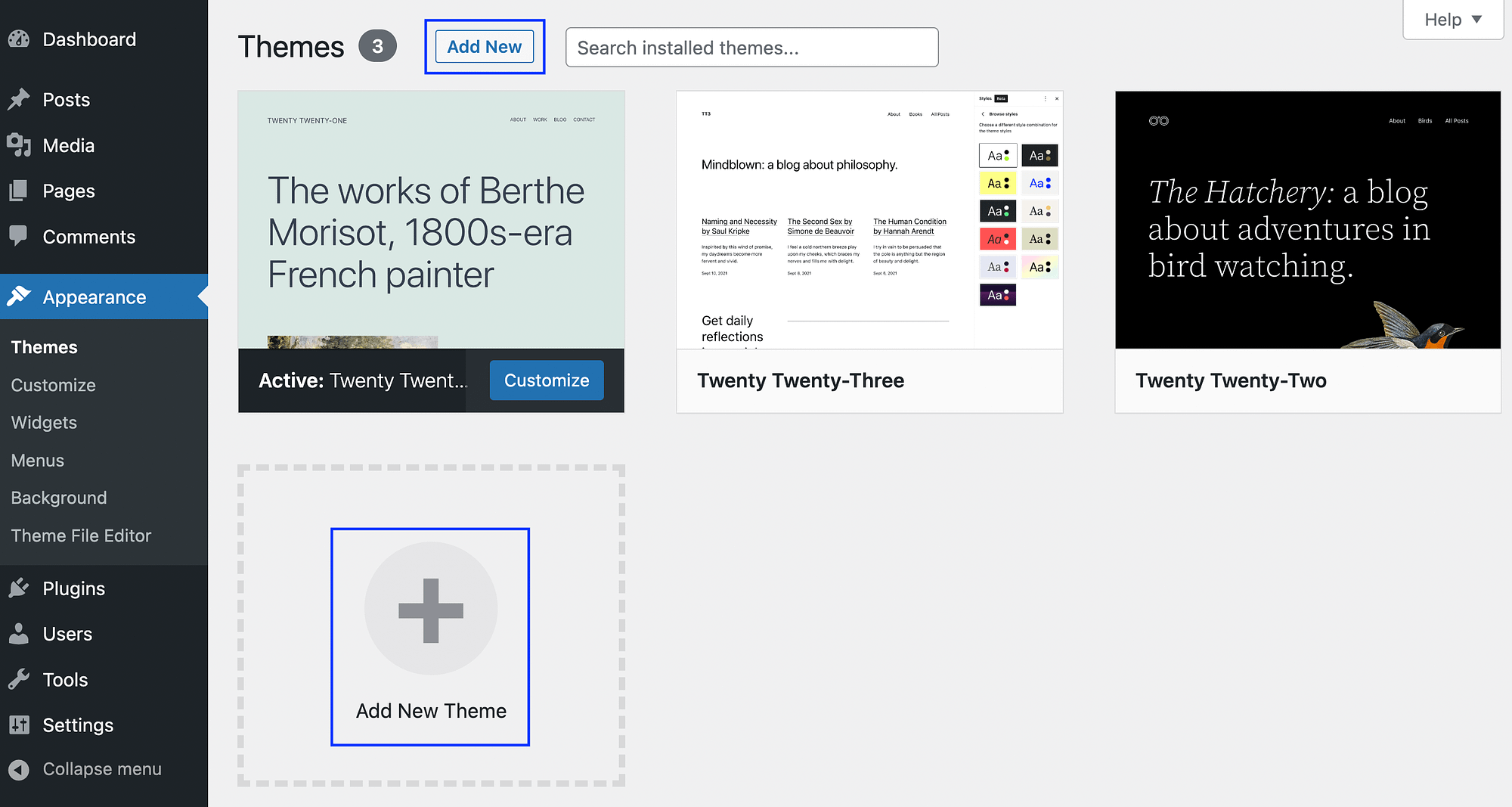
Then, select Add New or Add New Theme. After that, you can search for a theme or upload one you’ve downloaded elsewhere:
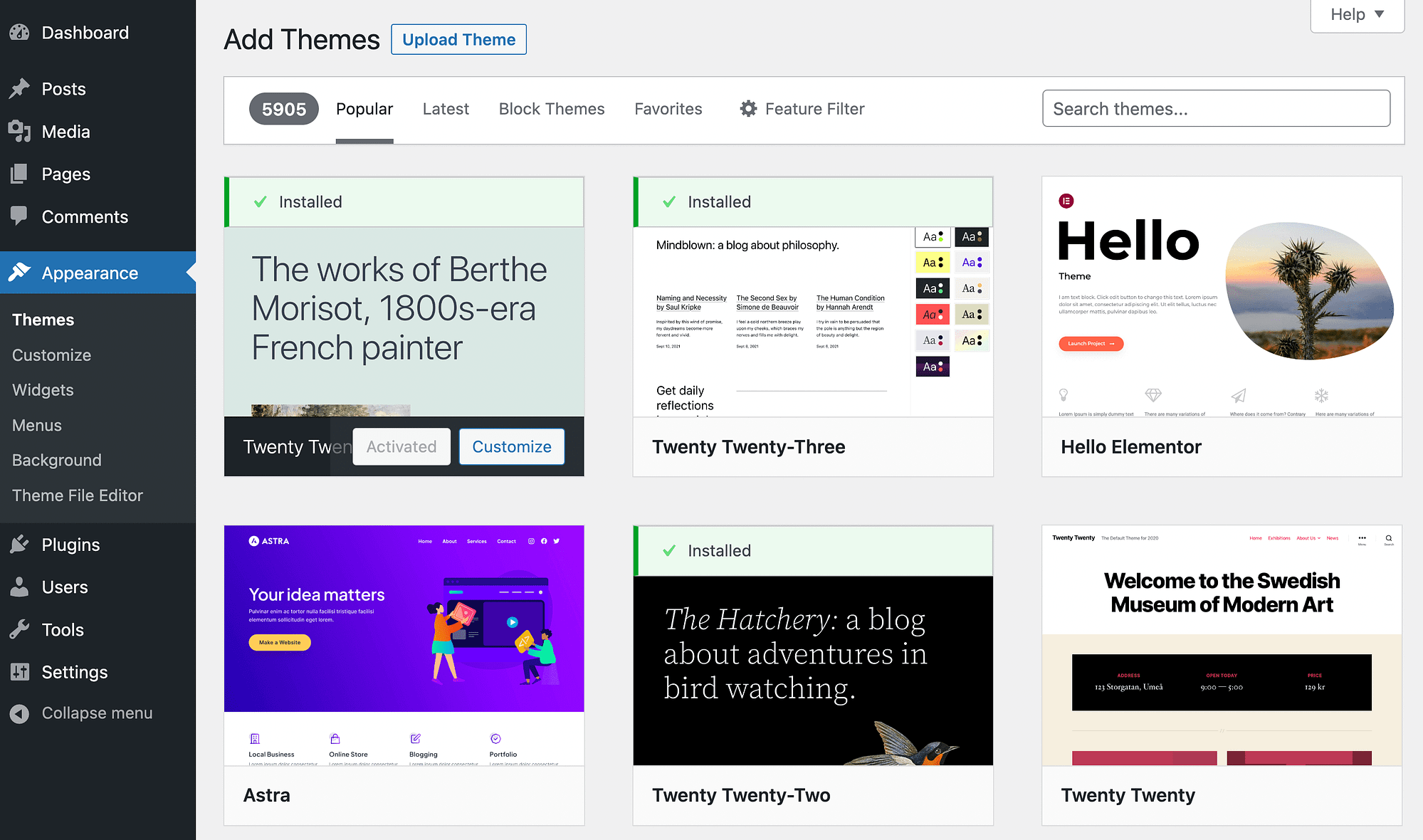
You can choose from thousands of free and premium themes. And, if you’re using the WordPress official theme directory, you’re able to filter them by features.
For instance, you might want a block theme so you can edit your entire site visually, without needing to do any coding. Alternatively, you might be looking for a store theme with certain ecommerce functionalities.
Once you’ve found your ideal option, all you have to do is install and activate it. For complete instructions, check out our documentation on installing WordPress themes.
It’s also important to note that if you’re not happy with a theme down the line, you can always change your WordPress theme.
Method 2: Modify your website color scheme using the Site Editor 👩💻
Picking a WordPress theme with a color scheme that aligns with your needs is perhaps the quickest approach to creating an appealing color story. But, it can be hard to find the exact tones and hues you’re looking for.
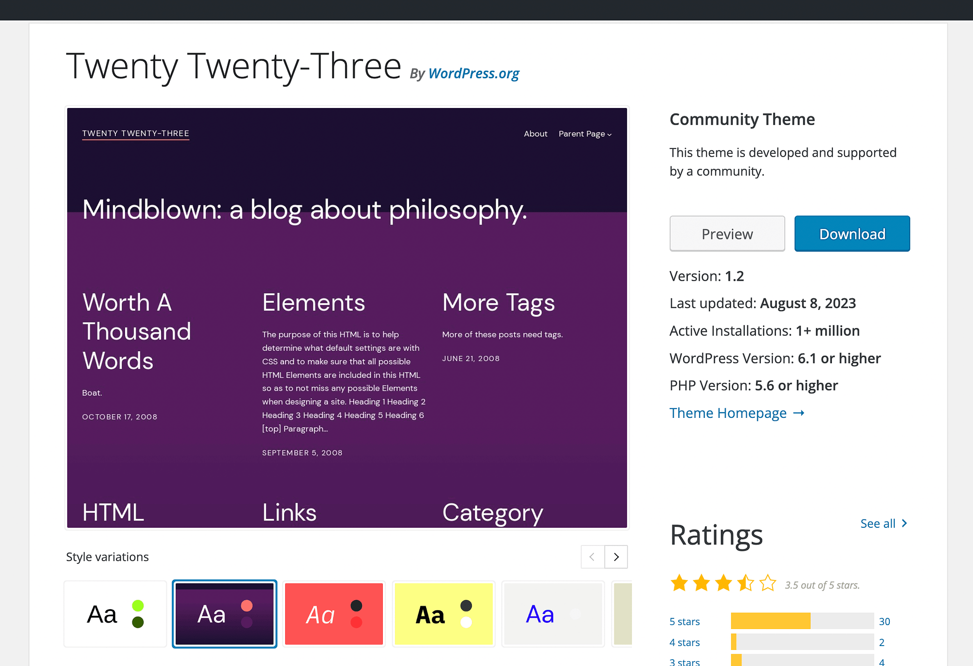
The good news is that you can modify any WordPress theme to create a custom branded website. As we mentioned, this is even easier when you’re using a block theme, like Twenty Twenty-Three:
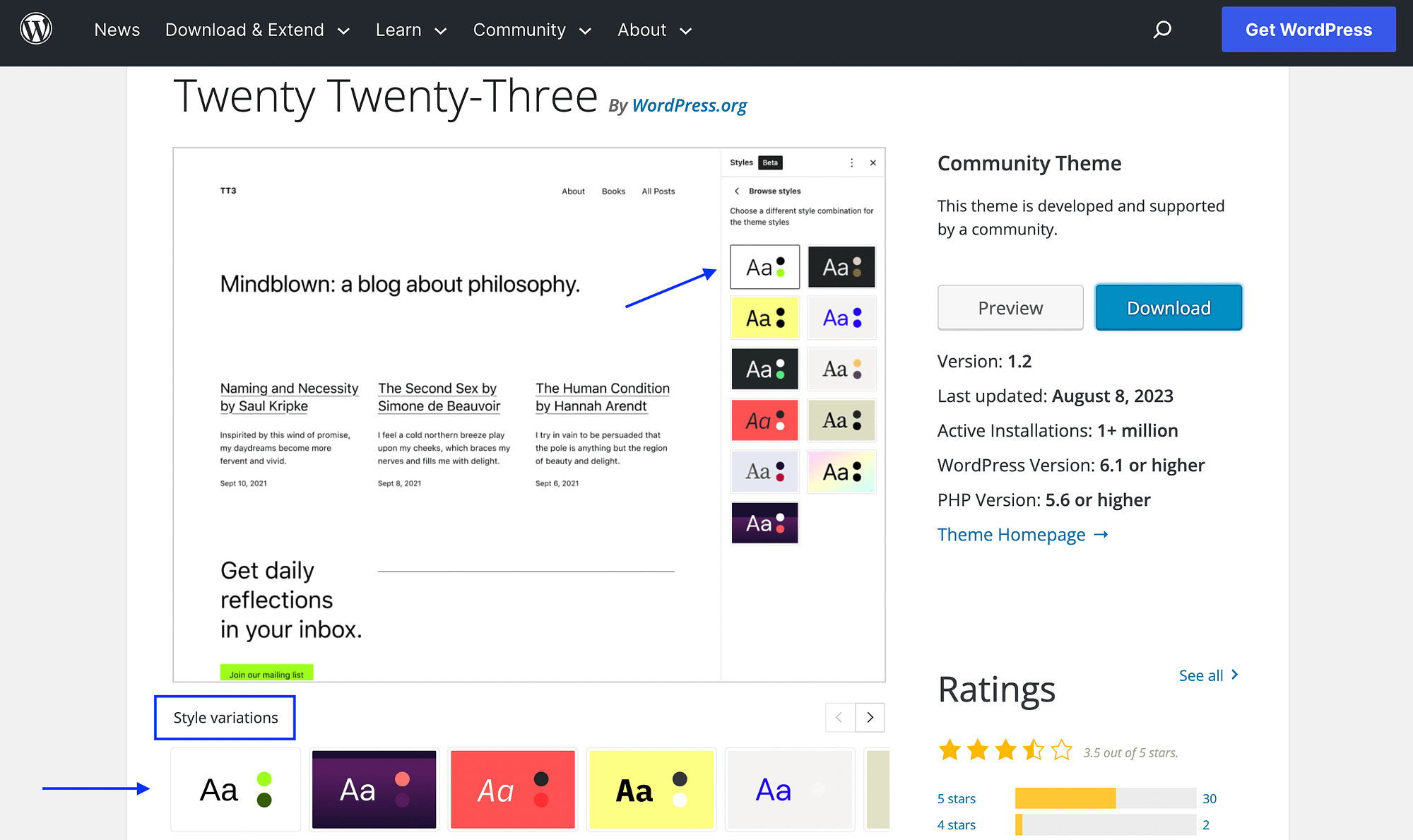
This is because block themes are compatible with the Site Editor. Plus, many of them include Style variations. These allow you to change color palettes and font families in a single click:
To do this, go to Appearance → Editor:
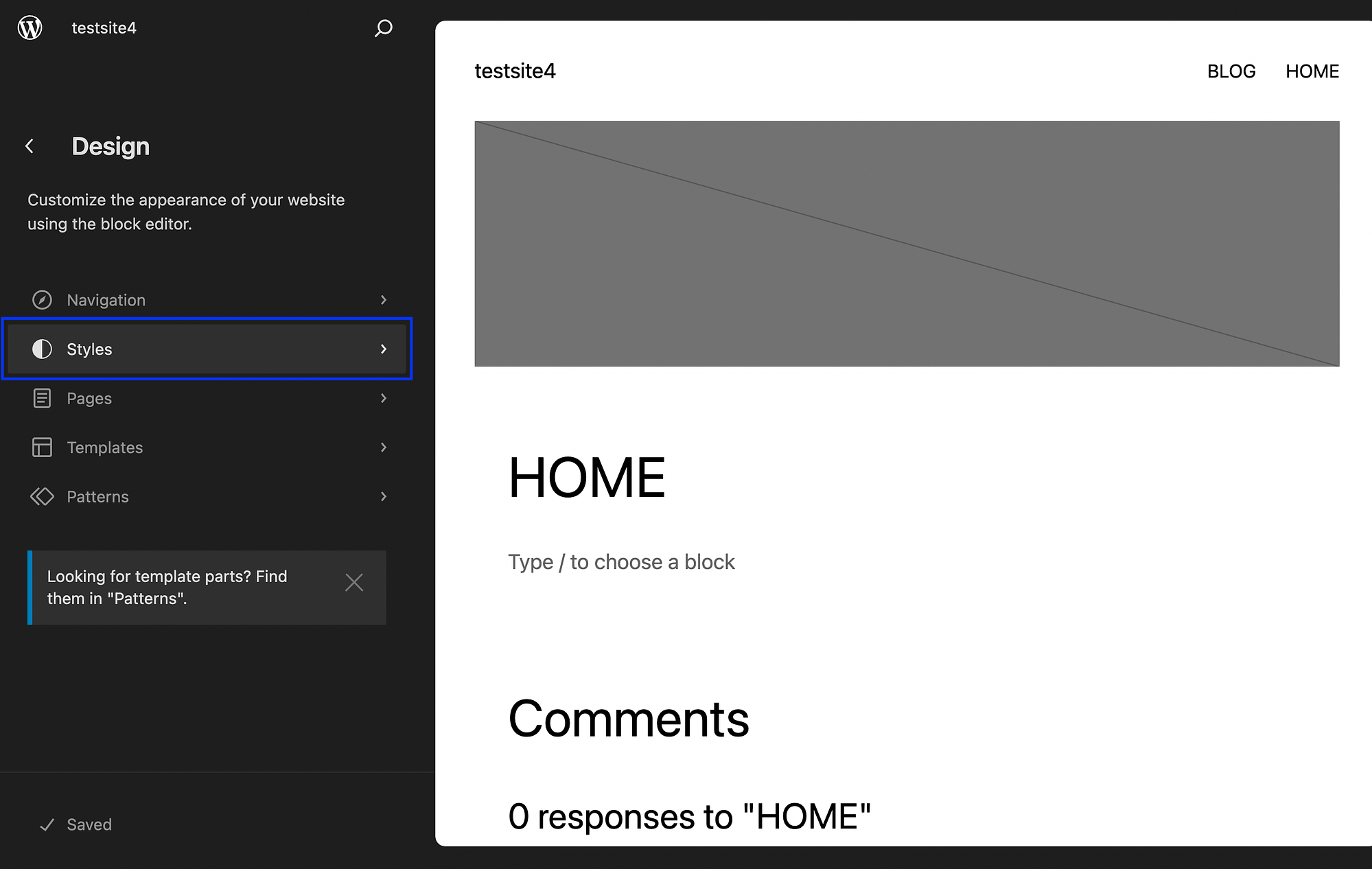
Click on Styles, choose one and hit Save. It’s as simple as that!
However, if you don’t like every aspect of a block theme or style variation, you can simply use the Site Editor to further modify your colors. To do this, go to Appearance → Editor once again:
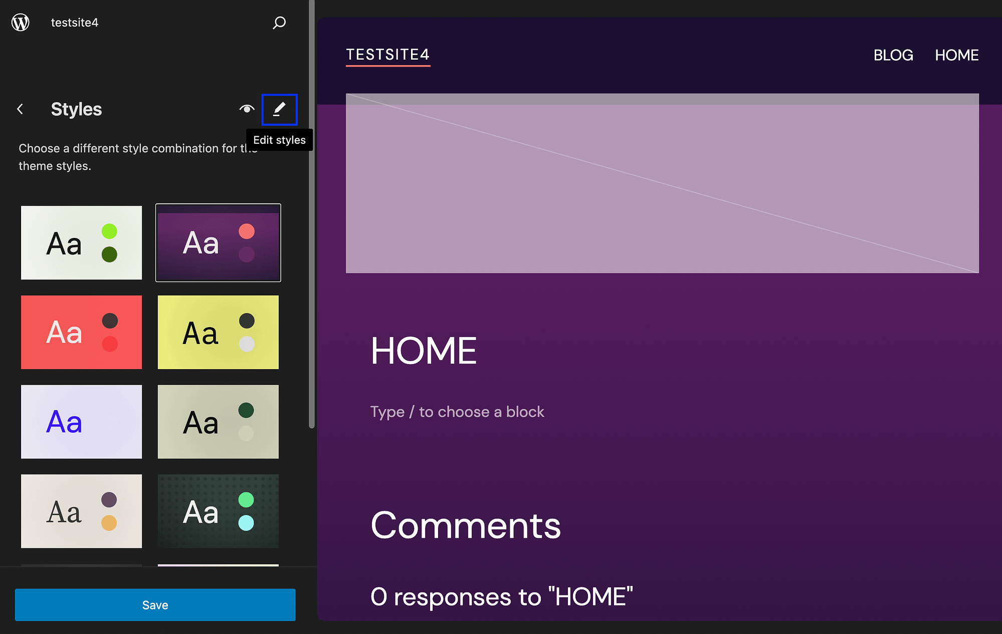
Hover over the pencil icon to open your Site Editor. Then select Colors on the right:
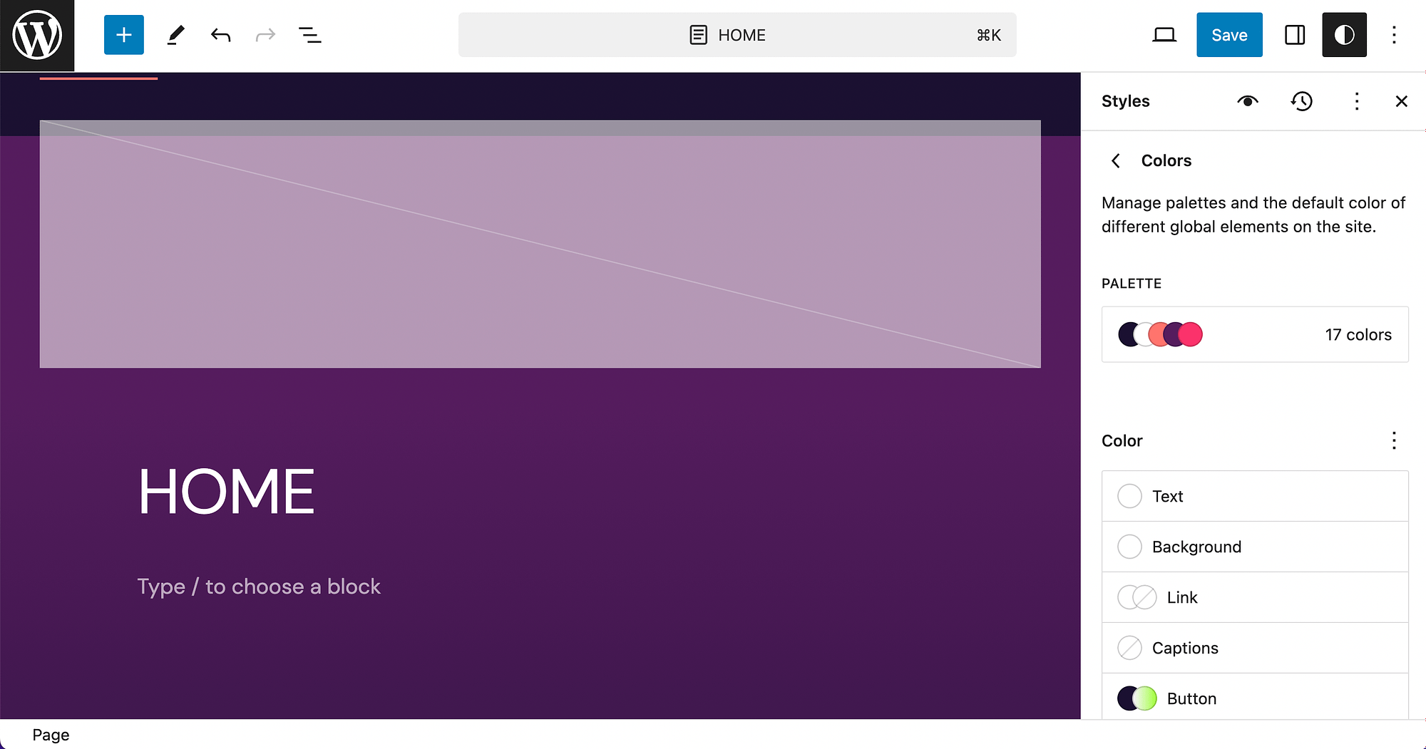
Next, open Palette:
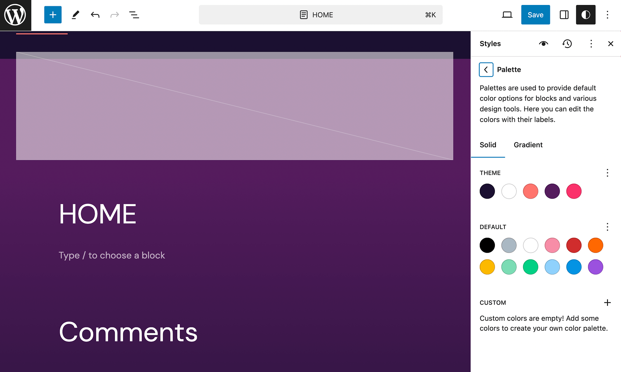
Within the Solid tab, you’ll see your theme and default colors, and an option to add Custom colors:
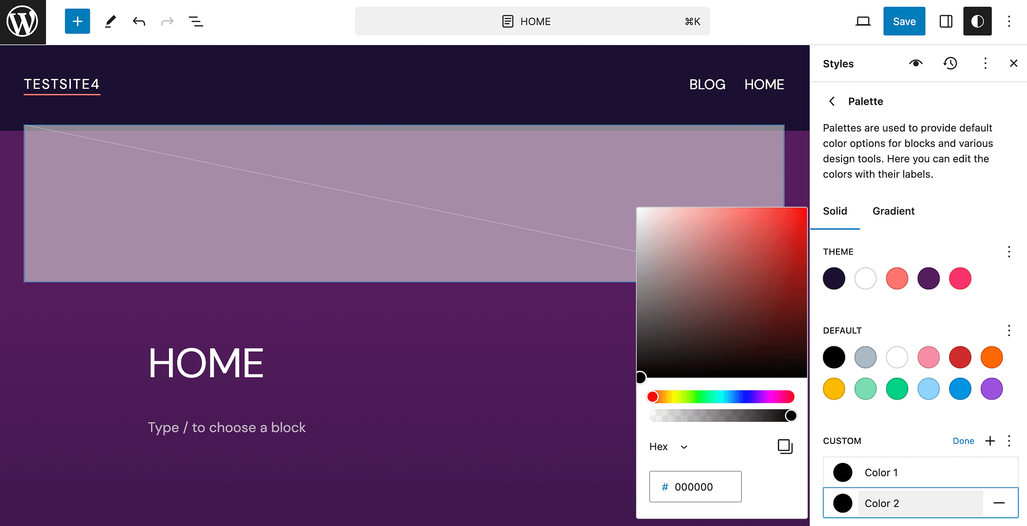
Here, you can use a color picker or input a hex value. You’re also able to input RGB and HSL values when you change the format in the dropdown menu.
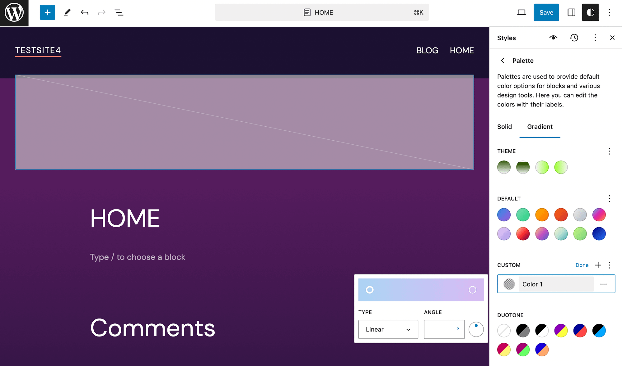
Additionally, you can open the Gradient tab to get more choices:
When you’re happy with your color selections, hit Save!
⚠️ Note. In case you’re using an older WordPress theme, you might also get some color customization options in the WordPress customizer.
Best website color schemes
Now, let’s go over ten of the best website color schemes!
📚 Table of contents:
- Light
- Dark gray
- Bright
- Teal and orange
- Dark blue
- Black and white
- Rainbow gradient
- Orange and blue
- Yellow and Cream
- Light green and beige
1. Light
First up, let’s check out a light and elegant color scheme. This minimalist color scheme features a soft beige background paired with muted gray and mauve text:
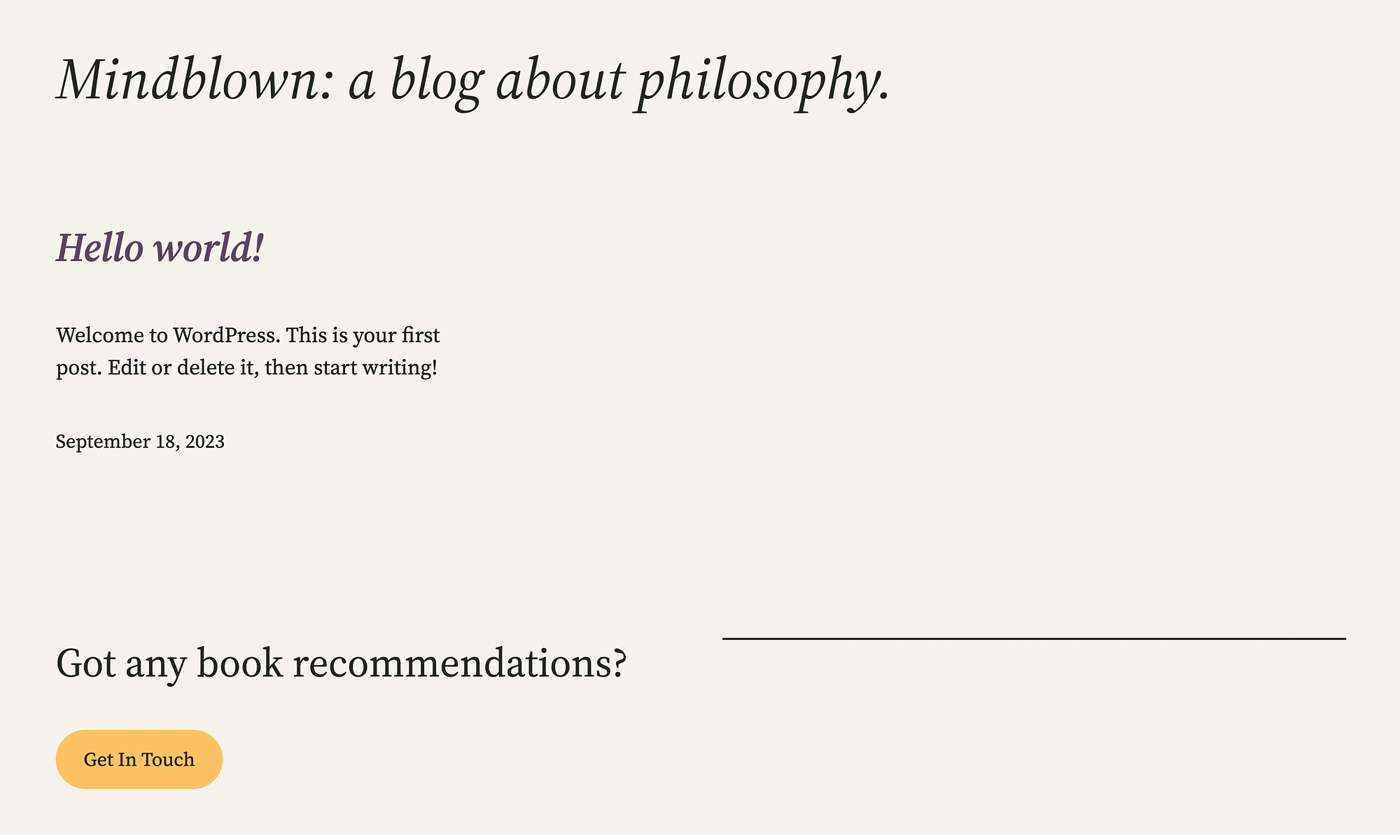
The one main pop of color we see is a yellow-orange call-to-action (CTA) button. Additionally, this color scheme is coupled with soft, swooping typography that matches the overall subtleness of the design.
The above example is actually the “Marigold” style variation for the Twenty Twenty-Three theme. Meaning, it’s super easy to implement it on a WordPress site. Of course, since it’s also a block theme, both colors and fonts are easy to edit.
Due to its delicate nature, this color scheme may be good for personal blogs or wedding websites.
2. Dark gray
Next up on our list of the best website color schemes, let’s check out another minimalist example:
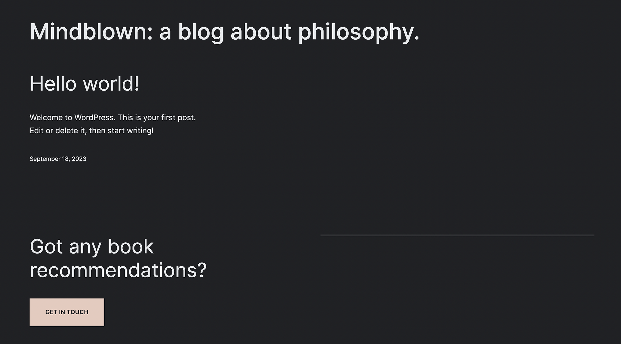
This palette uses just a few colors, focusing on the contrast of a dark gray background and white text.
Once again, the main pop of color highlights an attention-grabbing CTA button. Using contrasting colors to drive conversions is an excellent strategy.
This color scheme is another style variation of the Twenty Twenty-Three theme, called “Pitch.” It’s also worth noting that this theme uses sharper edges and fonts, which suit its starker design.
3. Bright
Now, we’re going to change gears and take a look at a brighter color scheme:
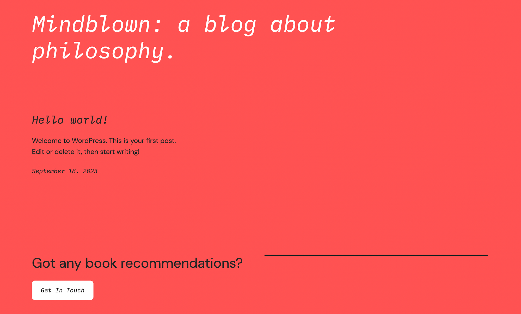
This is yet another Twenty Twenty-Three variation called “Block Out.”
Similar to Pitch, this design leans on a strong background color, which in this case is a light but bright shade of red. The most important features, including the page title and CTA button, stand out thanks to a pop of white.
The rest of the site’s text is in a dark gray. Additionally, Block Out’s typography nicely complements its simple design, featuring narrow and slanting fonts.
4. Teal and orange
If you’re looking for a more adventurous color scheme, this one might interest you:

This site’s color palette features a teal background alongside orange and white accents. Since this is a somewhat unexpected color combination, it could help you stand out from the crowd.
Even better, this example comes from another popular WordPress theme called Neve. When you purchase the premium version of this theme, you’ll get access to tons of starter sites, including the above option, which is “NFT Illustrator.”
In addition to one of the best website color schemes around, this Neve starter site includes core pages that could work well for design agencies, freelancer websites, and other creative purposes.

5. Dark blue
Moving along, here’s a dark blue color scheme you might like:

It’s simple but straightforward. You get a dark blue background with yellow accents, which works well because they are both bold primary colors. White text also pops on this inkier palette.
This may be a good option if you want to create a professional-looking website without hiring a developer or web designer. In fact, this is another premium Neve starter site, called “Architecture.” It includes useful web pages for projects, contact, and more.
Plus, Neve is proven to be one of the fastest WordPress themes.
6. Black and white
Now for a classic color combination, black and white. This is Neve’s Blogger starter site:
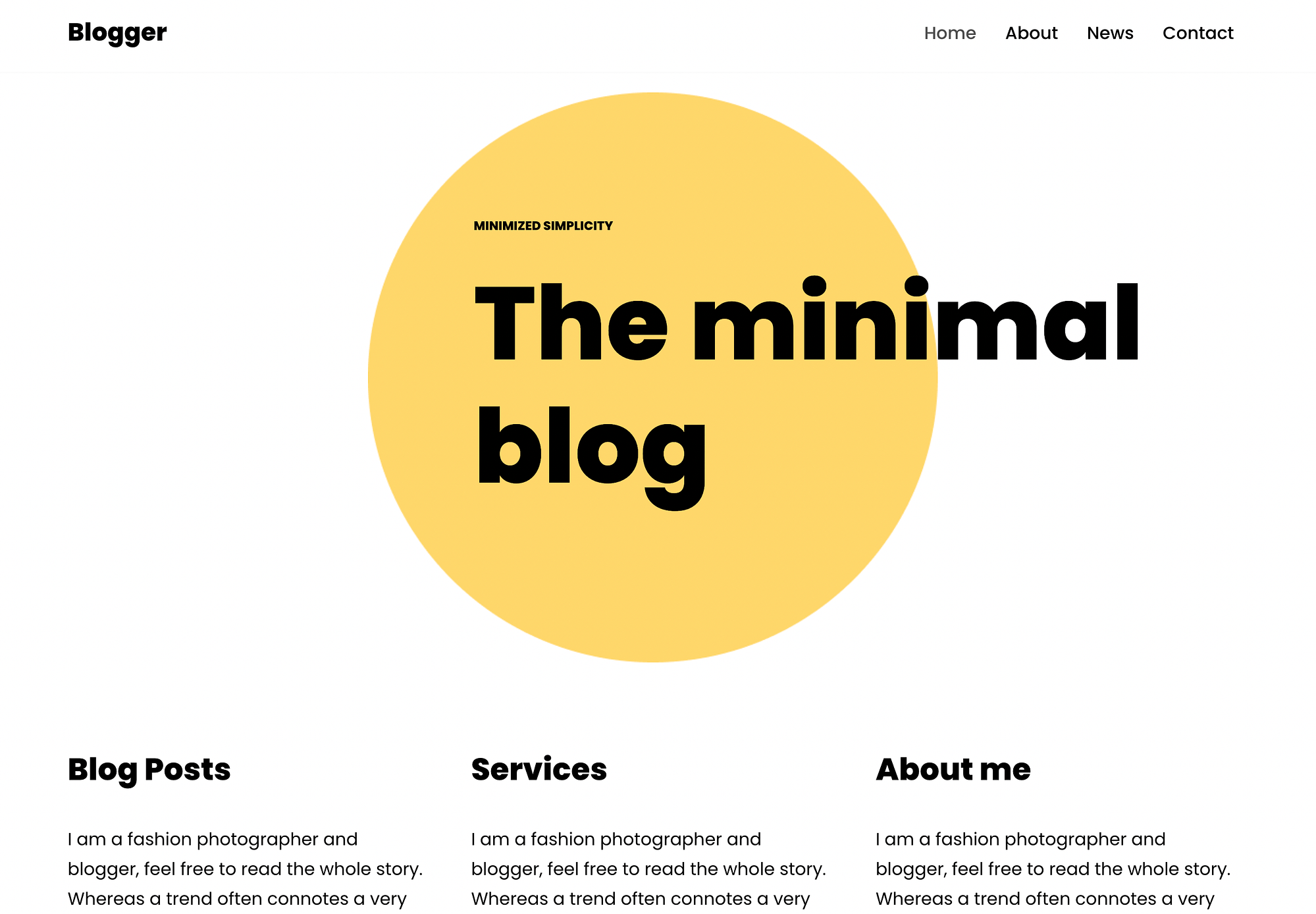
If you don’t want to spend too much time obsessing over which is the best website color scheme, you might consider this timeless option.
Moreover, a simple black and white backdrop can help you grab visitors’ attention by enabling you to highlight one specific element. For instance, you could swap out the yellow circle above for your own brand’s colorful logo. If you don’t have a logo yet, it’s easy to create one using a logo maker.
7. Rainbow gradient
If you want to create a playful visual experience, you might consider a rainbow gradient:
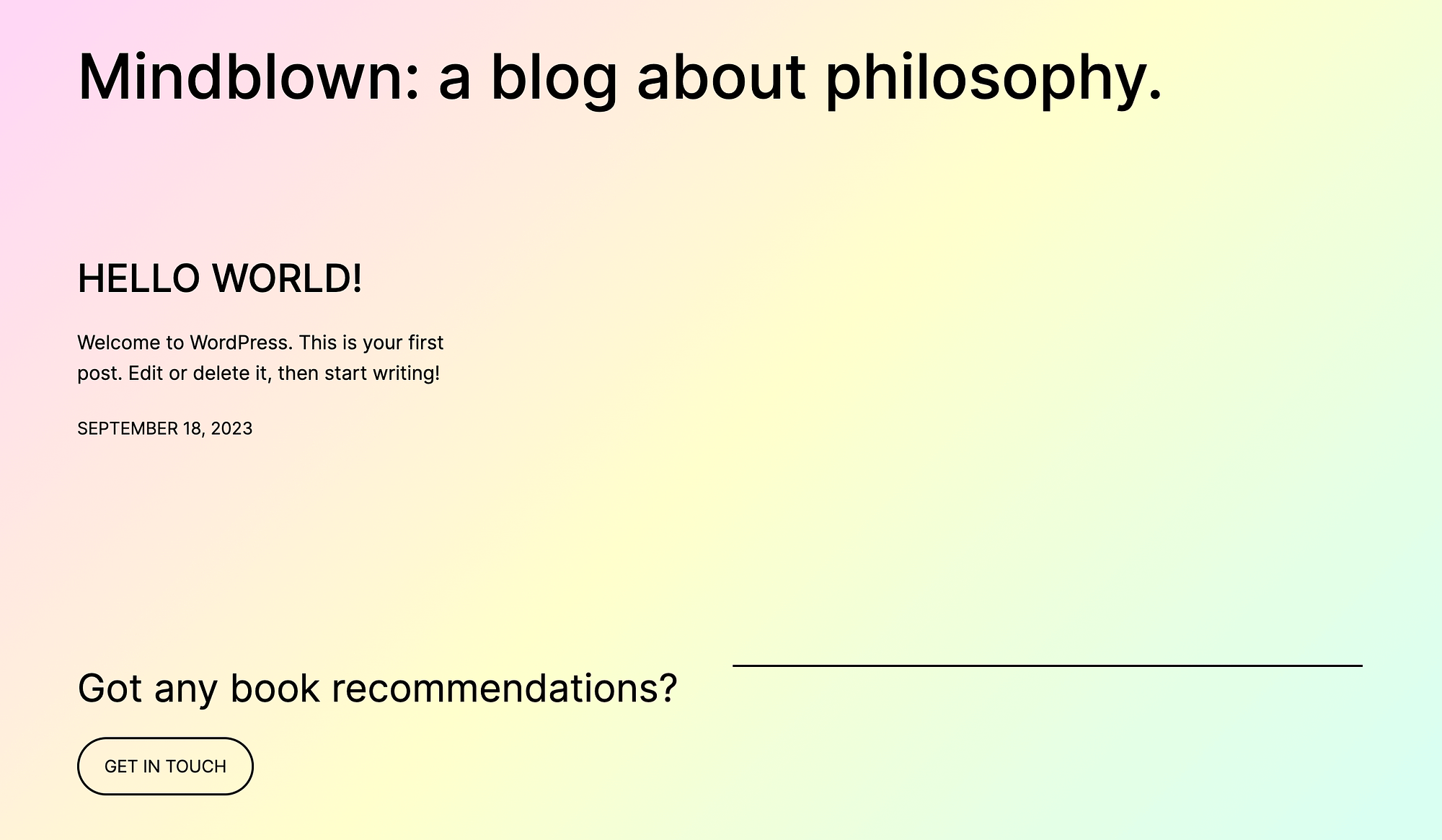
This is Twenty Twenty-Three’s Sherbet variation. It’s one of the best website color schemes if you want to show visitors your fun side, without bombarding them with a bunch of overstimulating primary colors.
Furthermore, this is an excellent option because you only have to choose one color (technically a gradient) and not an entire palette.
However, keep in mind that if you opt for this color scheme, you’ll want to stick to either black or white for text elements. Otherwise, it could damage your site’s accessibility, as visitors might have a hard time reading your content.
8. Orange and blue
You can get the next color scheme when you’re using one of the best free full site editing themes – Neve FSE:

This design, featuring rich blue and orange hues, is called Vivid-Red Tangelo. It’s an excellent option because orange and blue are complementary colors, falling on opposite sides of the color wheel.
What’s more, if you use Neve FSE to get this color scheme, you’ll also get a wide range of templates for things like headers, footers, 404 pages, and much more. Plus, similar to its counterpart (Neve), Neve FSE is a fast and lightweight theme.
9. Yellow and Cream
If you want to use colors to give off a welcoming yet professional vibe, you might consider yellow and cream:

This is one of the best website color schemes because it’s delicate yet polished. It enables you to use a more aggressive, attention-grabbing primary color and soften it with a muted cream.
What’s more, these yellow pops of color can go a long way when it comes to user experience (UX) and smooth navigation. Furthermore, you might have guessed that this is another variation for Neve FSE. Aptly named, this youthful variation is called “Crayola.”
10. Light green and beige
Last but not least, let’s check out a cool light green and beige color scheme:

As you might have guessed, this is another Neve FSE variation, appropriately named “Greenlight.” Since this is a straightforward color scheme, it can help you create a pleasant and streamlined website.
The green contrasts nicely with the beige, but it’s not so stark as it would be if you were using white. Moreover, when you use green and beige as your main colors, you can utilize multiple text colors.
Like in the example above, you could experiment 👩🔬 with white text on green and black text on beige.
Conclusion 🧐
These days, online users are inundated with interesting, visually appealing web pages and content. So, you’ll want to put in the extra effort to make yours stand out from the rest. Choosing one of the best website color schemes can be a great place to start.
If you’re embracing the minimalist trend, you might opt for light colors, black and white, or dark gray. Or, consider a rainbow gradient for a playful website color palette. Otherwise, you might try soft color combinations like yellow and cream, or light green and beige. 🔴🟡🟢🔵
Do you have any questions about the best website color schemes we shared in this list? Let us know in the comments section below!