Updated: Jul 06, 2023 By: Dessign Team
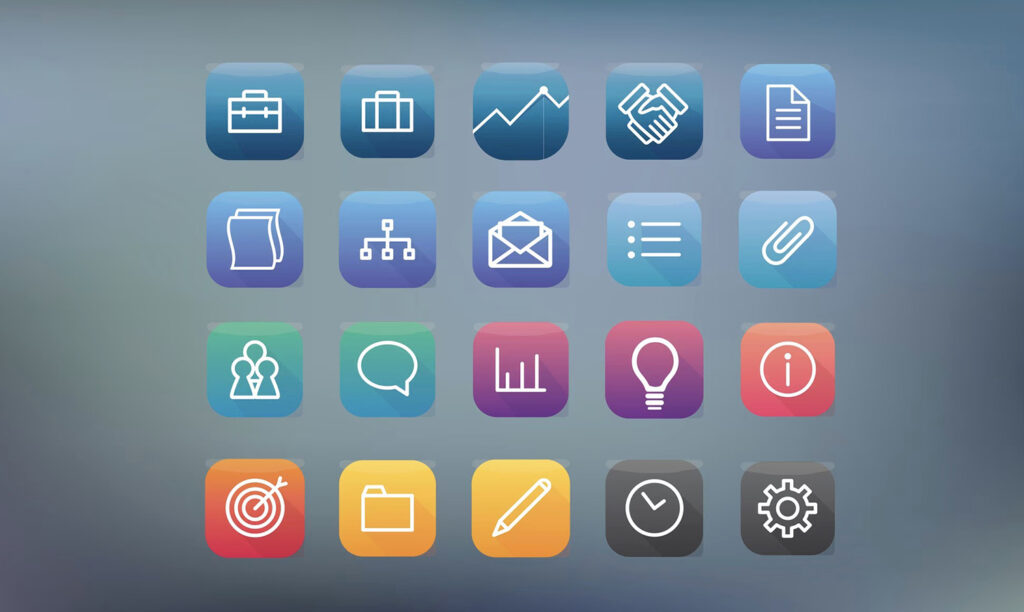
Icon design is an essential aspect of graphic design that focuses on creating visually appealing and informative pictograms, symbols, and user-interface elements. These small yet impactful graphic elements have the power to convey complex ideas or actions in a simplified manner, making them a vital tool for effective communication in the digital age.
As a beginner, diving into the world of icon design may seem intimidating, but with the right guidance and understanding, one can master this skill seamlessly.
The objective of this beginner’s guide is to provide a comprehensive understanding of the intricacies of icon design, including the basic principles, tools, and techniques employed by professionals. The guide aims to help aspiring designers grasp the importance of crafting visually consistent and contextually appropriate icons that resonate with the intended audience.
By following the insights shared in this guide, beginners can embark on a journey to create meaningful and effective icon designs across various platforms and applications.
In this resource, readers will explore the foundations of icon design, such as scalability, legibility, and adherence to established design systems. Additionally, the guide introduces the industry-standard software and resources that will help novices hone their skills and develop their unique design language. As the journey unfolds, beginners will gain the confidence and knowledge necessary to create compelling and memorable icons that leave a lasting impression on users.
Understanding Icon Design
Icon design is the process of creating simple, recognizable visual elements used in digital interfaces. These visual elements, or icons, play a crucial role in enhancing the user experience design of various platforms, including websites and applications. A well-designed icon can provide clarity and improve interaction within user interfaces (UIs).
In the world of iconography, simplicity is key. Icons should be designed to convey their function or meaning in the most straightforward and uncomplicated way possible. The use of minimal detail and clean lines can make icons more accessible and easier to understand for users.
That being said, it is essential to strike a balance between simplicity and detail to ensure the icon effectively communicates its intended purpose.
Consistency is another vital factor when it comes to icon design. Consistent iconography helps create a cohesive visual language across different material design elements and user interfaces. This uniformity not only aids in user comprehension but also contributes to a more polished and professional appearance across UIs. One way to achieve consistency is by adhering to established design guidelines, such as Google’s Material Design.
Creating recognizable icons is essential for effective icon design. To be easily understood by users, icons should reflect familiar concepts and objects. Designers can achieve this by utilizing universally recognizable shapes and symbols, or by creating unique visuals that can quickly become associated with a specific function or feature on the platform.
In conclusion, understanding and mastering icon design involves focusing on simplicity, consistency, and recognizability. By adhering to these principles, designers can create effective and visually appealing icons that improve the overall user experience design on digital platforms.
Getting Started with Icon Design
When it comes to icon design, the first step is to understand the basics of the design process. This involves familiarizing oneself with fundamental elements such as basic shapes, simple shapes, grids, and sketching.
To begin, an icon designer should start by focusing on simple shapes, as these are the building blocks of most icons. A combination of basic shapes like circles, squares, and triangles can be used to create various icons. Developing a strong understanding of these shapes will help a designer create clean and efficient icons.
Next, incorporating icon grids and pixel grids into the design process is essential. Grids serve as a guide to maintain consistency in size, style, and proportion. An icon grid is a framework with a series of horizontal and vertical lines that helps designers align their icons accurately. A pixel grid, on the other hand, is more focused on the finer details, ensuring the icons look sharp and crisp even at small sizes.
Sketching is another crucial aspect of getting started with icon design. Before diving into digital tools, it’s beneficial to put ideas to paper through quick and rough sketches. This practice enables designers to explore various concepts and make adjustments before moving on to digital implementation.
When designing icons, it’s important to maintain a confident and knowledgeable tone, while keeping the information neutral and clear. Design is subjective, but adhering to established guidelines and best practices will support the successful creation of visually appealing and functional icons.
Remember to use basic shapes, work with grids, and practice sketching as you embark on your journey into icon design. These practices will help you establish strong foundations that result in well-crafted and effective icons.
In the world of icon design, the concept plays a pivotal role in conveying meaning effectively. Designers utilize metaphors to create a connection between the visual elements and the idea they represent. This helps users to quickly grasp the intended message and navigate interfaces with ease.
Metaphors serve as the backbone of any good icon set. They consist of recognizable symbols or visual representations that stand for a particular concept, action, or object. The more intuitive the metaphor, the more effective the icon will be. For instance, a magnifying glass signifies search, and a floppy disk represents saving.
When creating an icon set, consistency is also crucial. Designers must ensure that their icons follow a consistent visual style, size, and color palette. This unifies the overall appearance and enhances user experience. Using icons design which can also be part of your logo design.
Striking a balance between simplicity and detail is vital when crafting icons. Simplifying the design helps with visual clarity, but adding some level of detail can make the icon more visually appealing. Consider the context in which the icons will be used, and choose a suitable level of detail that maintains legibility without overwhelming their surroundings.
To summarize:
- Utilize metaphors to create a strong connection between visual elements and their intended meaning.
- Ensure consistency in design, size, and color for all icons within a set.
- Balance simplicity and detail to achieve an optimal combination of visual appeal and clarity.
Design Systems and Guidelines
Design systems are essential for creating consistent and visually appealing icon designs. They serve as a foundation for designers to follow, ensuring that all elements within the project maintain a uniform appearance. Guidelines provide specific instructions on how designers should approach aspects such as alignment, balance, and other design principles.
One popular software for facilitating design systems is Figma. This collaborative platform allows designers to craft and maintain consistent design components, ensuring that all team members work within the agreed-upon guidelines. As the design evolves, teams can easily update the design system in Figma, allowing for seamless collaboration and an up-to-date reference point for all parties involved.
The consistency of design systems can be achieved through several key factors:
- Alignment: Ensuring the arrangement of elements within an icon along vertical and horizontal lines or around a central point creates visual harmony and order.
- Balance: Maintaining an equal distribution of visual weight among all elements encourages a cohesive look in the icon design.
- Guidelines: Documented rulesets should be provided to maintain consistency across elements at all times and to anchor the design process.
Implementing design systems in the icon design process is an effective way to create a cohesive, visually appealing output. Adhering to guidelines and design rules creates a structure that guides designers towards building professional and attractive icons. Making use of powerful software solutions like Figma can help designers streamline their work, resulting in icons that align with the overall brand style and aesthetics.
Icon Creation Process
The icon creation process involves several key steps to design effective and captivating icons. These visual elements play an essential role in enhancing user experience, as they succinctly convey information and guide users through a digital platform.
The first step in the icon design process is conducting research. A UX designer should have a clear understanding of the target audience and the context in which the icons will be used. This helps in creating relevant and recognizable symbols.
Next, the designer should focus on developing a consistent visual style for all icons. Consistency ensures that the icons blend seamlessly within the interface, creating a unified look and feel. It is important to consider factors such as color, line thickness, and shapes while adhering to the chosen style.
Once the style is established, it’s time to sketch ideas for individual icons. Quick and rough sketches are helpful in brainstorming various concepts and identifying the most suitable representation for each function or action.
After finalizing the sketches, move on to digitalization. Employ a vector-based software like Adobe Illustrator or Sketch for creating and refining the icons. These programs offer flexibility and precision, making it easier to modify and scale icons without losing quality.
Testing the icons in context is a significant step in the icon creation process. It ensures that they are easily recognizable, visually pleasing, and contribute positively to the overall user experience. This stage may involve refining the design based on user feedback and making necessary adjustments.
Remember that simplicity is key when designing icons. Avoid cluttering the icons with excessive details, as this can distract from their core purpose and make them less effective.
In summary, the icon creation process consists of research, style development, sketching, digitalization, and testing. Combining these steps with a clear, knowledgeable, and neutral approach will contribute to the creation of engaging and functional icons for an enhanced user experience.
Types and Sizes of Icons
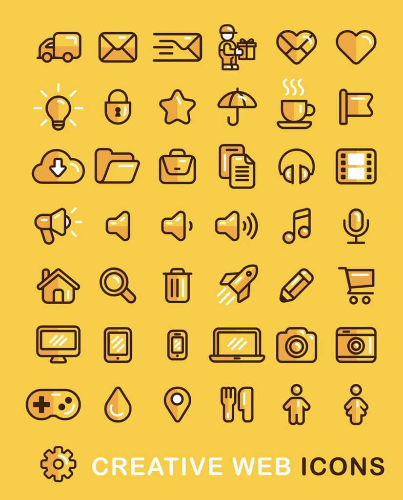
In the world of icon design, there are various types of icons, each serving a specific purpose. Two notable categories are app icons and system icons.
App icons represent individual applications on devices such as smartphones, tablets, and computers. These icons are typically colorful and unique to each app, allowing users to easily identify and access the applications.
System icons, on the other hand, are icons that belong to the operating system itself. They are used to represent common actions, functions, and navigation elements within the user interface. These icons are usually consistent in style, following the design language of the operating system.
When designing icons, it’s crucial to consider the size and resolution. Generally, icons come in several different sizes, accommodating various display and usage contexts. For example, a small icon might be used within a menu or toolbar, whereas a larger version may appear in an app store or website. Some common icon size standards are:
- 16×16 pixels
- 32×32 pixels
- 48×48 pixels
- 64×64 pixels
- 128×128 pixels
To ensure an icon looks sharp and clear on various screens and resolutions, it’s best to create multiple sizes or provide a vector file that can be scaled without losing quality.
In summary, icon design involves understanding the different types of icons, such as app icons and system icons, and designing them according to their specific use cases. Additionally, creating icons in various sizes is necessary to cater to diverse display and usage contexts. When designed correctly, icons serve as effective visual communication tools that enhance the user’s experience.
Work with Colors and Branding
When designing icons, it is essential to consider colors and branding. The choice of colors plays a crucial role in the success of the icons, as it is an essential element in creating a visual appeal and strengthening the brand identity.
Selecting the right colors for your icons can enhance their visibility and impact. To achieve this, choose colors that are consistent with your branding to establish a cohesive look throughout your design. A well-defined color palette will help you maintain a consistent and harmonious tone among your icons.
When deciding on colors, consider the color theory principles and ensure that the colors complement each other, which can be achieved by selecting contrasting or analogous colors. Consider the cultural connotations of colors, as they can evoke emotions and perceptions when viewed by different audiences.
Moreover, it’s important to acknowledge the impact of color accessibility. Design icons keeping in mind color blindness and other visual impairments. Utilize high-contrast color combinations to enhance visibility and readability.
To sum up, the use of colors and branding in icon design is an important aspect that should not be overlooked. A well-executed color scheme will contribute to the effectiveness of your icons, enhance your branding, and make your designs more accessible to diverse audiences.
Accessibility and Readability
The design of icons plays a crucial role in ensuring accessibility and readability for users. Clarity is a vital aspect, allowing users to effortlessly understand the symbol’s message. Icon design should prioritize user-friendly elements, keeping in mind various factors such as size, color, and shape. By focusing on these elements, designers can create icons that enhance the overall experience of the user.
One basic principle for achieving icon clarity is to maintain simplicity. Icons should not incorporate excessive details, as this can distract users and make it difficult to comprehend their meaning. Ideally, bold and minimalistic shapes should be used to convey the message clearly and effectively.
Color choice in icon design is another essential consideration for ensuring accessibility. Contrasting colors help distinguish the icon details from the background, improving overall readability. However, it is crucial not to overwhelm the design with many colors, as this can lead to visual confusion. A limited color palette and simple color combinations will ensure that the icon remains easy to understand.
The size of the icon must also contribute to its readability. Icons should ideally be scalable so that they can be easily adapted to various screen sizes and resolutions. The design should maintain legibility at both small and large sizes, making it accessible for users on different devices.
Moreover, designers should be mindful of the universal meanings behind shapes and symbols when creating icons. Using familiar shapes and symbols will make it easier for users to understand the icon’s message intuitively.
When designing icons with accessibility and readability in mind, designers must aim for a confident, knowledgeable, neutral, and clear tone of voice. This approach will ensure that the final design effectively communicates the intended message, resulting in a more user-friendly experience.
Testing and Iteration
Testing and iteration are essential steps in the icon design process. They ensure that the final product is both visually appealing and effectively communicates its intended meaning.
In the initial stage, after creating a set of potential icons, the designer must test them with users. This process can uncover unforeseen issues and help discover opportunities for improvement. It’s essential to gather feedback from a diverse group of users who represent the target audience, ensuring varied perspectives and insights.
User testing methods can vary from interviews to online surveys, but the goal is to obtain honest, unbiased feedback. The designer should carefully analyze the results to identify trends and common issues, such as confusion or misunderstanding of the icon’s purpose.
Once the issues have been acknowledged, it’s time to iterate on the design by making necessary changes. This may involve minor tweaks or complete overhauls, depending on the feedback received.
A successful iteration process includes:
- Comparing different icon versions side by side, which can reveal strengths and weaknesses more effectively than evaluating an individual icon.
- Researching existing icons in the same domain to understand popular visual cues and avoid potential pitfalls.
- Re-evaluating the design with a fresh perspective, as additional insight can arise after stepping away from the project.
The cycle of testing and iteration should continue until the icons achieve their desired result. A well-executed process results in more user-friendly, intuitive, and visually appealing icons. Balancing creativity and functionality is key, as excessive experimentation can lead to convoluted designs, while too little innovation can produce uninspiring work.
Through diligent testing and iteration, designers can refine and perfect their iconography, ensuring that it effectively communicates the intended message to the target audience.
Building an Icon Library
Building an icon library is a crucial step for any designer looking to work with icons in their projects. An organized icon library helps you maintain consistency in your designs and makes it easier to find and use the icons you need.
When creating an icon library, it is essential to establish consistency in icon styles. Choose a unified style for your icons, such as flat, gradient, or 3D. This will ensure that your designs look cohesive and professional. If you work with different clients or projects, consider creating separate icon libraries for each, reflecting the individual styles and aesthetics.
To start building your icon library, gather existing icons that match the selected style. You can either design them yourself or source them from online resources. Additionally, you could purchase a set of icons from a professional designer. Regardless of where you obtain icons, ensure they share a consistent visual language and adhere to the chosen style.
As your icon library grows, it is essential to organize the icons into categories. This will enable members of your team to quickly locate and use icons in their projects. Common organizational methods include categorizing by function (e.g., navigation, social media), format (e.g., SVG, PNG), or themes (e.g., finance, communication). Use a clear naming convention for your icons to help with searchability and avoid confusion.
Collaboration is a key element in building and maintaining the icon library. Encourage team members to contribute new icons to the library, ensuring they match the established style and follow the same organizational structure. Regularly review and update the library, removing outdated icons, and adding new ones as the team’s needs evolve.
In summary, a well-maintained and organized icon library is an invaluable resource for designers working with icons. Establishing a cohesive style, organizing icons into categories, and encouraging collaboration among team members are essential steps for building an effective icon library.
Use Cases for Icons
Icons serve various purposes, adding visual appeal and enhancing user experience across different platforms and applications. They communicate ideas and concepts effectively while maintaining a clear and concise design.
In applications such as Google Maps, icons are used to represent specific locations, like cafes, parks, or transportation options. These simple graphics allow users to quickly identify places of interest, without cluttering the map with excessive text. Icons also help to distinguish between different types of locations, such as restaurants and hospitals, by using distinct shapes and colors.
Another notable use of icons is to represent actions within the user interface. Many applications use arrow icons to signal navigation, showing users the direction they need to swipe or click. Similarly, a magnifying glass icon is frequently used to indicate the search functionality.
Icons are a crucial aspect of visual communication in music applications. For example, a universal “play” triangle can be easily understood by users, regardless of language or region. This allows for a seamless experience across platforms and devices. Alongside this, icons are utilized to distinguish between genres, moods, and playlists, often incorporating abstract visuals or relevant musical symbols.
In design, icons come in a variety of typefaces and styles, ranging from minimalist to ornate. Depending on the desired look and feel, designers can opt for clean, geometric shapes or more intricate, hand-drawn illustrations, adapted to blend with different backgrounds. Icons can be customized to fit within certain color schemes, ensuring a cohesive aesthetic throughout a project.
As part of a consistent visual language, icons can be employed within various containers, such as buttons or menus. This allows for a more organized layout, creating a clear hierarchy and guiding users as they interact with a website or application. Additionally, icons can be utilized in feeds or notification bars, providing instant recognition of new messages, updates, or alerts.
In conclusion, icons play an essential role in optimizing user experience and facilitating communication across diverse platforms. By implementing well-designed icons, designers can create effective visuals that cater to specific use cases and contexts, enhancing overall functionality and appearance.
Frequently Asked Questions
What tools are commonly used for icon design?
There are various tools available for icon design. Some popular choices include Adobe Illustrator, Sketch, Figma, and Inkscape. Professionals often opt for Adobe Illustrator due to its powerful vector capabilities, while Sketch and Figma are popular choices for their user-friendly interfaces and collaborative features. Inkscape is a popular free open-source option.
What are some recommended icon design principles?
When designing icons, it is essential to consider the following principles:
- Simplicity – Keep icons minimalistic and easy to understand.
- Consistency – Ensure a consistent style across all icons in the set.
- Scalability – Design icons to maintain clarity at various sizes.
- Recognition – Make sure icons are easily recognizable and follow established visual cues.
How can beginners create effective icon designs?
Beginners can start by learning the basic principles of icon design and familiarizing themselves with design tools. Studying popular icon sets and understanding trends can also provide inspiration. Additionally, practicing and soliciting feedback from fellow designers can help hone their skills.
What are the best sizes for different types of icons?
The optimal size of an icon varies depending on its intended use. Common sizes for web icons are 16×16, 32×32, and 48×48 pixels. For mobile apps, developers often opt for 48×48 pixels on Android and 44×44 points (equivalent to 88×88 or 132×132 pixels) on iOS devices. Meanwhile, desktop applications tend to use icons between 16×16 and 256×256 pixels.
Are there free resources for icon design templates?
Yes, there are various websites that offer free icon design templates and resources. Examples include Flaticon, Icons8, and Font Awesome. These platforms provide pre-designed icons that can be customized and used in different projects.
What should be considered for an icon design grid?
An icon design grid is a guide that helps maintain consistency, alignment, and scalability within a set of icons. When creating an icon design grid, designers should consider:
- Grid size: Choose a base grid size, such as 24×24 or 32×32 pixels, to ensure icons are consistent and fit within the intended dimensions.
- Spacing: Establish equal spacing between elements within the grid to maintain alignment and balance.
- Scaling: Define a consistent stroke weight and corner radius to ensure icons retain their visual appearance when scaled.