If you had to look at your audience insights, you’d probably find that most users access your site from a mobile device. Therefore, prioritizing mobile image optimization is essential. If your photos are unoptimized or served incorrectly, it will likely result in a poor user experience and slow loading times.
📱 Implementing mobile image optimization correctly will ensure two things:
- The images load as quickly as possible, which will speed up your site (especially important for mobile visitors).
- Visitors don’t see any blurry images or oddly cropped images, which ensures you’re still creating a great user experience.
To help you get started with mobile image optimization, we’ve put together a list of the best strategies for serving high-quality visuals and improving site speed. For example, you can enable lazy loading and use a tool like Optimole to automate tasks like real-time adaptive cropping and resizing. 📐
👉 In this post, we’ll take a closer look at the importance of mobile image optimization. Then, we’ll look at some strategies you can implement on your site and show you how to use Optimole to automate the work. Let’s get started!
How to optimize your website images for mobile devices
Now, let’s look at some ways to optimize your site’s images for mobile phones. Later, we’ll show you how to automate all of these strategies with Optimole.
- Serve adaptive images based on each user’s device
- Use smart cropping
- Configure your site to handle image compression
- Implement network-based optimization
- Enable lazy loading
- Serve images in next-gen formats
1. Serve adaptive images based on each user’s device 💻
One of the first things you’ll want to do for mobile image optimization is to ensure that photos are resized for different devices. As you already know, mobile phones come in various screen sizes and resolutions, so the quality of your images may vary from one device to another.
Therefore, you’ll want to make sure that your site provides images that are optimized for each specific device. This is called an adaptive image approach, because the image is adapted for each individual visitor in real time.
While it might sound complex or time-consuming to serve a uniquely sized image to each visitor, adaptive image tools like Optimole can do this for you automatically. This helps ensure that you’re achieving optimal load times, while also making sure each site visitor can view your photos without any issues.
2. Use smart cropping 💡
Smart cropping is a technique that automatically identifies and crops the most important parts of an image. This can be particularly useful when it comes to mobile image optimization, as it ensures that the focal point in a photo, like a person’s face or the primary object, appears properly on smaller screens.
This also crops out any insignificant elements in an image, like blank space or background noise. As a result, it can make your photos more visually appealing on mobile devices.
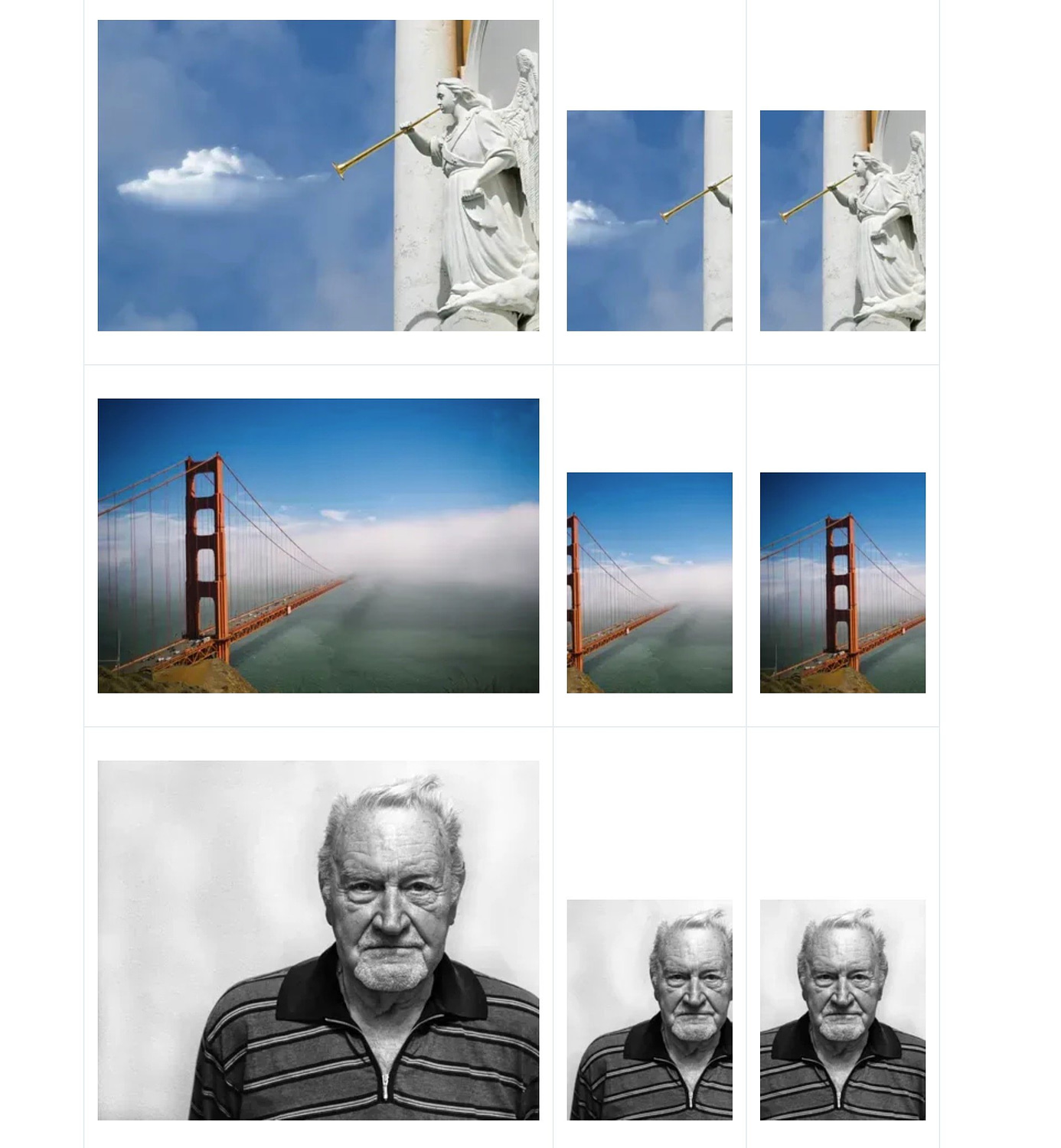
👉 Here’s an example of smart cropping vs regular “dumb” cropping from ImageKit.io:
- Left image – the original image.
- Middle image – example of “dumb” cropping that focuses on the center of the image regardless of the content.
- Right image – example of “smart” cropping that automatically focuses on the key part of the image.
Of course, manually cropping every image can be super time-consuming. Fortunately, smart cropping is one of the many features offered by Optimole – we’ll show you how to enable it later in the post.
3. Configure your site to handle image compression (rather than doing it before uploading images) 🖱️
Compression is the process of reducing the file sizes of images so that they take up less storage space and load faster. This is crucial for improving your site’s overall performance, especially on mobile devices.
You can compress images on your device before uploading them to your site. However, for optimal results (and a faster process), we recommend uploading the original files and then using a tool on your site to handle compression.
That way, the tool can optimally resize the images in different ways depending on the user. If you compress your images before uploading them, you’re limiting what the tool can do.
Once again, you can use a tool like Optimole to compress images on your site. This will automatically optimize any photos you upload to WordPress, based on your preferred settings.
4. Implement network-based optimization ⚙️
Network-based optimization considers the internet speed of your users, which is especially important for mobile visitors. For example, if a site visitor is experiencing a slow connection, the quality of your images is downgraded automatically so that the content is delivered faster.
For example, users with older technologies, like 3G networks, could benefit from higher image compression. This way, less data is needed to render the content on the page, reducing the load on an already weak network.
On the other hand, you might be able to serve a higher-resolution image if someone has their smartphone connected to Wi-Fi, as their comparatively faster connection would allow the image to still download quickly and not affect load times.
This may seem like a complicated task, but it’s actually all automated. If you use Optimole, you can simply enable this feature, and the tool will do all the work for you.
5. Enable lazy loading 🐌
Another step to take into consideration when thinking about mobile image optimization is to enable lazy loading. This is a process in which images are loaded as a user scrolls down the page. Without this feature, all images on a page are served at once, which can result in slower loading times, particularly on mobile devices.
When you enable lazy loading, each image will load as the user arrives at that point on the page. This facilitates faster loading times and a smoother user experience.
6. Serve images in next-gen formats 🖼️
Adopting next-generation formats is particularly important if you have an image-heavy website, like a travel blog or an online shop.
Next-gen formats like WebP or AVIF provide better compression levels than traditional formats like JPEG and PNG. This means they serve smaller file sizes, which can lead to faster loading times on mobile devices.
WebP is supported by most major browsers, so it’s the safest option. It also uses lossless compression, so it doesn’t compromise image quality. Meanwhile, AVIF uses lossy compression, and it’s not as widely supported as WebP.
How to implement mobile image optimization with Optimole
Optimole is a free WordPress plugin that offers a suite of image optimization features, including all of the tactics that we discussed above.
Here’s a quick guide on how you can use it for WordPress mobile image optimization…
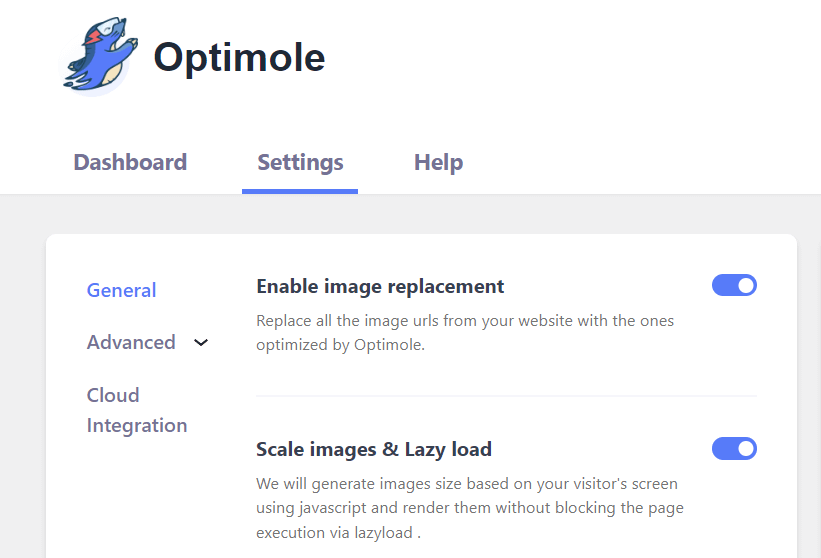
Once you’ve installed and activated the plugin, you can navigate to Optimole > Settings in your dashboard to enable these features.
In the General section, you’ll see the option to scale images based on the user’s screen and enable lazy loading:
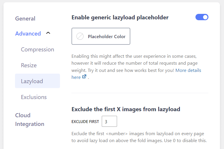
Use the toggle switch to turn on this feature. If you go to Advanced → Lazyload, you’ll see more options for lazy loading your images. For example, you can exclude the first few photos from this feature, and enable/disable lazy loading for videos and background images:
If you go to Compression, you can toggle on the switch to Enable Best Format:
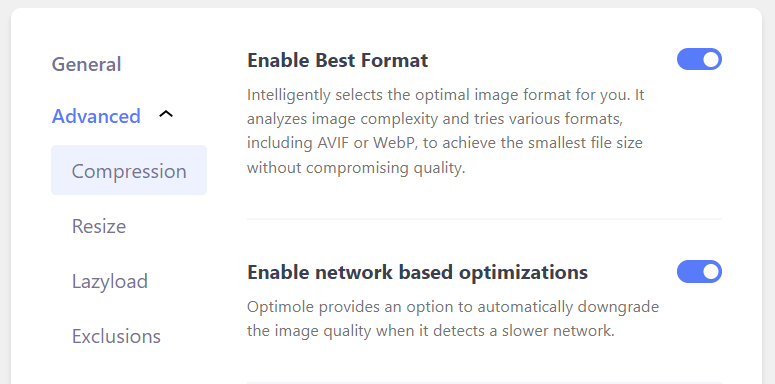
Optimole will now automatically select the best format for your images, including next-gen formats like WebP, and compress your images without affecting the quality.
Here, you’ll also see the option to enable network-based optimizations. Optimole will automatically downgrade the image quality when it detects a slower network on a user’s device.
Finally, you can go to the Resize section to enable smart cropping:
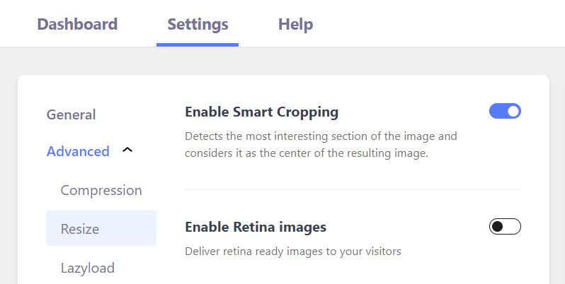
Optimole is able to detect the focus of an image and crop it accordingly.
As you can see, Optimole makes it super easy to implement mobile image optimization – and all of these features are available for free.
Improve mobile image optimization today 🚀
Mobile image optimization can help ensure that your photos are displayed correctly on smaller screens. Plus, it can improve loading times on mobile devices, leading to a better user experience and possibly higher conversion rates.
👉 Here’s how to use Optimole for mobile image optimization:
- Serve images based on the device.
- Use smart cropping.
- Enable image compression at the site level.
- Implement network-based optimization.
- Enable lazy loading.
- Serve images in next-gen formats.
For some other tips to improve mobile performance, you might also be interested in our guide on how to increase site speed for mobile visitors. 📱
Do you have any questions about mobile image optimization? Let us know in the comments section below!