Updated: Jul 16, 2023 By: Dessign Team
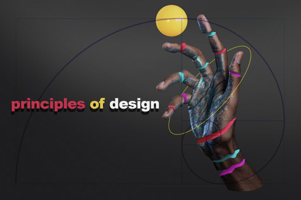
The principles of design play a crucial role in shaping the visual language and aesthetics of various forms of art, architecture, and communication. These key concepts provide a framework for understanding and discussing the fundamentals of visual composition.
By mastering these principles, artists, designers, and creatives can effectively convey ideas, evoke emotions, and guide the viewer’s eye through their work.
These principles act as essential building blocks for creating well-balanced and visually appealing designs. Among the most prominent principles are unity, balance, hierarchy, scale, proportion, contrast, and emphasis. Each principle serves a specific purpose, and when combined, they work together to enhance the overall composition and message of a piece.
Understanding and utilizing the principles of design allow for more thoughtful and intentional creative expression. By incorporating these concepts into their practice, artists and designers can improve their ability to convey meaning through visual elements. Furthermore, a firm grasp of design principles fosters stronger communication between creative professionals and their audience.
Basic Principles of Design
The principles of design are fundamental guidelines that help create visually appealing and effective compositions. They can be applied to various disciplines, such as graphic design, interior design, and architecture. Here, we discuss the main principles – balance, emphasis, proportion, movement, rhythm, and unity – that contribute to an engaging design.
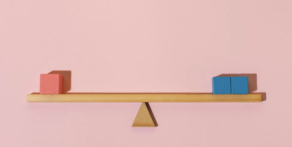
Balance refers to the distribution of visual weight within a composition. It can be achieved through the use of size, color, texture, icons and shape. There are three types of balance: symmetrical, asymmetrical, and radial.
Symmetrical balance is achieved by placing elements of equal weight on either side of an imaginary central axis, while asymmetrical balance uses unequal weights on each side but still maintains a sense of equilibrium. Radial balance involves arranging elements around a central point, creating a sense of harmony.
Emphasis is used to draw attention to a focal point or an area of importance within a design. This can be achieved by using elements such as contrast, color, size, or placement to make certain aspects stand out. Emphasis helps to guide the viewer’s eye and ensures that the primary message or idea is clearly communicated.

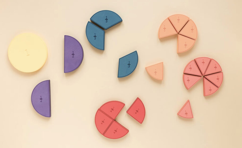
Proportion refers to the relationship between the sizes and dimensions of various elements in a design. A well-proportioned composition will have elements that relate to each other in size, weight, and scale. This principle helps to create harmony, balance, and a sense of unity within the overall design.
Movement is the way a viewer’s eye is directed to move through a design. This can be achieved through the use of visual elements such as lines, shapes, and patterns, or by creating a hierarchy with elements of varying sizes and weights. Movement helps to guide the viewer’s attention and contributes to a more dynamic and engaging design.
Rhythm is the repetition or pattern of elements that create a sense of visual flow and consistency in a design. It can be achieved through the use of color, shape, or texture, and can be regular, alternating, or progressive. Rhythm establishes a sense of cohesiveness and helps to create a visually appealing composition.
Unity is the principle that ties all other principles together, creating a harmonious and cohesive design. This can be achieved through the use of consistent elements such as color, typography, or style, or by ensuring that all aspects of the design work together to convey a clear message or concept. A unified design is more visually appealing and effective in communicating its intended purpose.
In summary, the basic principles of design – balance, emphasis, proportion, movement, rhythm, and unity – are crucial for creating visually appealing and effective compositions.
By applying these guidelines, designers can enhance the aesthetic appeal and communication effectiveness of their work.
Visual Elements of Design

Lines
Lines are fundamental elements in design and art, serving as the building blocks for compositions. They can be horizontal, vertical, diagonal, or even curved, guiding the viewer’s eye and creating visual flow. Lines can also convey a sense of movement, provide structure, or divide areas within a particular design.
Shapes
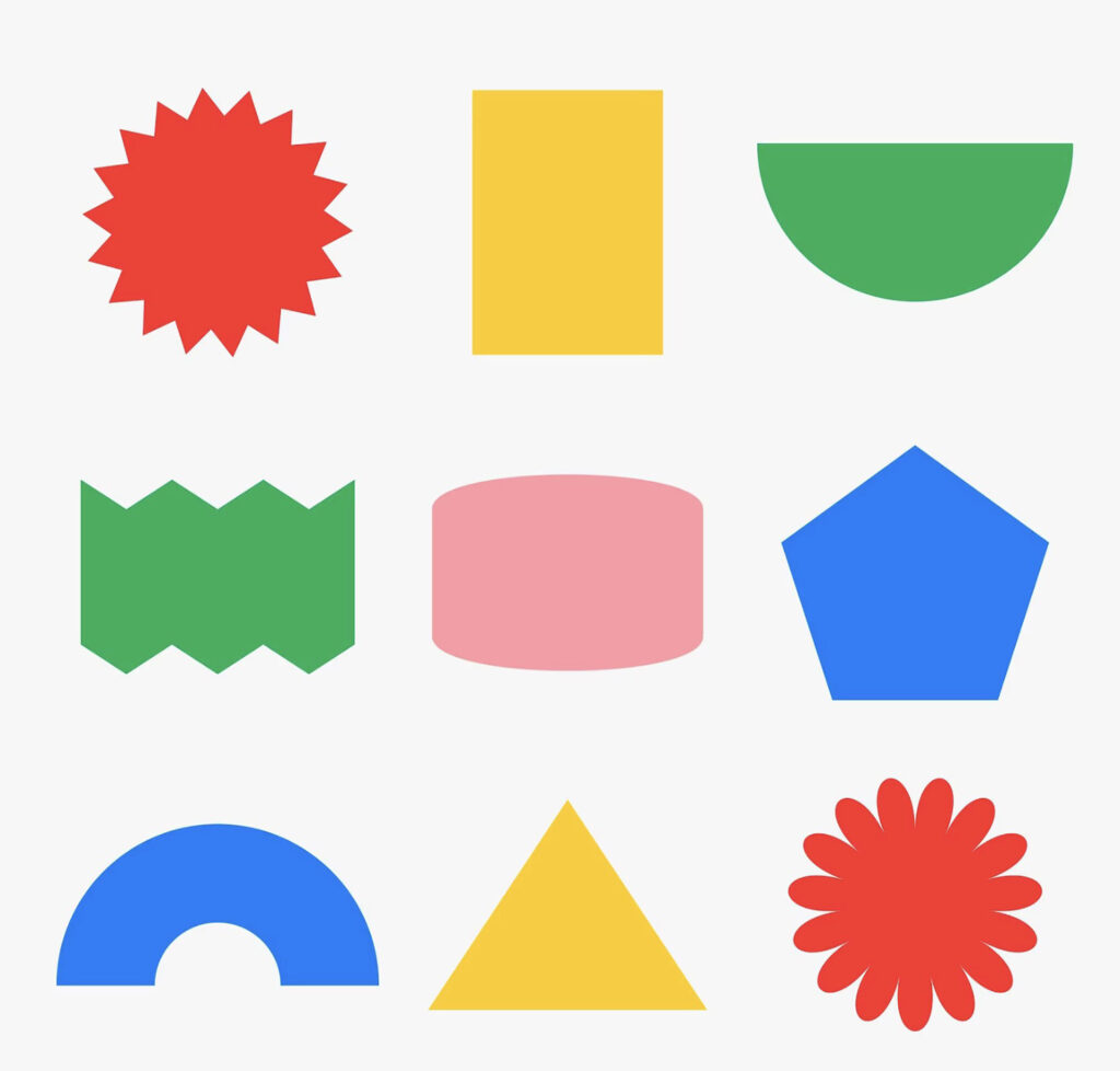
Shapes are created when lines connect or through the use of color or texture. They can be geometric, such as squares, circles, and triangles, or organic, resembling elements found in nature. Shapes are important in design because they establish hierarchy, create contrast, and contribute to the overall balance.
Colors

Color theory plays a crucial role in design, as colors evoke emotions and communicate messages. Designers must understand the principles of color theory, such as the color wheel and color harmonies, to create aesthetically pleasing color schemes.
Colors also have cultural and psychological implications, making their selection a significant aspect of the design process.
| Color | Emotion |
|---|---|
| Red | Passion, anger |
| Blue | Calm, trust |
| Yellow | Happiness, energy |
| Green | Growth, harmony |
Textures

Textures refer to the tactile quality or surface appearance of an object in a design. Designers use physical or visual textures to create depth, enhance the overall style, and provide a tangible feeling to the design. Textures can be applied through materials, patterns, or even though the use (or absence) of whitespace.
Typography
Typography is the art of arranging text to be both legible and visually appealing. It encompasses several elements, including:
- Typeface: The collection of characters that share common design attributes
- Font: A specific weight, width, or style of a typeface
- Hierarchy: The arrangement of different text components in order of importance
A well-thought-out typography choice communicates information clearly and sets the tone for the overall design. Designers achieve harmony and balance through the careful consideration of typeface, weight, and style.
Techniques for Achieving Balance
Symmetrical Balance

Symmetrical balance refers to the equal distribution of visual elements on both sides of a central point. In design, it is achieved by placing objects or elements with equal weight or importance on opposite sides of the composition. Symmetrical balance creates a sense of harmony, stability, and formality, making it a popular choice for many designs.
To create symmetrical balance, designers can use various techniques such as mirroring, reflection, and repetition. For example, a designer can place two identical images on either side of a central point, or use a similar color scheme and font size for text elements on both sides. Symmetrical designs tend to be easy on the eye and convey a sense of order and organization.
Asymmetrical Balance

Asymmetrical balance, on the other hand, involves the arrangement of different yet visually balanced elements within a composition. Unlike symmetrical balance, asymmetrical designs do not rely on equal distribution or mirroring. Instead, they use contrast, color, size, and positioning to create a sense of equilibrium between elements that may vary in shape, size, and importance.
To achieve asymmetrical balance, designers can use techniques such as scale, proximity, and the use of white space. For example, a large dark-colored shape on one side of the composition can be balanced by several smaller, lighter-colored shapes on the other side. Asymmetrical designs often convey a sense of dynamic movement, energy, and informality, making them suitable for a wide range of creative projects.
In conclusion, both symmetrical and asymmetrical balance are essential design principles that contribute to the overall visual effectiveness of a composition. Each approach offers its unique benefits and emotional impact, and understanding when and how to use both styles can help designers create engaging and visually harmonious designs.
Creating Hierarchy and Focal Points

In design, the arrangement of elements in a composition plays a crucial role in creating hierarchy and focal points. Well-executed hierarchy enables viewers to quickly understand the intended message, while focal points attract attention and establish a clear narrative.
Hierarchy is achieved through the careful consideration and organization of design elements. The size, color, and position of each component impact its prominence in the overall composition. Designers often use scaling, contrasting colors, and spatial orientation to emphasize the most important aspects of their work.
A properly organized hierarchy helps guide the viewer’s eye through the design, providing a clear and logical flow of information.
Focal points, on the other hand, are specific areas or elements within a composition that demand attention. They play a central role in establishing a narrative or story within the design.
By utilizing bold and contrasting colors, unique shapes, or dramatic typography, designers can create compelling focal points that engage and captivate the viewer. Some techniques for establishing focal points include:
- Making an object larger or smaller than the surrounding elements
- Using contrasting colors or patterns to make an element stand out
- Placing the focal point in a prominent position within the composition
In addition to these techniques, understanding how viewers naturally observe and interpret design elements can greatly enhance a composition’s hierarchy and focal points. For instance, people tend to read from left to right and top to bottom, so designers can strategically position elements to guide their audience through the design.
Moreover, using visual cues such as arrows, lines, or repetition can encourage viewers to follow a specific path.
In conclusion, creating hierarchy and focal points in a design is essential for effectively conveying a narrative and engaging the viewer. By skillfully arranging elements and utilizing contrast, size, and positioning, designers can craft visually appealing and impactful compositions.
Utilizing Space and Contrast
Positive and Negative Space
Utilizing space in design is essential for creating balance and harmony. Positive space refers to the elements within the composition, while negative space, often referred to as white space, is the space surrounding those elements. The strategic use of negative space can emphasize certain elements and create a visual hierarchy.
Negative space is not always white; it can be any color, texture, or background that complements the overall design. By carefully considering the relationship between positive and negative space, designers can create a more engaging and visually appealing composition.
Contrast in Design
Contrast is a principle of design referring to the arrangement of opposite elements, such as colors, shapes, or textures, to create visual interest. It helps to establish a visual hierarchy and emphasize the most important elements in a design.
Here are a few ways to incorporate contrast in design:
- Color: Use contrasting colors to create emphasis and focus. For instance, pairing a bold color with a neutral background can direct the viewer’s attention to the subject.
- Size: Vary the size of elements to create contrast and a sense of hierarchy. This can help guide the viewer’s eye, drawing attention to specific parts of the design.
- Shape: Incorporate different shapes to add variety and create depth. Use organic shapes with geometric ones or combine various shapes to create contrast.
- Texture: Combining contrasting textures, such as smooth and rough surfaces, can add visual interest and depth to a design.
In summary, utilizing space and contrast effectively in design can greatly enhance the overall visual appeal and effectiveness of a composition. By considering the relationship between positive and negative space, as well as incorporating contrasting elements, designers can create balanced, engaging, and visually interesting works.
Repetition, Pattern, and Variety
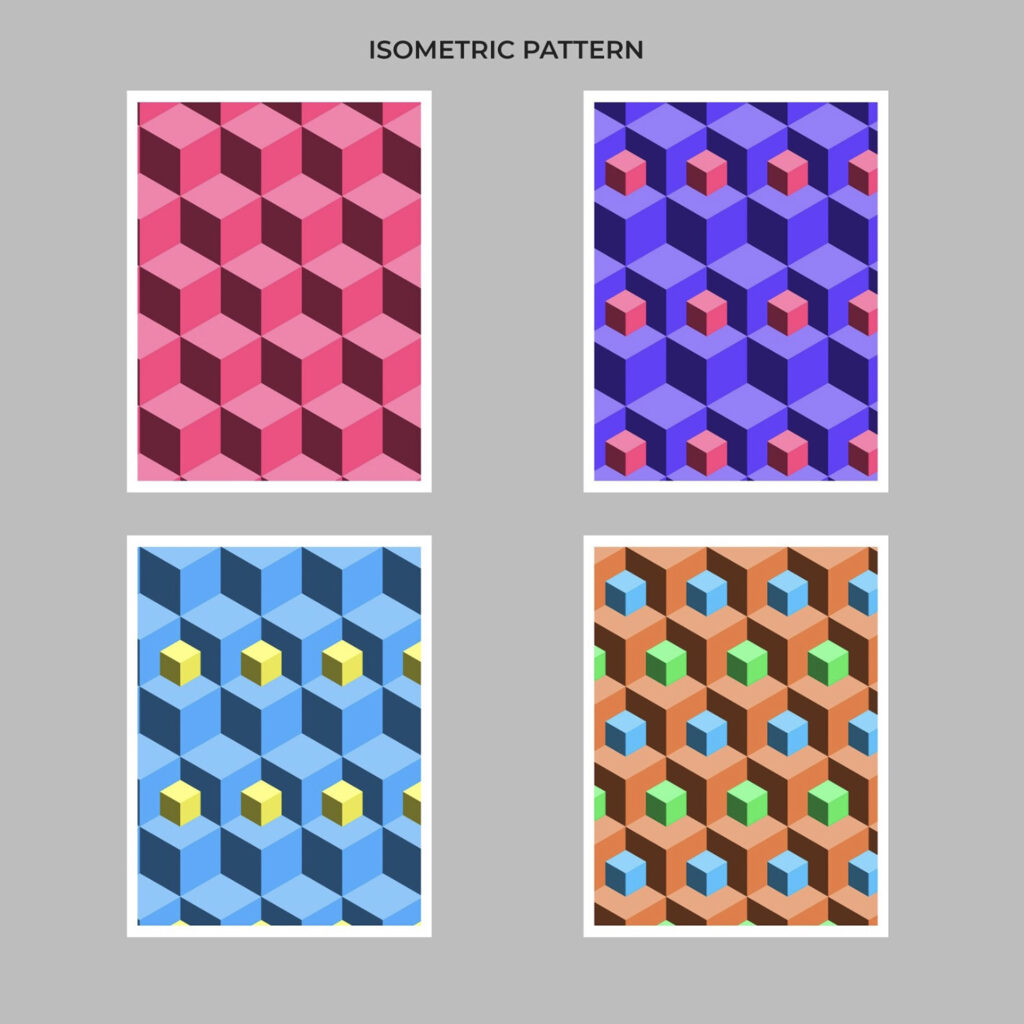
Repetition and Pattern
Repetition and pattern are essential principles of design that can create unity and harmony in a composition. Repetition involves the use of identical or similar elements throughout the piece, such as shapes, colors, or motifs. Patterns, on the other hand, refer to the arrangement of these repeated elements in a predictable manner, such as in grids, stripes, or checkerboard layouts.
The use of repetition and pattern can help guide the viewer’s eye through the composition, making it easier to understand and appreciate. Additionally, these principles can create visual interest, as the repetition of a particular motif or pattern can become an engaging focal point within the design.
Variety in Design
While repetition and pattern can create unity, it is important to incorporate variety to avoid monotony and keep the viewer engaged. Variety refers to the use of different or contrasting elements in a design, such as a mix of shapes, textures, or colors.
By incorporating a variety of elements, a designer can create balance and contrast, breathing life into the composition and making it more dynamic.
One way to achieve variety without compromising unity is by subtly altering repeated motifs or patterns. This may involve changing the color, size, or orientation of the repeated elements, ensuring that they are still recognizable but with enough variation to keep the viewer interested.
In conclusion, the principles of repetition, pattern, and variety play essential roles in creating successful designs. Balancing these principles can result in compositions that are visually engaging, cohesive, and stimulating for the viewer.
Alignment and Grid Systems
Alignment is a fundamental principle in design that plays an essential role in organizing and presenting visual content in a clear and cohesive manner. It refers to the arrangement of elements in a way that creates visual connections and relationships, ensuring a sense of order and harmony. Grid systems, often used in conjunction with alignment, provide a structured layout that can enhance both the aesthetics and functionality of a design.
In the realm of design, there are various types of alignment that serve different purposes. These include:
- Horizontal alignment: Aligning elements on a horizontal axis, such as aligning text to the left, center, or right of a page or graphic.
- Vertical alignment: Aligning elements on a vertical axis, such as aligning text or objects top, middle, or bottom.
- Edge alignment: This type of alignment involves aligning elements along a shared edge, whether it be the top, bottom, left, or right side of an object or layout.
Grid systems, on the other hand, divide the design space into equal segments or columns, allowing for a more systematic placement of elements. Designers use grids to:
- Maintain consistency: Consistent spacing and arrangement of elements contribute to a unified look and a more professional appearance.
- Simplify alignment: A grid system offers a clear structure that makes it easier to align elements, both horizontally and vertically, ensuring neat and orderly designs.
- Improve legibility: A well-structured grid can help make content in sections more readable and easily accessible to users.
In summary, alignment and grid systems are essential tools for designers to achieve a balanced, visually appealing, and organized layout. By incorporating these principles into their work, they can ensure that their designs convey information clearly and effectively.
Applying Principles to Different Design Areas
Brand Identity and Graphic Design
In brand identity and graphic design, principles of design play a vital role in creating a strong visual representation of a company or product. These principles ensure that the design conveys the intended message effectively and cohesively.
For instance, a designer may use the principle of contrast to make a logo stand out from the competition. This can be achieved by using bold colors, unique typography, or distinct shapes. Aligning the overall aesthetics of the brand identity with the target audience’s preferences ensures successful communication.
Consistency is another important principle when it comes to brand identity. It helps create a cohesive and unified image across all marketing materials, such as business cards, advertisements, and packaging. This consistency makes the brand easily recognizable and memorable.
User Experience (UX) Design
UX design revolves around the principles of good design to create an optimal experience for users while interacting with a product or service. These principles ensure an enjoyable and efficient experience, fostering user satisfaction and loyalty.
Balance is an essential principle in UX design. Layouts should be well-organized, with elements evenly distributed and with proper usage of white space. This allows users to intuitively navigate through the interface without unnecessary distractions.
Another crucial design principle in UX is hierarchy. Information should be organized and presented in a logical manner, with the most important elements being prioritized. This can be achieved through various techniques such as size, color, or placement on the page.
Furthermore, clarity and simplicity are also important principles in UI design. The interface should be easily understandable and visually appealing. By avoiding clutter and unnecessary elements, users can quickly find what they need and complete tasks with minimal effort.
By incorporating these principles in both brand identity and UX/UI design, designers can create visually engaging and effective designs that resonate with the target audience and ensure a positive user experience.
Frequently Asked Questions
What are the key elements of design?
The key elements of design include line, shape, color, texture, and space. These elements work together to build a cohesive visual experience design and communicate the intended message to the audience.
How does balance contribute to design principles?
Balance is crucial in design as it creates a sense of stability and harmony. It can be achieved through symmetry, asymmetry, or radial balance. Balancing visual elements helps guide the viewer’s eye and contributes to the overall effectiveness of the design.
What role does contrast play in design?
Contrast emphasizes differences between elements and creates visual interest. It can be achieved through juxtaposition of color, size, shape, or texture. Contrast helps to highlight important elements and contributes to the overall clarity and readability of a design.
How do the principles of design impact visual communication?
The principles of design, such as balance, contrast, movement, and unity, guide the arrangement and organization of visual elements. These principles ensure that designs are visually engaging and communicate effectively. By employing these principles, designers can create a more cohesive and impactful visual message.
Can you provide some examples of design principles in action?
Some examples of design principles in action include:
- A brochure using contrasting colors to make important information stand out
- A website using a balanced layout to create a pleasing and easy-to-navigate experience
- A poster with a clear alignment to lead the viewer’s eye and make the content easy to read.
In what ways do rhythm and pattern influence design?
Rhythm and pattern create a sense of movement and establish visual connections between elements. Rhythm is achieved through repetition, while pattern refers to a consistent arrangement of elements. These principles help to create a sense of unity and can guide the viewer’s eye through the design, making it more engaging and easier to understand.