Updated: Jul 06, 2023 By: Dessign Team
Color theory is a fascinating subject that delves into the science and art of color, exploring how it affects human perception, emotion, and various visual aspects. At its core, color theory involves the study of how colors interact and influence one another, and how they can be used strategically in design, art, and everyday life.
This field has been well-researched, with principles and guidelines that can help create visually appealing and harmonious color combinations.
Understanding the basics of color theory is essential for anyone involved in graphic design, art, advertising, or even personal projects. The foundation of color theory begins with the color wheel, which is a circular arrangement of hues that demonstrates the relationship between primary, secondary, and tertiary colors.
Primary colors (red, blue, and yellow) are the basis from which all other colors are derived, while secondary colors are formed by mixing equal parts of two primary colors, and tertiary colors result from combining a primary with a secondary color.
Color theory also encompasses the concept of color harmony, a principle that holds that certain color arrangements are more aesthetically pleasing and create a sense of balance and order. These harmonious relationships can be achieved through various schemes, such as complementary, analogous, and triadic arrangements.
By mastering these fundamental concepts, individuals can make more informed decisions when selecting colors for various projects, ultimately enhancing visual appeal and efficacy.
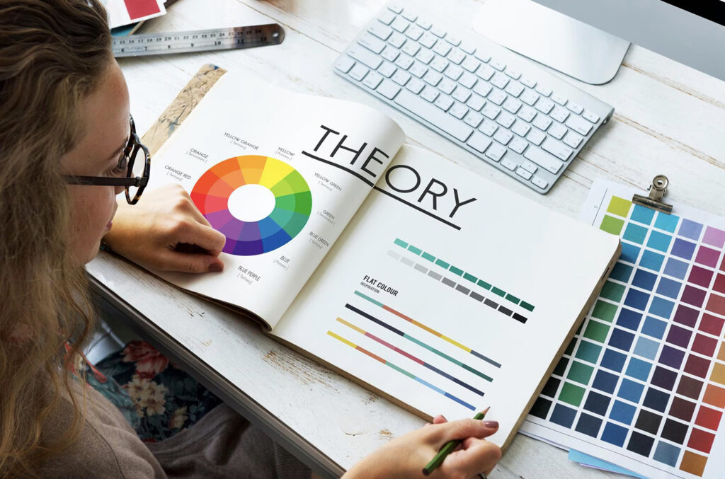
The Basics of Color Theory
Color theory is the study of how colors interact and complement each other. It is a crucial aspect of design, art, and visual communication, which helps create visually appealing and harmonious color combinations. Understanding the basics of color theory starts with the color wheel and the different types of colors.
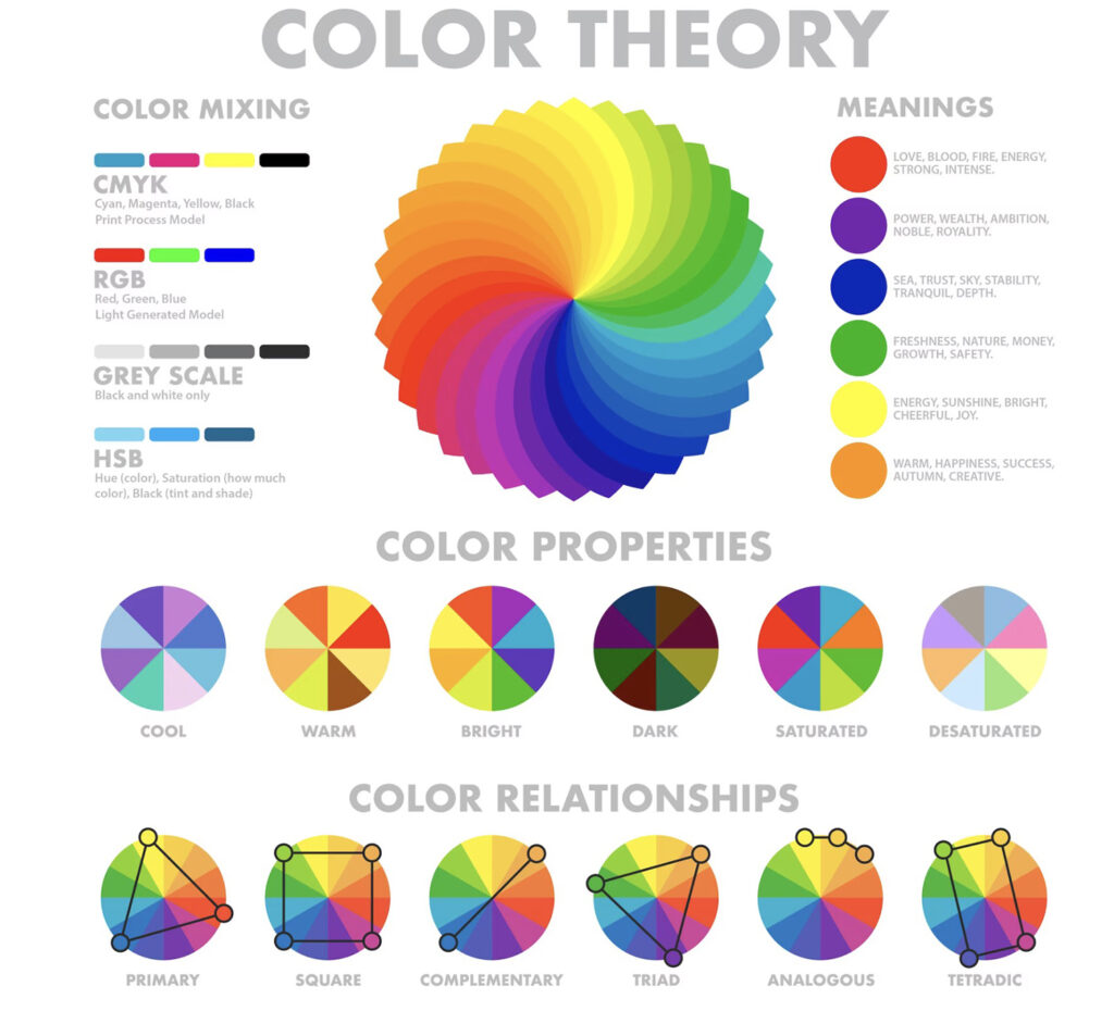
The color wheel is a visual representation of the relationship between different hues, which are the fundamental aspects of any color. A hue is defined as the purest form of color without any tints (white added) or shades (black added). The color wheel is typically organized into three main categories: primary colors, secondary colors, and tertiary colors.
Primary colors are the most basic colors and cannot be created by combining other colors. In traditional color theory, these consist of red, blue, and yellow. Primary colors are the foundation from which all other colors are derived.
Secondary colors are formed by mixing two primary colors. The three secondary colors are green (blue and yellow), orange (red and yellow), and purple (red and blue). These colors complement the primary colors and create more variety in the color wheel.
Tertiary colors are created by combining a primary color with a secondary color. There are six tertiary colors in total: blue-green, yellow-green, yellow-orange, red-orange, red-purple, and blue-purple. These colors further expand the range of possible combinations and create a more intricate color palette.
In addition to the categories, color theory also takes into consideration the properties of colors. For example:
- Complementary colors are colors that sit directly opposite each other on the color wheel. These colors provide a strong contrast, making them visually striking when used together.
- Analogous colors are groups of colors that are adjacent to each other on the color wheel. These combinations often produce a more harmonious and pleasing effect, as the colors blend seamlessly into each other.
Mastering the basics of color theory helps in creating captivating and effective visual compositions, whether in design, art, or everyday experiences. By understanding the relationships between hues and the behavior of different color types, one can skillfully use color to make a strong visual impact, convey meaning, or evoke specific emotions.
Understanding the Color Wheel
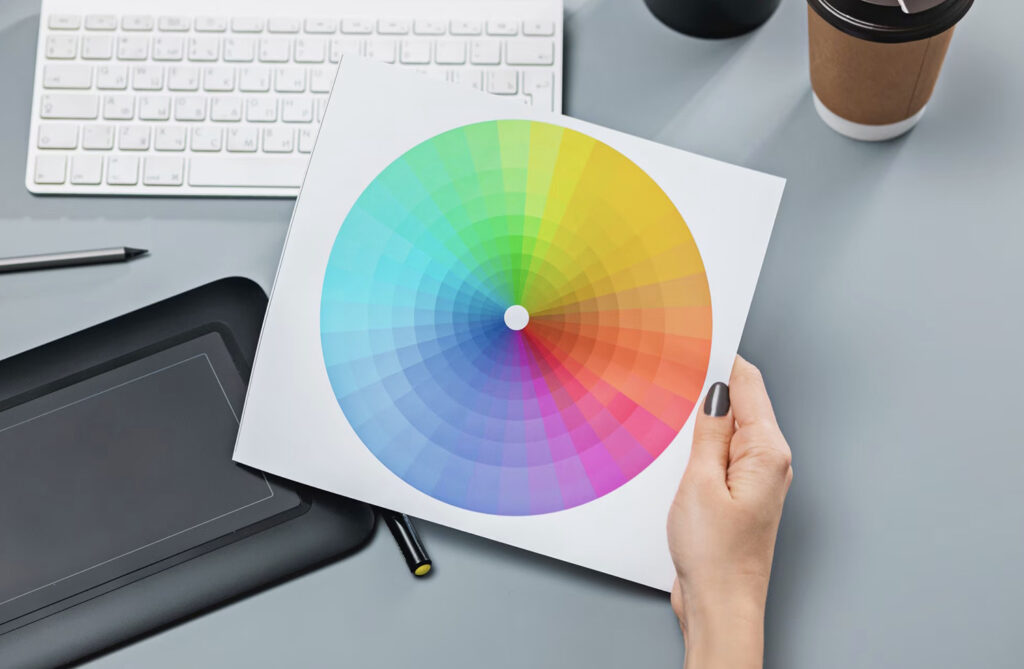
The color wheel is a visual representation of colors organized in a circular format. It allows for an easy understanding of the relationships between colors and is an essential tool in color theory. The concept of the color wheel was first introduced by Sir Isaac Newton in the late 17th century when he arranged the colors of the spectrum into a circle while studying the refraction of light.
Primary colors are the building blocks of the color wheel and consist of red, yellow, and blue. These colors cannot be created by mixing other colors together, and all other colors are derived from these three primary colors.
Secondary colors are formed by combining two primary colors together. They include orange, green, and purple (or violet). To create these colors, one would mix equal parts of adjacent primary colors, such as red and yellow for orange, yellow and blue for green, and red and blue for purple.
Tertiary colors are achieved by mixing a primary color with an adjacent secondary color. There are six tertiary colors: red-orange, yellow-orange, yellow-green, blue-green, blue-purple, and red-purple. These colors provide more nuanced variations in the palette and allow for a wider range of color combinations.
The color wheel can be further understood by dividing it into sections such as warm colors (red, orange, and yellow) and cool colors (blue, green, and purple). Warm colors tend to evoke feelings of warmth, energy, and passion, while cool colors are associated with calmness, tranquility, and nature.
Overall, the color wheel serves as a valuable tool for artists, designers, and anyone working with color. By understanding the relationships between primary, secondary, and tertiary colors, as well as warm and cool colors, one can create harmonious and visually appealing combinations in their work.
Color Models and Mixing
Color models are mathematical representations that help us understand, define, and manage colors. There are several color models, each designed for specific purposes and contexts. Some of the most widely used color models include RGB, CMY, and CMYK.
RGB (Red, Green, Blue) is an additive color model, used primarily for digital displays like computer monitors, smartphones, and televisions. In this model, colors are produced by mixing various amounts of red, green, and blue light. The additive model works by combining colored light sources, where the resulting color becomes brighter as more light is added. When all three primary colors of light are combined at full intensity, white light is produced.
CMY (Cyan, Magenta, Yellow) is a subtractive color model used mostly in the printing industry for creating pigments or inks. Subtractive color mixing works by selectively absorbing or reflecting wavelengths of light. As more colors are mixed, the resulting color becomes darker. In the CMY model, the primary colors cyan, magenta, and yellow are combined to create a wide range of colors. Mixing equal parts of all three primary colors produces black, but it can sometimes appear as a muddy brown due to the imperfections in inks and pigments.
CMYK (Cyan, Magenta, Yellow, Black) is an extension of the CMY model and includes an additional black component to compensate for the imperfect black created by the CMY model. The “K” in CMYK stands for “key,” as the black ink is often the key plate in printing processes. CMYK is the standard for offset and digital printing, providing a more accurate representation of colors.
In the world of paint and art, another color mixing model called RYB (Red, Yellow, Blue) has been widely adopted. The RYB model uses red, yellow, and blue as primary colors. This model is commonly taught in art classes and used by artists to mix paint colors. The RYB model predates modern color science but still holds relevance for artists today.
To sum up, understanding the differences between the various color models and mixing methods is crucial for accurately reproducing colors in different contexts, whether it’s on digital screens, in print, or with physical materials like paint.
Creating Color Schemes

Color theory plays a crucial role in creating visually appealing and effective design compositions. One aspect of color theory is the development of color schemes, which are combinations of colors that work harmoniously together.
A well-designed color scheme creates an aesthetically pleasing and cohesive appearance and conveys the intended mood or message. Designers employ various methods to generate color schemes, often drawing inspiration from nature, culture, or personal preferences.
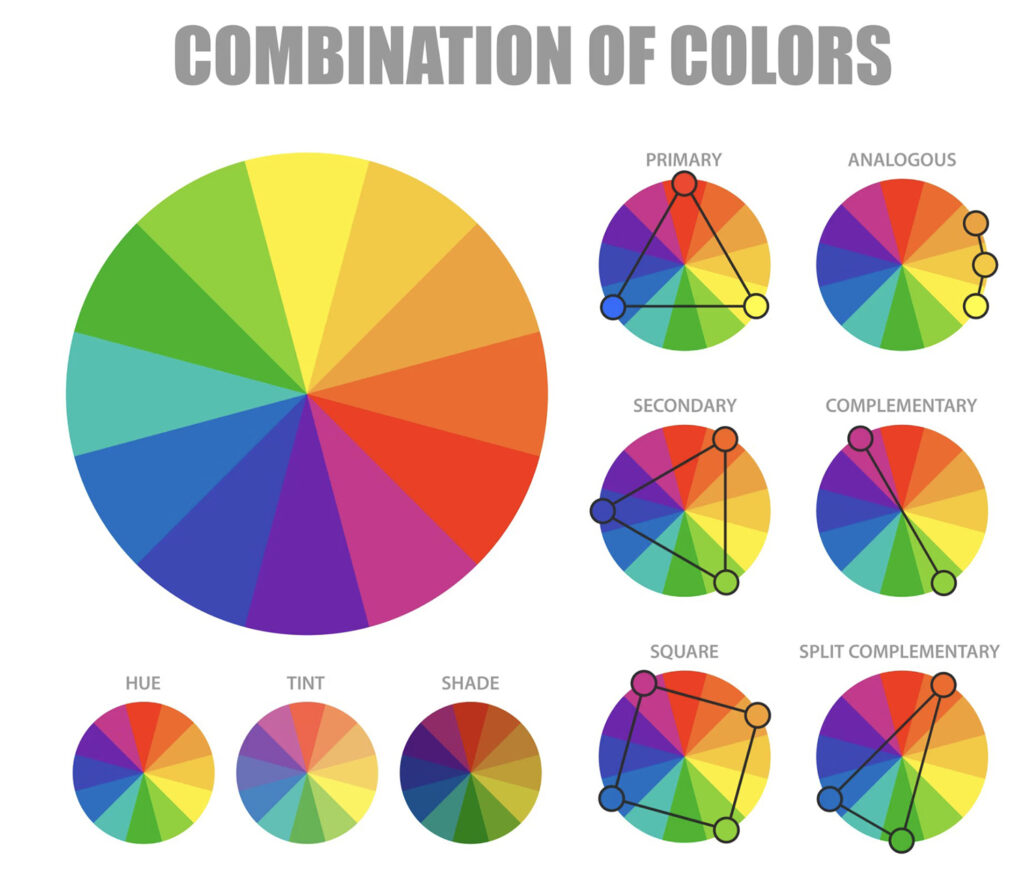
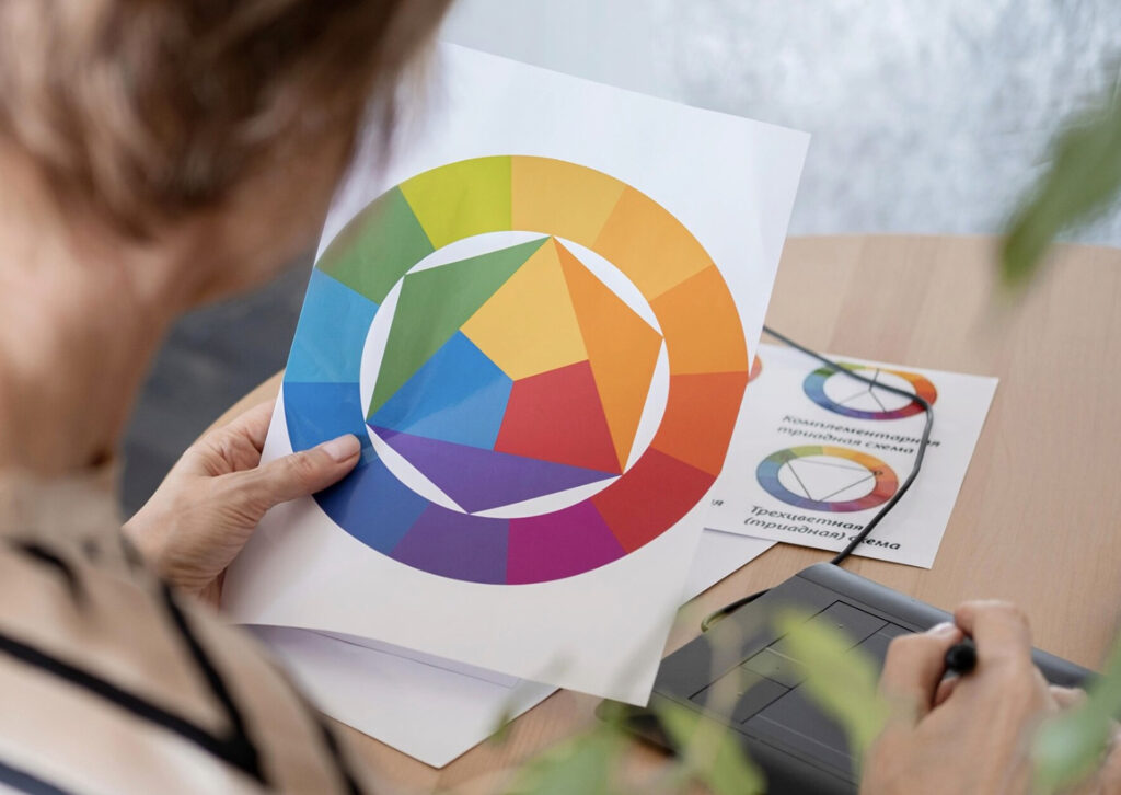
One approach to create color schemes is by utilizing the color wheel, which is a circular representation of the color spectrum. This tool helps designers identify complementary, analogous, and triadic color schemes.
- Complementary color schemes consist of two colors that are opposite each other on the color wheel. This scheme creates high contrast and visual interest, making it an ideal choice for designs that require boldness and energy.
- Analogous color schemes involve colors that are adjacent to each other on the color wheel. These harmonious combinations evoke a sense of tranquility and balance, ideal for subtle designs.
- Triadic color schemes feature three colors that are equidistant from one another on the color wheel, creating a vibrant and diverse palette with a sense of unity.
In addition to these basic schemes, designers can experiment with various shades, tints, and tones of chosen colors to fine-tune their color combinations. By adjusting the saturation and brightness, a more refined and tailored color harmony can be achieved.
While creating color schemes, it is vital to consider the emotional and psychological impact that colors can have on viewers. Each color has its associations and connotations, which contribute to the overall message conveyed by the design.
In conclusion, a well-crafted color scheme is the foundation for successful and engaging designs. By understanding color theory and employing methods such as the color wheel, designers can create color combinations that are both visually appealing and meaningful.
Color Terminology
Color terminology is essential to understanding and working with color theory. There are various terms used to describe colors, their relationships, and their properties. The following paragraphs provide a clear, concise, and confident overview of some key color terms.
Shade, Tint, and Tone: These terms describe how a color’s appearance is changed. A shade is created by adding black to a color, resulting in a darker variation. A tint is produced by adding white to a color, resulting in a lighter variation. Tonerefers to the result of adding gray to a color, making it less saturated than the original hue.
Contrast, Key, Chroma, Value, and Saturation: These terms relate to a color’s characteristics. Contrast refers to the difference between colors and is essential for readability, visual interest, and focus. The key of a color refers to its overall lightness or darkness within a color scheme.
Chroma means the intensity or purity of a color, whereas, value refers to a color’s relative lightness or darkness. Finally, saturation describes the strength or weakness of a color, with highly saturated colors appearing brighter or more intense.
Temperature and Color Temperature: The terms temperature and color temperature describe the warmth or coolness of a color. Warm colors generally include red, orange, and yellow tones, while cool colors encompass blue, green, and violet variations. Typically, warm colors evoke feelings of warmth and energy, while cool colors convey a sense of calmness and tranquility.
Analogous, Complementary, and Split Complementary Colors: These terms relate to color relationships. Analogous colors are those that sit closely together on the color wheel, usually consisting of one primary color and its adjacent secondary colors. These combinations tend to create visually harmonious and cohesive color schemes.
Complementary colors are opposite each other on the color wheel and create maximum contrast when used together, bringing balance and dynamism to a design. Split complementary schemes involve selecting a base color and the two colors adjacent to its complement, providing a greater variety while retaining the balance of a complementary palette.
Monochromatic Colors: A monochromatic color scheme consists of various shades, tints, and tones of a single hue. This type of color scheme creates unity and harmony while drawing attention to different elements or textures in a design.
Color Psychology and Marketing
Color psychology plays a vital role in marketing and branding, as it helps create a cohesive visual experience. Understanding the psychological associations of different colors can significantly improve user experience and user interface design.
Warm colors like red, orange, and yellow are often associated with energy, passion, and happiness. Red, for example, is known for evoking excitement and intensity, making it a common choice for call-to-action buttons and sales promotions. Orange, a blend of red and yellow, promotes enthusiasm and creativity, while yellow is generally linked to positivity and warmth.
Cool colors such as green, blue, and purple tend to have a calming and soothing effect on the viewer. Green signifies growth, balance, and harmony, making it a popular choice for eco-friendly brands. Blue, on the other hand, represents trust, loyalty, and stability, which explains its prevalence in corporate branding and financial institutions. Purple combines the stability of blue with the energy of red, often symbolizing luxury, power, and sophistication.
Neutral colors like cyan and magenta can be combined with both warm and cool colors to create a balanced visual experience. Cyan is a mixture of blue and green, often evoking feelings of calmness and clarity, making it suitable for technology or healthcare related brands. Magenta, a blend of red and blue, is typically associated with creativity and imagination.
When considering color psychology in marketing, companies must carefully choose colors that align with their brand’s values and desired emotional response from customers. For example, a brand aiming to convey trust and stability may opt for blue hues, while one targeting a younger, more vibrant audience might lean towards brighter colors like yellow and orange.
In conclusion, color psychology and its associations are crucial factors in effective branding and marketing strategies. By understanding the emotional impacts of different colors, businesses can create more cohesive and visually appealing user experiences and interfaces, ultimately influencing customer perceptions and decisions.
History and Science of Color Theory

The study of color theory began during the Renaissance era, with prominent figures like Leonardo da Vinci exploring the relationship between light and color. Color theory evolved further in the 18th century with Sir Isaac Newton’s publication Opticks, where he introduced the color wheel—a visual representation of colors based on their relationships with one another.
In the early 19th century, German writer and scientist Johann Wolfgang von Goethe published Theory of Colours, offering a more psychological and artistic perspective on color. Goethe’s work also introduced the Law of Simultaneous Color Contrast, which describes the visual phenomena of colors appearing different when juxtaposed.
Advancements in chemistry allowed the development of synthetic pigments, which led to expanded practical color applications in art and design. Color theory continued to evolve as a multidisciplinary subject, incorporating elements from psychology, optics, physics, and visual arts.
Perception of color is a result of how our eyes and brain interpret colored light and is fundamentally different from purely physical properties like wavelength or frequency. In the context of color theory, colors are considered “pure” if they cannot be created through the combination of other colors. Traditional color theory focuses on the color wheel, which arranges colors based on their relative relationship to one another in terms of hue, lightness, and chromatic attributes.
The color wheel theory allows for a better understanding of how colors interact and influence one another in different contexts. Achromatic colors, such as black, white, and gray, do not fall on the color wheel but play a significant role in creating contrast and emphasis in art and design.
To create harmonious and balanced color schemes, various techniques can be employed, such as triadic schemes, which use three colors equidistant on the color wheel. This ensures a cohesive and visually appealing combination of colors.
Overall, color theory remains an essential aspect of various fields, from art and design to marketing and branding. By understanding the history, science, and practical applications of color, one can harness its power and create visually engaging and effective compositions.
Frequently Asked Questions
How does color theory impact design?
Color theory plays a crucial role in design as it helps designers create harmony, incite emotions, and communicate effectively with the audience. The choice of colors can evoke feelings, provoke a particular response, or influence perception. By understanding color relationships and their meanings, designers can better use colors to enhance aesthetics, improve usability, and convey their intended message.
What are the primary principles of color theory?
The primary principles of color theory include understanding the color wheel, color harmony, and color context. The color wheel is a visual representation of colors in a circular arrangement, showcasing the relationships among primary, secondary, and tertiary colors.
Color harmony refers to the pleasing combination of colors that work well together and create balance in a composition. Color context highlights the perception of a color is subjective and can change depending on its surrounding or background.
What is the role of the color wheel in color theory?
The color wheel is a fundamental tool in color theory. It illustrates the relationships among colors and helps determine complementary, analogous, and other color combinations that create color harmony in a design. The color wheel is composed of primary colors (red, blue, and yellow), secondary colors (formed by mixing the primary colors, such as green, orange, and purple), and tertiary colors (formed by mixing primary and secondary colors).
How does color theory relate to human psychology?
Color theory has strong connections to human psychology, as certain colors can evoke specific emotions, subconscious responses, or mental associations. For instance, red is often associated with passion, aggression, or danger; blue with calmness, trust, or stability; yellow with happiness, energy, or optimism. Using this knowledge, designers and artists can deliberately choose colors to evoke desired emotions in their audience or communicate feelings within their work.
How is color theory applied in fashion?
In fashion, color theory is significant in creating appealing color combinations, evoking specific moods, and making a style statement. By understanding the principles of color theory, fashion designers can devise harmonious color palettes for garments that convey a desired image or mood, set trends, and make a visual impact. Additionally, color theory can inform consumers’ personal style, guiding them in selecting clothing that complements their skin tone and enhances their overall appearance.
What is the significance of color theory in film?
Color theory plays a significant role in film, as it helps set the tone, mood, and atmosphere of the visual narrative. Cinematographers, directors, and production designers use color theory strategically to create visual consistency and evoke intended emotions from viewers. From costume design to lighting and set design, color choices contribute to the storytelling process and can enhance the impact of cinematic scenes, highlight specific characters, or symbolize themes and motifs in the story.