Updated: Mar 10, 2022 By: Dessign Team
Reader Disclosure: When you purchase through referral links on our site, we might earn a commission (at no additional cost to you)
When someone visits your website and goes on your homepage with broken images, hard to read fonts, dark colors and not a clear message the chances are they will leave your website as soon as possible. That’s why you need the most functional homepage design possible so your visitors will stay and convert to customers or reader.
The main goal of well design homepage is to convert your visitors into your customers or fans. If your homepage don’t have any call to actions (CTA) where someone can click and either sign up or learn more about your product they will not know what to do and leave without doing any action. So our focus will be to make sure your homepage design has at least one or two specific CTA’s.
Our goal is to review many well design & functional homepage created by teams of designers, UI/UX experts and developers who work hard to understand what it takes to create a homepage that stands out and appeals with aesthetics to your first time visitors. We will discus the use of fonts, colors, tag-lines, slogans and call to actions as those are the main and most important aspects of well structured homepage.
The goals and benefits of Well Design Homepage
Every website you visit has different message and purpose what you want your audience to do and understand once they land on your website homepage? The most important is that they understand who you are and what you want them to do next. In short slogan what is that you do and description of quick details of what your websites is about.
As most visitors will first land on your homepage you need to convert them in under 2 seconds of what is your business or website about this will be done with beautiful design layout of your images, colors, typography, call to action buttons to keep them on your site and help them explore and learn more about your product or service you want to offer.
Improve User Experience (UX) and User Interface (UI) to get more conversion
Images play very important role in your layout of homepage, images of people, objects, animals, technology will let your visitors know in few seconds or less what is your website about. We also need to understand your target audience, what they expect when they first visit your website? is your homepage on online store and you selling goods or digital product or is it more information oriented? The Nest company will try to sell me product for my home but United Healthcare will provide me with information about specific health insurance I might need.
We will go over all the specific aspect of well design homepage to capture your visitors with call to action buttons well placed on your page, or newsletter signup where your new visitors can signup for your weekly news. We will talk about the placement of logo, size of fonts, overall main colors your specific website and why some colors work well and some colors might not be so pleasant. We want to make sure the user experience has nice flow and people don’t get confuse or lost on your homepage looking for specific information or product as they will get angry and leave your site.
How to layout and design best homepage?
So what do you need to design well converting homepage? First we will give you great examples with explanations of some of the most popular companies website homepage so we can compare and see what makes them so great. This is good practice for any beginner designer to get some ideas of what the experts are doing. If you want to make your own website we have detail post that will help you get started. There are many free graphic design softwares to help you layout your homepage and test different designs before you happy with your outcomes.
We encourage you to use visuals such as illustrations, icons, vector graphics to make your homepage memorable, stock photos play important role when designing your homepage as it will make your visitors feel safe and pleasant.
The best homepage design examples with explanation and what makes them the most memorable
Now we can finally get to see the best examples of well design homepages from many different categories, those companies are all well know with many resources and years of testing the colors, fonts, call to action buttons they did a lot of A/B testing to see what colors or images works better than others. They use heat maps to see where people are clicking on and where they don’t so they can put the call to action button in that place. We will explain in details what makes each website homepage design stand out.
Do You Need Best Reliable WordPress Hosting?
To Build your own best Homepage design website?
Get the best affordable WordPress hosting for your new website at special pricing. Bluehost and SiteGround are both best recommended hosting by WordPress.org with the 24/7 Support, 99.99% Uptime, and 30 days money back guarantee.
1. Adobe
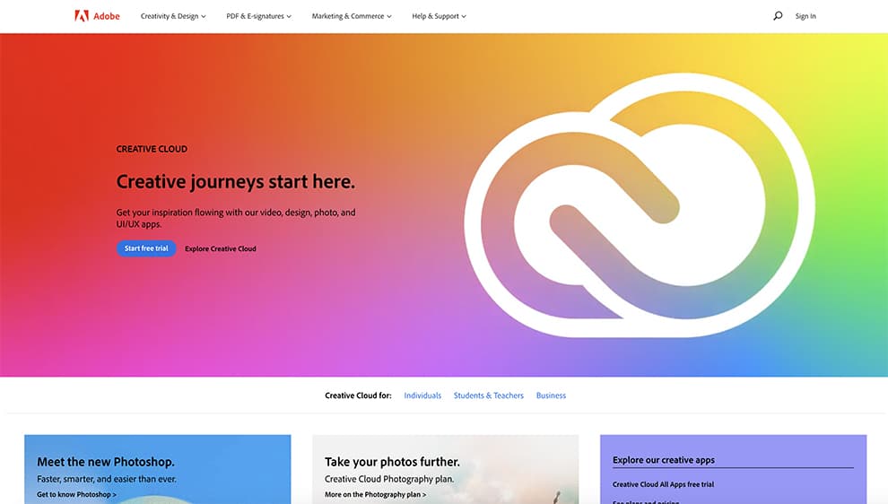
Adobe one of the most well know software company for creatives. We use Adobe for many of our design projects from Photoshop to After Effects. They want you to signup for free trial of their software so this is the main call to action. Once you see the word “free” you will probably give them a try as you have nothing to loose.
Very clean and straight forward layout with large slider with background animation showing you how you can use Adobe software to create your own interaction. The second CTA is “learn more” if you not ready to get started maybe you want to learn more of different software or product they offer.
Main Colors: White, Red, Black, Blue, Orange, Green
Tagline: Creative journeys start here.
Slogan: Get your inspiration flowing with our video, design, photo, and UI/UX apps
Call to Action (CTA 1): Start Free Trail
Call to Action (CTA 2): Learn More
2. Nest

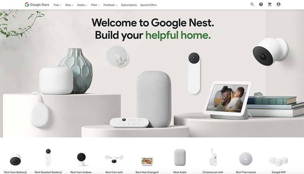
Nest one of the biggest cam and thermostat eCommerce website, they use a lot of product images, once you visit the homepage you know exactly what they are selling, under the main large images are all the products they are selling so you can click and explore specific product to buy.
They don’t have specific call to action button on the homages since they have so many different products. The homepage is super clean and professional looking, they use large fonts up top “Welcome to Google Nest” build your helpful home nice slogan wants you to stay here and explore more.
Main Colors: White, Black, Green, Grey
Tagline: Welcome to Google Next.
Slogan: Build your helpful home.
Call to Action (CTA 1): None
Call to Action (CTA 2): None
3. WordPress
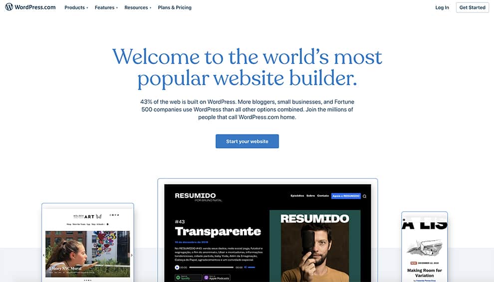
WordPress as we use for our company and love it, is the most used website builder powering over 43% of all the website on the internet. Homepage is very clean with large tagline welcoming you to use the software to build your next website. They show you images of others who build their sites so you can get your started today.
WordPress is based on themes you can use and install to start creating your website, there is many free portfolio themes you can pick from to help you visualize your homepage and customize to your needs as we discussed above.
Main Colors: White, Black, Blue
Tagline: Welcome to the world’s most popular website builder.
Slogan: 43% of the web is built on WordPress.
Call to Action (CTA 1): Start Your Website
Call to Action (CTA 2): None
4. Slack
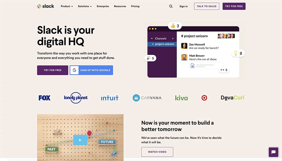
Slack is one of the most used messenger software for companies. It has nice image on the right side showing how the software looks like when you install it which is great use of images to show potential clients or visitors what they will get.
Nice bit tagline “Slack is your digital HQ” and under it two call to action buttons, one is in purple “Try for Free” and other is blue “Signup with Google” once you visit the homepage of slack you have clear action what to do next.
Main Colors: Black, Purple, White
Tagline: Slack is your digital HQ
Slogan: Transform the way you work with one place for everyone
Call to Action (CTA 1): Try For Free
Call to Action (CTA 2): Signup with Google
5. DropBox
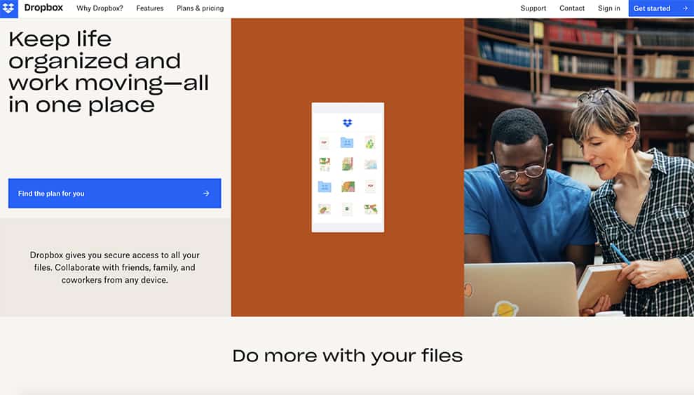
Dropbox uses nice photos of two people on the right side showing them looking at computer screen and probably sharing files which is the first impression they want you to have. Nice use of images as we discussed before and some nice icon illustrations in the middle of the homepage.
Large tagline in upper left side, “Keep life organized” and under it in blue just one call to action “Find the Plan for you” make you click on it and see what they offer and how much is each plan.
Main Colors: Black, Blue, Orange
Tagline: Keep life organized and work moving—all in one place
Slogan: Dropbox gives you secure access to all your files.
Call to Action (CTA 1): Find the Plan for you
Call to Action (CTA 2): None
6. Uber
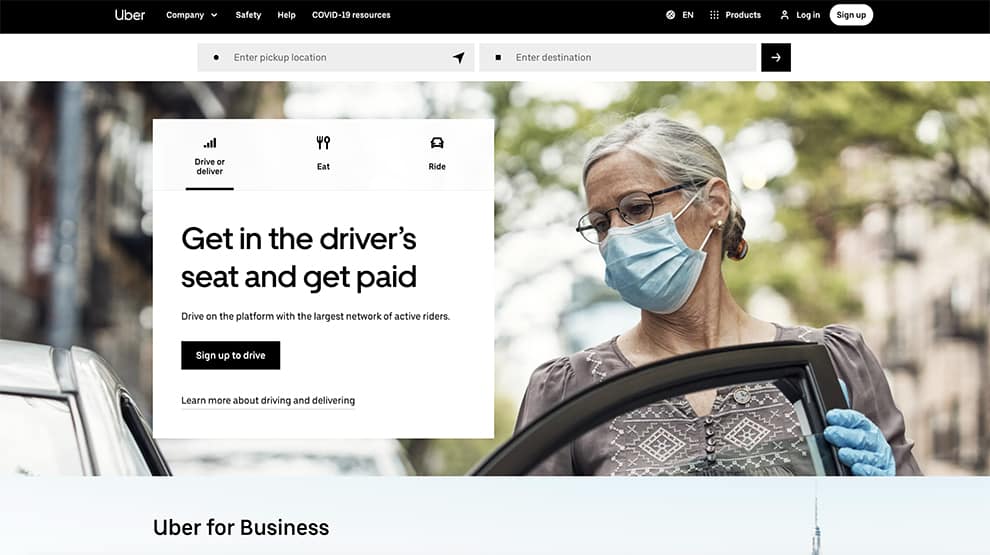
Uber uses a large almost full screen image of a person in this case a women opening the doors to a car, since they are car/taxi company using people and cars as images lets us know what they doing without even reading the tagline, which as we mention before using images is very powerful.
Uber has two call to action buttons, one is “Sign up to drive” other is “Reserve a ride” so you either want to be Uber driver or you want a Uber ride to specific place. This is very simple and modern website using mostly images and two colors white and black.
Main Colors: Black, White
Tagline: Get in the driver’s seat and get paid
Slogan: Drive on the platform with the largest network of active riders.
Call to Action (CTA 1): Sign up to drive
Call to Action (CTA 2): Reserve a ride
7. WooCommerce
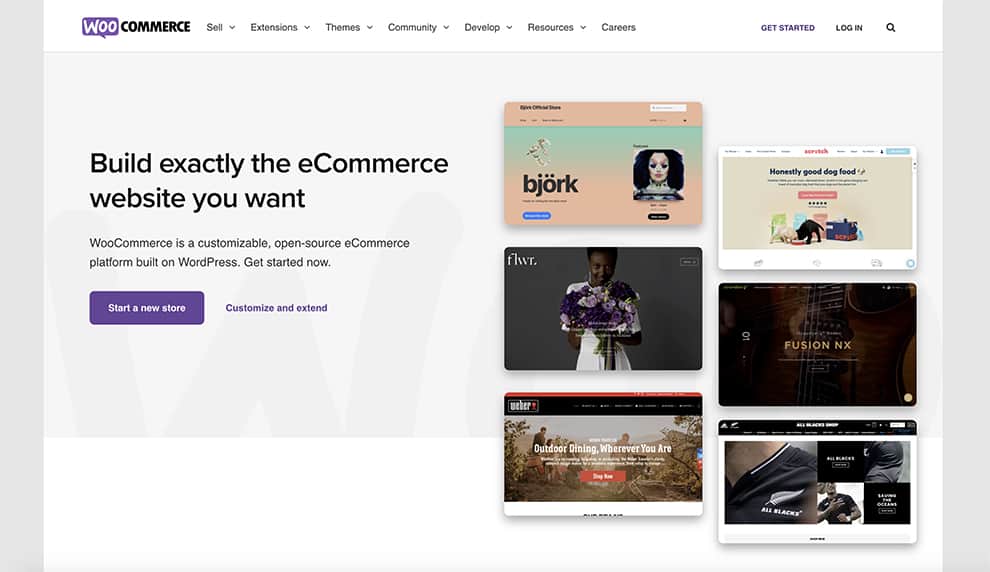
WooCommerce one of the biggest eCommerce platforms to build your own online store. Very simple homepage layout almost divided on two. On the left side you have nice large tagline “Build eCommerce website you want” with two call to action – one is “Start a new store” it tells you exactly what to do.
On the right side are example of website or themes you can use to build your own online store, there are many free WooCommerce themes well design and coded to help you build your own store.
Main Colors: Black, White, Purple
Tagline: Build exactly the eCommerce website you want
Slogan: WooCommerce is a customizable, open-source eCommerce platform built on WordPress
Call to Action (CTA 1): Start a New Store
Call to Action (CTA 2): Customize and extend
8. HotJar
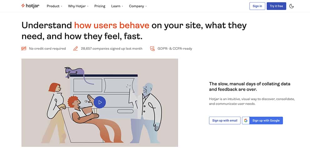
Hot jar the company behind heat map once you done with your homepage design we strongly recommend to signup with them to see where your visitors are clicking and if your call to action buttons are placed correctly.
HotJar homepage is very simple and modern, with large tagline up top and creative illustration video on the left side with call to action button on the right. This is very nice and clean layout UI/UX very well executed as you would expect from a company who does this everyday. Great example of well deign homepage, also give you nice statistics of 26,657 companies sign up last month .. gives you trust as how many new people had signup with them over past month.
Main Colors: Black, White, Orange
Tagline: Understand how users behave on your site, what they need, and how they feel, fast.
Slogan: The slow, manual days of collating data and feedback are over.
Call to Action (CTA 1): Try it Free
Call to Action (CTA 2): Sign up with Google
9. eWedding
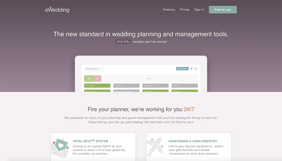
eWedding one of the biggest wedding planer tools on the web, clean and simple layout large tagline on top with statistics “921,470+ couples can be wrong” giving you peace of mind that they are trusted company. Nice large illustration of showing you how the tools looks like when you sign up.
The CTA is “Free to use” as we know before Free is very powerful call to action button as many people will try your product since they have nothing to lose. Tye also use nice illustration icons combined with text for visual aesthetics.
Main Colors: Purple, White, Green
Tagline: The new standard in wedding planning and management tools
Slogan: Fire your planner, we’re working for you 24/7
Call to Action (CTA 1): Free to use
Call to Action (CTA 2): Start Now
10. ensurem
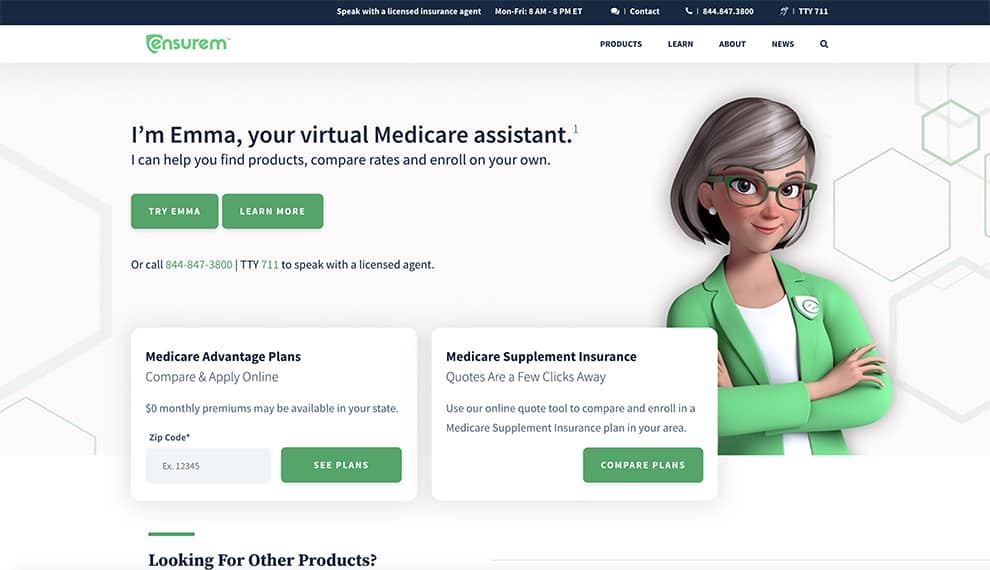
Ensurem one of the biggest medicare online websites, they have a cartoon looking women as she can help you find your plan, if you don’t want to talk to real person you can try the virtual assistant. Very clean well design website, with a lot of white space to easily find your way around.
You can click to see the plans or compare plans, or you can call them as they put the phone number right in the middle of the page. Nice to see all the options available to you, so you not lost of not knowing what to do.
Main Colors: Black, White, Green
Tagline: I’m Emma, your virtual Medicare assistant.
Slogan: I can help you find products, compare rates and enroll on your own.
Call to Action (CTA 1): See Plans
Call to Action (CTA 2): Try Emma
11. Bluehost
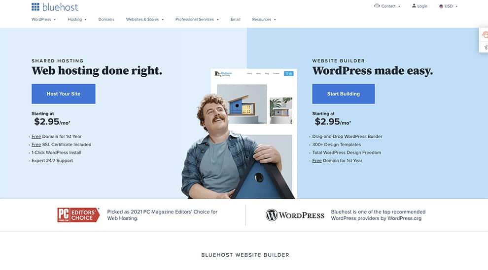
Bluehost one of the biggest hosting providers, has very nice and clean homepage design with focus on hosting and building websites. The homepage is split in two, on the left they are offering hosting your site with nice call to action, and on the right you can start building your website with “start building” CTA.
A prominent image of a person in the middle inviting you to create and build your site is easy and simple, nice and clean message. They also have a badge as they are PC editors choice for best hosting in 2021, good use of safety and security as a reward they got.
Main Colors: Black, White, Blue
Tagline: All-in-One Web Hosting.
Slogan: Our new Builder makes WordPress website creation fun & easy.
Call to Action (CTA 1): Host your site
Call to Action (CTA 2): Start building
12. FindLaw
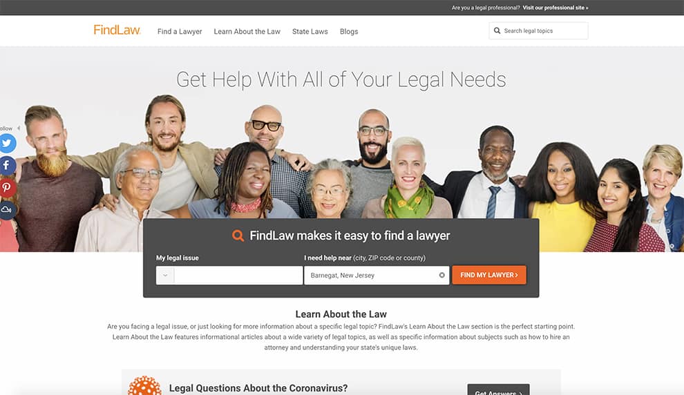
FindLaw a website with a database of all lawyers in United States, where you can search by legal issues or zip code. They use a large image of people just like you who are smiling that finding a lawyer was very easy. FindLaw uses image as the main focus of the site, with diversity of people base on race and gender.
They have a big search bar right in the middle where you can just input your info or zip code and easy search the database of all lawyers around your area. The CTA “Find My Lawyer” is in bright orange so you can’t miss it.
Main Colors: Black, White, Orange, Grey
Tagline: Get Help With All of Your Legal Needs
Slogan: FindLaw makes it easy to find a lawyer
Call to Action (CTA 1): Find my Lawyer
Call to Action (CTA 2): None
13. Sucuri
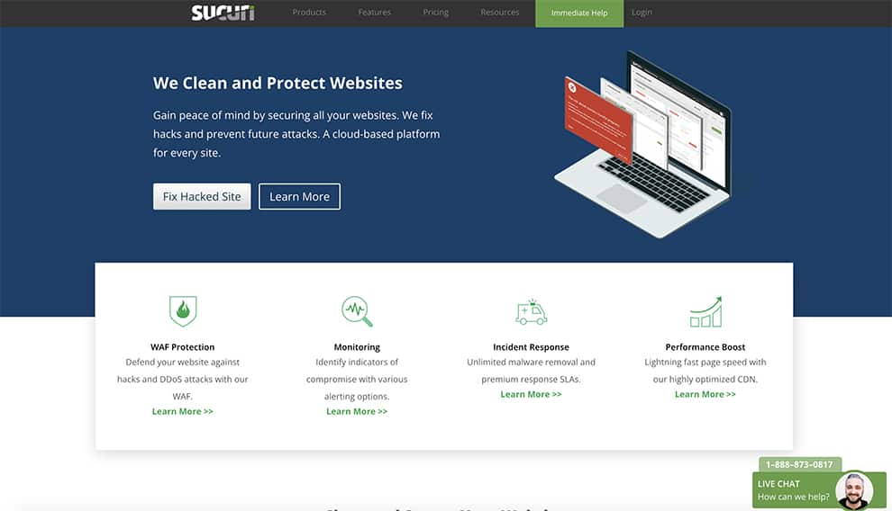
Sucuri is one of the well know sites to clean your website when it get hacked or infected with viruses. We like the CTA “Fix Hacked Site” there is no questions what they want you to do when you arrive at the homepage. You come here with a problem, probably your own website is hacked and they can easy fix it for you.
They have a image on the right side of a computer and the red screen shows a hacked website, probably looking exactly as yours so you can easily related to the problem. On the right bottom they have Live Chat with phone number or you can just chat with live person to help you fix the issues. The live chat is in green to make you feel safe and comfortable talkin to the other person.
Main Colors: Black, White, Green, Red
Tagline: We Clean and Protect Websites
Slogan: We fix hacks and prevent future attacks. A cloud-based platform for every site.
Call to Action (CTA 1): Fix Hacked Site
Call to Action (CTA 2): Learn More
14. WP Engine
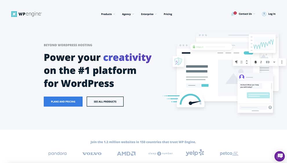
WP Engine is a well known WordPress hosting company they have a very clean and simple homepage with very large slogan telling you that they are number one hosting company for WordPress. They use two CTA, one is in blue with message Plans and Pricing and other is see all our products. They use very nice illustration image on the right showing you speed, analytics, and chat.
They have logos of other popular companies who use their products to make you feel safe that companies such as Volvo, yelp, petco are also using WP Engine to host their websites. Clean and simple homepage they also have a love chat on the bottom right side if you need to ask any questions.
Main Colors: Black, White, Torque, Blue
Tagline: Power your creativity on the #1 platform for WordPress
Slogan: Choose the best WordPress hosting solution for your business
Call to Action (CTA 1): Plans and Pricing
Call to Action (CTA 2): See all products
15. United HealthCare
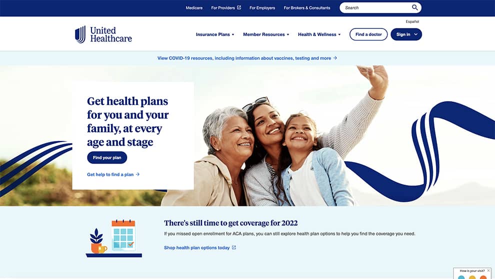
United Healthcare one of the largest website for healthcare and health coverage. Very clean looking website, they use a image of family smiling and taking a selfie, they look happy and safe. The website uses a nice slogan “Get health plans for you and your family” straight to the point, under it you have a CTA “Find your plan” once you land on this website it makes you feel safe and you want to stay here and explore more options.
Main Colors: White, Torque, Blue
Tagline: Get health plans for you and your family, at every age and stage
Slogan: There’s still time to get coverage for 2022
Call to Action (CTA 1): Find your plan
Call to Action (CTA 2): Get help to find a plan
16. Elegant Themes
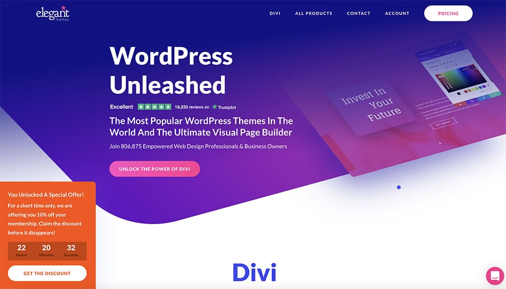
Elegant themes one of the biggest WordPress page builder, has a beautiful homepage very elegant and attractive, focus on technology and software. With large tagline and also very prominent call to action in pink. They use very nice image on the right with nice slogan “invest in your future” nice use of typography and illustrations.
They also use a live chat icon on the right bottom, if you have any specific questions. They are very specific on targeting their audience with 10% discount.
Main Colors: Blue, Pink, White
Tagline: WordPress Unleashed
Slogan: The Most Popular WordPress Themes In The World And The Ultimate Visual Page Builder
Call to Action (CTA 1): Unlock the Power of Divi
Call to Action (CTA 2): Pricing
17. Lyft
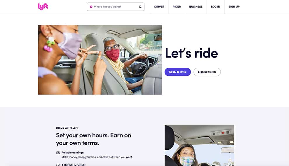
Lift is another large car/taxi provider with minimalist and sophisticated homepage design. The logo as on almost any well design homepage is in upper left corner, Lyft logo is in bright pink so it stands out very prominent. In the middle you have a image of a women driver with a passenger in the back. Once you land on this homepage you know exactly what they are trying to tell you.
With large tagline “Let’s ride” and call to action apply yo drive or sign up to ride you have two option to explore more. Very clean and minimal design with nice use of fonts and photos of people just like you.
Main Colors: Black, Pink, White
Tagline: Let’s ride
Slogan: Set your own hours. Earn on your own terms.
Call to Action (CTA 1): Apply to drive
Call to Action (CTA 2): Sign up to ride
18. Starbuck
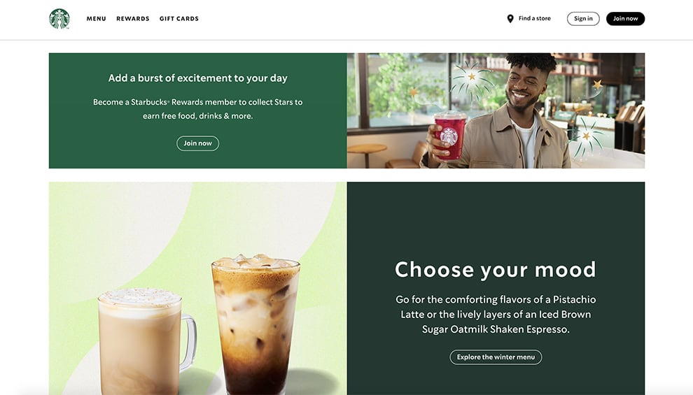
Starbuck probably don’t need introduction as they are the largest coffee store around the world, I personally love Starbuck coffee with so many varieties. Starbuck focus is on coffee for coffee lovers. Since the logo is green most of the homepage design is green and light green. They use a image of a man smiling as he just receive his cup of coffee, another image under it is of two coffee cappuccino which makes you want to get your own.
They want you to become member of Starbuck with a CTA join now and get rewards, nice use of images, colors and tagline “Choose your mood” based on your coffee.
Main Colors: Black, Green, Brown
Tagline: Choose your mood
Slogan: Add a burst of excitement to your day
Call to Action (CTA 1): Join Now
Call to Action (CTA 2): Explore the winter menu
19. Zoom
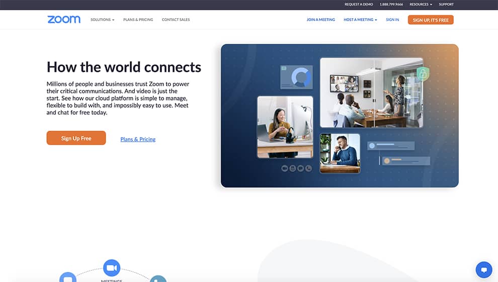
Zoom the biggest platform for meeting online, this is as clean of a homepage as it gets, they use a large slider with test and CTA on the left and video on the right with people faces connection each other by Zoom video conference.
The CTA is in orange with white text “Sign up free” or you can search for prices and plans. There is no questions about it what they do and what they want you to explore more by sign up for their product.
Main Colors: Black, White, Blue
Tagline: Zoom Learning Center
Slogan: Zoom is for you
Call to Action (CTA 1): Sign up free
Call to Action (CTA 2): plans and pricing
20. Mint
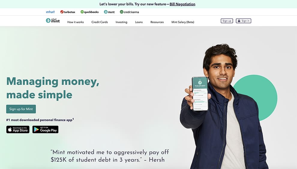
Mint is number 1 app for personal financial made simple just for you. The homepage is very clean and straight to the point, with large tagline “Managing Money” and large image of a person holding a phone showing you how easy and simple the app is. Very nice use of green colors as they symbolize money.
Main Colors: Black, Green, Light Green
Tagline: Managing money, made simple
Slogan: Say hello to the app that takes the work out of personal finances
Call to Action (CTA 1): Sign up for Mint
Call to Action (CTA 2): App Store or Google Play
21. AirBnB
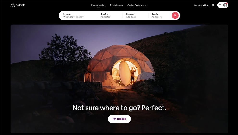
If you ever went on vacation you probably know airbnb as the alternative to any hotel. You can book any place in any country or state and stay as someones home, apartment or room. The website is black with a dominant white tagline “not sure where to go” and CTA “I’m flexible” There is a large image of a man standing in a dome in the mountains, nice use of creative image.
The website is almost 90% black with white being the dominant and focal points. Very modern and elegant look.
Main Colors: Black, White
Tagline: Not sure where to go? Perfect.
Slogan: Inspiration for your next trip
Call to Action (CTA 1): I’m flexible
Call to Action (CTA 2): None
22. Moma
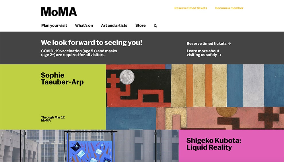
MoMa one of the most popular museums in the world if you are designer or any creatives this is one of the museums you have to visit. The homepage is very creative as you would expect from modern museum. They use very bright colors with focus on the current exhibition.
The CTA is to reserve your tickets or learn more about what is on display at the current date and time. Large images give you glimpse of what you will see when you visit the place. MoMa homage is very creative and unique in a way that you can have unique website and still have CTA’s to let visitors know what to do next and how to explore your site even more. Why this layout works because they know their audience are creative professionals with vision of abstraction and arts.
Main Colors: Black, White, Green, Purple
Tagline: We looking forward to seeing you
Slogan: Plan your visit
Call to Action (CTA 1): Reserve timed tickets
Call to Action (CTA 2): Learn more
Homepage design summery
We explore many best design homepage’s with in detail explanation what works and why they are perfect examples of how your homepage should look and what should be your main focus when designing your website.
The best way when starting your new website is to do a research on what kind of visitors you will try to attract, are they professionals, family oriented or creatives who like fun and unique site? Doing extensive UI/UX research will help you determine what your homepage should look like and not confuse your audience. Your CTA’s should be in prominent places letting them know why should they click and do any actions on your site.
Using photos, illustrations or quick videos will give you advantage of visual objectives as your visitors even before they read your tagline will know what your site is about. Make sure to use large fonts and clean message so you don’t confuse your users . Don’t add too many CTA’s one or two should be enough for the fist time visitors to click on, if you give them too many options they will not know what to do so you need to avoid miss-conception.
Keep your most important information above the fold, as most people will not scroll down your website, most action will happen above the fold so that is your main focus
The main goal of well design and functional homepage is to convert your visitors into your customers or fans.
A good homepage design website has a clear vision and converts visitors to potential clients. It has a strong message, well placed call to action buttons, readable fonts and pleasant colors with beautiful images.