Creating a mobile-friendly WooCommerce WordPress theme can be tricky. There are a lot of factors to consider when it comes to mobile performance, from loading speed to plugins to image optimization.
A WooCommerce theme must work well on mobile for obvious reasons; eCommerce shoppers will click away if a website could be more appealing to use on mobile.
On top of that, Google uses mobile-first indexing best practices, which means they will prioritize mobile versions of websites regarding indexing and ranking. So ensuring your WooCommerce theme is as mobile-friendly as possible is very important.
If you’re new to WooCommerce and want to build a mobile-friendly theme or improve the mobile performance of a current theme, here are a few key factors you may want to consider.
1. Choose A Responsive Theme
Choosing a responsive theme will be essential when it comes to mobile performance. If you’ve had the same theme for a while, it’s a good idea to put it through the test by using a mobile-friendly testing tool (more on that in the next section).
If your WordPress or theme version requires updates, now is the time; even minor adjustments may make your theme run more smoothly on mobile and may fix some small problems you need to be aware of.
You should be able to see this in your WordPress admin menu; going to Dashboard > Updates should flag up any new updates you need to install. This may take a little time, but ensuring your website runs smoothly is worth doing.
Just ensure you test the theme post-update to ensure everything works as it should.
Choosing A New Theme: Some Tips
Picking a new theme is more complex than it sounds! There are thousands of WooCommerce themes for WordPress; sifting through them does take a bit of time, but there are a few things you can keep in mind to make the process easier:
- Test the theme to see how it performs on a mobile-sized screen. You can do this using the demo, giving you a good idea of how it looks on a smaller screen.
- Check reviews from other users. You can hit Ctrl+F and type in ‘responsive’ or ‘mobile’ to see what comes up. If there are any problems in this area, you may be able to find reviews that go into more detail.
- Look at the speed. Again, checking reviews here can help, but you can also read the theme description to ensure the theme runs smoothly and quickly. (We’ll go into speed in greater detail later in this article. There are ways to improve the speed of your existing theme, but it’s good to know if a new theme you’re about to pay for/install is designed to be as fast as possible.)
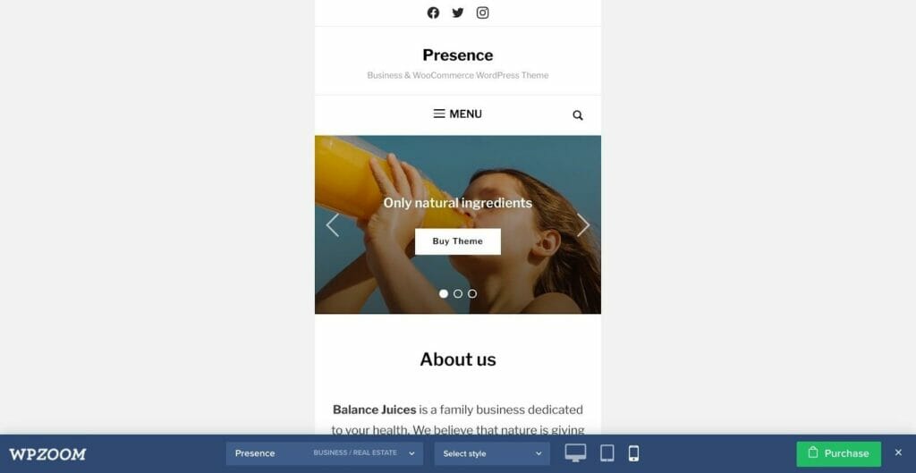
You can see in the above example (Presence by WPZoom) that you can view the theme on different devices; this is a great way to ensure your website looks good on desktop, mobile, and tablet.

Article Continues Below
You can put your existing or newly-installed theme to the test by using a mobile-friendly testing tool, like this free tool from Google. Just copy and paste your URL into the search bar.
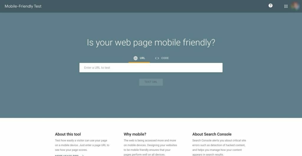
It will take a few moments, but it will come up with a verdict: either you’ll get a green tick or a red cross. If the tool decides your site is not useable on mobile, it will tell you why (for example, it might say ‘text too small to read’).
This means you can make the changes required to make your WooCommerce theme easy to navigate for mobile users. Review the suggested changes and see if you can adjust your theme to accommodate them. Even minor fixes (like the text being slightly too small) can make a big difference to mobile users!
3. Think About Plugins
Now you can start thinking about plugins. Plugins can add so much in terms of design and functionality on a desktop, but those same great features can cause problems on mobile. So whenever you install a new plugin for your chosen theme, preview how it looks on mobile and desktop.
Some plugins are specifically designed to help increase the performance of your website – you can read more about these in our guide to Must-Have WordPress Plugins to Enhance Your Website For Optimal Performance.
While it’s not a good idea to overload on plugins (this can cause your site to slow down), a few well-chosen plugins can make a huge difference in performance and ease of use from a visitor’s perspective.
4. Think About Speed
The faster your WooCommerce WordPress theme loads, the better! Customers will turn away if your website takes a long time to load, but getting to the bottom of slow loading times can take time and effort.
You can use a free tool to assess your page loading time honestly: PageSpeed Insights by Google is a great option.
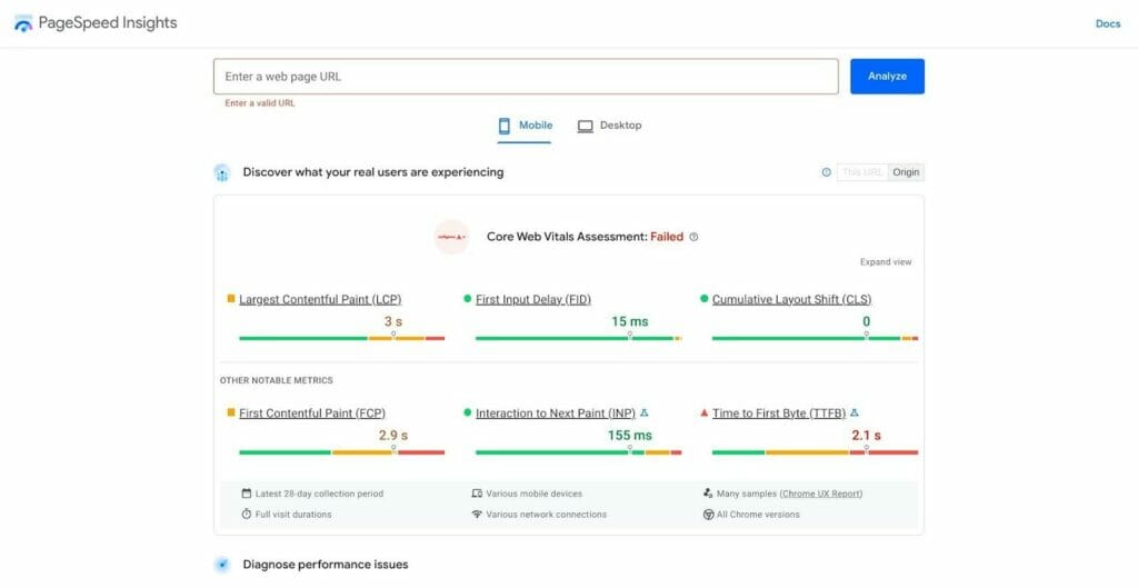
Pasting your URL into the search bar will give you a detailed breakdown in four key areas: Performance, Accessibility, Best Practices, and SEO.
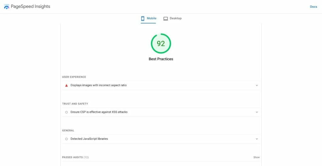
This allows you to make adjustments to improve key areas. The main area to focus on is Performance (if you’re trying to improve loading speed): this area breaks down some key factors so that you can identify anything causing a lag in your loading speed. If you need help figuring out what these metrics mean, Google has a good knowledge base with more information.
You can also find caching widgets to improve site speed, which may be the solution if your loading times are too long.
Lastly, you can use a paid tool to test page speed: Synthetic by Sematext, for example, offers website monitoring to diagnose and flag any performance issues. This may be a good option if you’re running a larger eCommerce store and want to be automatically alerted to potential issues.
5. Optimize Images
Optimizing images is going to be important, too. For example, some WooCommerce WordPress themes look gorgeous on desktop, but the images need to scale down better for mobile.
You can find image optimizer plugins to help with this – check out our WP Compress Review for more details.
Two key things you can do to optimize your images for mobile:
- Compress your images – look at the size of your images, including any photographs you use in your theme. Reducing their file size may help improve desktop and mobile performance. Read our Optimus Review to understand more about this!
- Remove unnecessary images – while some photography-heavy themes look beautiful, it’s a good idea to double-check whether all images are necessary from a customer’s perspective. A split-testing tool can help here; you can run an A/B test with some images removed to see how it alters the customer’s journey on your site.
- Use a CDN to speed up image delivery – using a Content Delivery Network service can help here. It allows pages to load faster by reducing the strain on your site’s server. Although this involves a few extra steps, it’s worth the effort.
Optimizing images can make a huge difference in speed, so spending a little time going through existing images to reduce their file size as much as possible without compromising quality is a good investment.
6. Some Pitfalls to Avoid
There are a few things you should avoid when it comes to creating a mobile-friendly WooCommerce WordPress theme:
- Avoid pop-ups on mobile. Pop-ups can be incredibly frustrating and difficult to click away from for mobile users. If visitors are bombarded with pop-ups, they may well click away. Even email opt-in pop-ups (great for expanding your email marketing list) can be fiddly and annoying for mobile users.
- Double-check your plugins. Plugins that add extra content and dynamic menus need to be tested on mobile, too: sometimes, they don’t scale well on mobile and may make navigation frustrating on a smaller screen.
- Pay attention to your analytics. If you’re concerned about how users interact with your new theme, check out the engagement rate: this measures how your users interact with your website and how long they spend there. For example, if mobile users are clicking away quickly, they might find the mobile experience frustrating.
- Remember to test it! When your theme is all set, check it out on a mobile device. Check every page, from your product pages to your blog. Do the images still look good? Are the menus touchscreen-friendly?
Remember iPad/tablet users. It’s also a good idea to check how your website works on a tablet: do the images scale down appropriately? Are the menus useable on a tablet-sized screen?
Frequently Asked Questions
Before you go, here are a few frequently asked questions you may want to know about:
Is WooCommerce suitable to use for beginners?
In our opinion, yes. It does take a few steps to install a WooCommerce theme for WordPress; but once you’ve done it, WooCommerce itself is brilliant for eCommerce. It offers guides for new store owners, which are useful, and the WooCommerce interface is easy to navigate.
How much does it cost to run a WordPress site?
The actual cost of running a WordPress site varies depending on what you need to use it for. You can see a detailed breakdown in our guide: How Much Does It Cost to Build a WordPress Website?
Some of the plugins mentioned in this article do come at an extra cost. So while WooCommerce is free, some mobile optimization tools will be an extra investment. (Although we think they’re well worth the money!)
Are all WooCommerce themes mobile-friendly?
Not necessarily. Most new themes are designed with mobile users in mind, but some older themes may not work as smoothly on mobile as on desktop.
WooCommerce’s own theme, Storefront, is designed to be mobile-friendly, so if you want to keep things simple, you can always stick with Storefront and customize it to suit your brand.
Creating a Mobile-Friendly Theme: Key Principles
Hopefully, this has helped you gain a basic idea of ensuring your chosen WooCommerce theme for WordPress works well on mobile.
The key things to consider are speed and navigation. You’ll need to ensure that your website runs as quickly as possible, from the homepage to the checkout.
Navigation is a huge factor. Any clunky, difficult-to-use menus on mobile will frustrate your customers, so testing your theme on mobile devices is essential; great-looking menus on a desktop may be annoying to use with your thumbs on a small screen.
Ultimately, most new themes are designed with mobile in mind, but it’s still worth ensuring your chosen theme works on all devices. In the long run, this can increase customer satisfaction and improve sales, and a particularly smooth mobile experience may even tempt customers to return again in the future!