There are thousands of responsive WordPress themes out there, and it’s no secret that some are remarkably better than others.
So, how can you be sure that the theme you’re thinking of using will provide your visitors with the kind of world-class user experience they expect, regardless of the device you use?
The answer is simple:
You learn how to test the responsiveness of a WordPress theme, putting it through its paces to ensure that it adapts well to different screen sizes and resolutions without negatively affecting usability or the quality of your design.
In this guide, we’ll show you the most effective manual and automated methods for testing your theme and even provide you with several free and premium tools to help you along the way.
Why Bother Testing a Responsive WordPress Theme
Did you know that there were just shy of five billion active mobile Internet users around the world in 2022, with 59.72% of all global web traffic coming from mobile devices?
Given these figures, it makes sense that, as a website owner, you need to meet your audience where they’re at, making your website fully accessible via smartphones, tablets, and other non-desktop devices.
This is where responsive design comes in.
The best responsive WordPress themes incorporate several key features, such as flexible grid systems and breakpoints, to ensure your site adapts appropriately to screens of all sizes.
However, there are also plenty of themes out there that, though they claim to be responsive, don’t quite cut it.

Article Continues Below
Perhaps they do a great job adapting to iPhone screens, but when you load that same theme on an Android or a tablet device, all kinds of issues present themselves.
This is why it’s crucial to test the responsiveness of your new theme before putting it to work on your website.
3 Manual Ways to Test if Your WordPress Theme is Mobile Responsive
1. Device Testing
The most straightforward way to see if your theme is responsive is to physically test it on different devices.
If you built your WordPress site on a desktop computer, you already know what it looks like on your monitor. However, it would help if you also took some time to open it up on your smartphone and tablet.
Of course, this approach may seem limited in that you probably only have one smartphone and a tablet, but don’t be afraid to ask friends and family who own devices with a different screen size than yours if you can borrow them.
While you’re testing, remember to see how your website looks and performs in both landscape and portrait orientations. Most smart devices can be used either way, so it’s important to know that your site is fully responsive in both.
You should also try out multiple web browsers, especially the major players such as Google Chrome, Safari, and Mozilla Firefox.
If you encounter any issues, make a note of them so that you can attend to them later.
2. Use Responsive Design Mode in Web Browsers
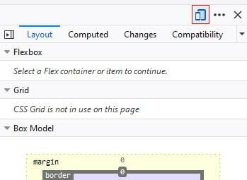
Although it’s not a feature commonly used by most people, Chrome, Firefox, and Safari all have an in-built responsive design mode that emulates different devices and screen sizes.
You can use each one by loading your website in each browser on your desktop device, then follow these next instructions.
How to Use Responsive Design Mode in Google Chrome
1. Load Your Website in Chrome
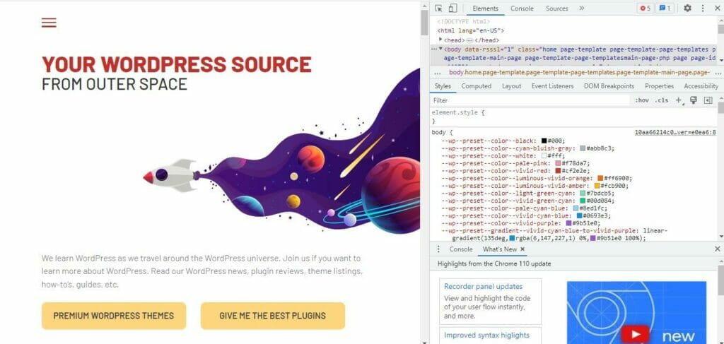
2. Press CTRL + SHIFT + I on your keyboard to open up the Chrome developer tools.
3. From here, there are two ways that you can open responsive mode.
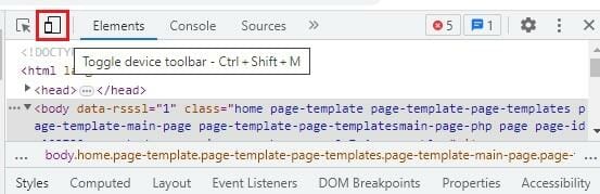
A. press CTRL + SHIFT + M
B. Tap the little icon to the left of Elements in the top-left corner of your developer tools. It’s the one that looks like a small rectangle overlapping the corner of a larger rectangle.
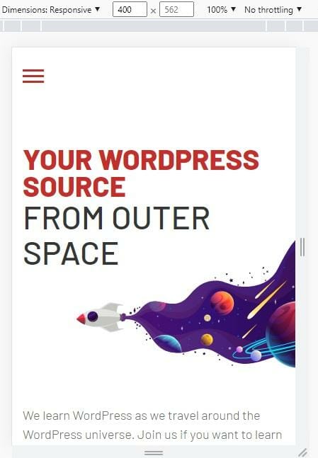
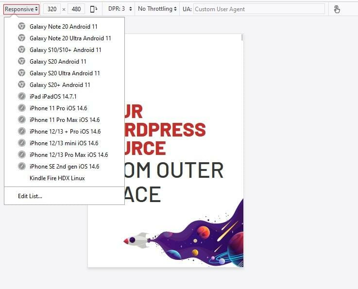
Both will open up your website in responsive mode, which shows you what your site will look like on a smartphone screen measuring 400 x 562.
To see how it looks on other screen sizes, tap the downward-pointing arrow next to the words Dimensions: Responsive.
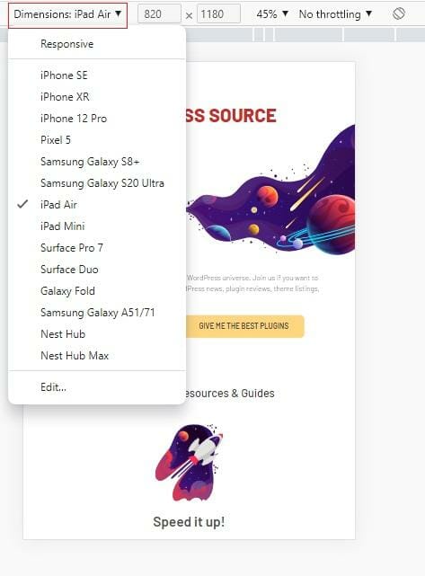
Here, you can select any number of popular smart devices, and Chrome will show you what your site looks like on your chosen device.
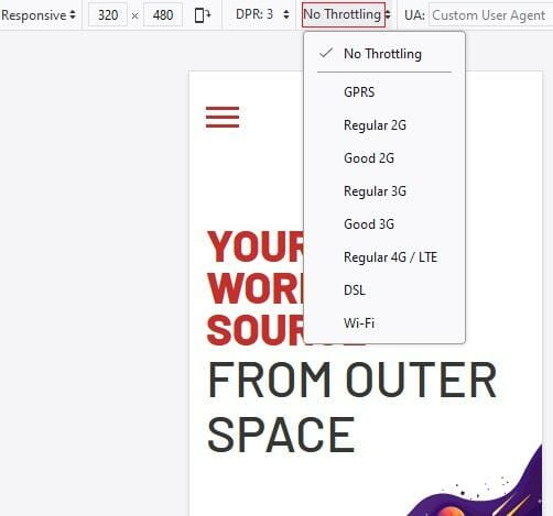
Another thing we really like about this is that you can even test how your site will perform based on different Internet connection speeds.
How to Use Responsive Design Mode in Mozilla Firefox
2. Open the Page Inspector tool by holding down CTRL + SHIFT + C.
3. Open responsive mode.
This time, you’ll find the icon in the top-right of your Page Inspector tools. Alternatively, you can open it using the same CTRL + SHIFT + M command as Chrome.
Here, you can again test how your site will look when viewed in Firefox on various popular devices.

You can also toggle the Internet speed to test performance and see how your site looks with different Digital Pixel Ratio (DPR) settings.
3. Use Google’s Mobile-Friendly Test
Even if you’ve used device and browser testing, it’s still worth running your site through Google’s Mobile-Friendly Test for two reasons.
1. SEO
If you read our guide to Google Core Web Vitals, you may recall that mobile usability and performance are two key factors that Google considers when determining where to rank your content in search results.
With that in mind, it’s a good idea to see precisely how Google sees your site so that you can take any necessary steps to improve it.
2. Identifying Errors and Room for Improvement
You may have looked your site over on several different devices and browsers and tested every possible screen orientation, only to find a few problems.
Unless you’re already an experienced WordPress expert, it may take time to determine what’s causing those problems or how to fix them.
This is where the Mobile-Friendly Test comes in, proving itself to be an essential WordPress developer tool by outlining any issues that need to be fixed and providing valuable recommendations for solving whatever issues you’re having.
How to Use the Google Mobile-Friendly Test
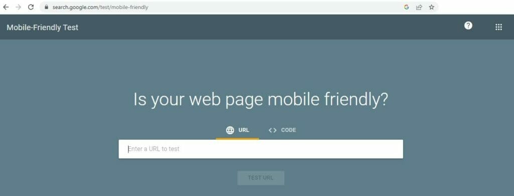
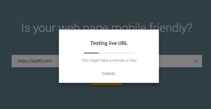
1. Point your browser to the Mobile-Friendly Test page at https://search.google.com/test/mobile-friendly
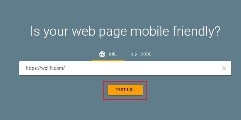
2. Enter the URL of your website and tap Test URL.
You’ll likely have to wait a moment while Google does its thing.
Once the test is complete, it will reveal one of two things:
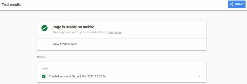
A. Your site is mobile-friendly, in which case you’ll receive a green check mark with the words “Page is Usable on Mobile” or;

B. Your site is not mobile-friendly. In that case, you’ll see a red warning icon and the message “Page isn’t usable on mobile.”
If you receive the latter message, scroll down, and Google will tell you exactly what’s wrong with your site.

Clicking on the question mark icon for any identified problems will take you to Google’s comprehensive documentation, which outlines the steps you need to take to solve that issue.
3 Automated Ways to Test the Responsiveness of Your WordPress Theme
As crucial as manually testing the responsiveness of your theme may be, there’s no denying that it can be a laborious and time-consuming hassle, especially when you’re testing across many different devices, browsers, and screen sizes.
The good news is that there are plenty of online tools out there that can do the job for you in half the time with none of the monotony.
Among the best WordPress theme responsiveness testing tools, we recommend the following:
1. Responsinator
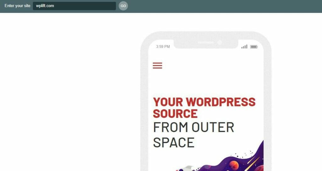
Responsinator is a free online platform that offers one of the easiest ways to see your site’s appearance and performance on different devices.
Head to Responsinator.com, enter your web address and click Go.
From there, Responsinator will show you how your site looks on multiple devices ranging from the latest iPhones and Android devices to some much-older devices.
You can then scroll around on each emulated device to test individual elements’ responsiveness.
Sure, this platform may be basic, and it certainly doesn’t cover all the possibilities, but it’s a great place to start for those new to responsiveness testing.
2. BrowserStack
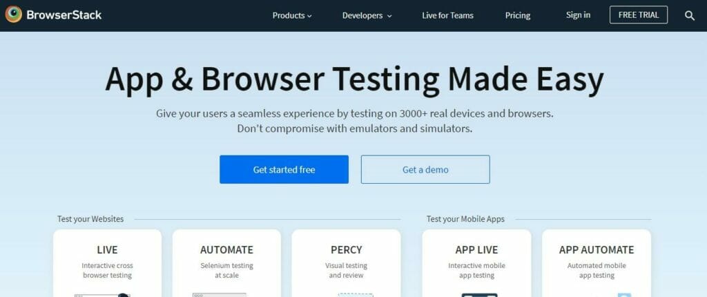
If you’re running a web agency or a growing business and need to constantly keep on top of site responsiveness, Browserstack may be a better option.
Offering more advanced options, Browserstack can test your site across more than 3,000 desktop browsers, all versions of Windows and Mac iOS released since 2008, and automated cross-browser testing on mobile devices.
Unlike Responsinator, no free plan is available. Paid options start from $39 for desktop and mobile testing up to $150 monthly for a five-user plan with added collaboration tools.
3. Testsigma
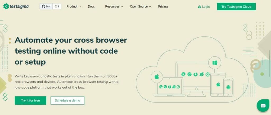
If you need the advanced testing options offered by BrowserStack but don’t yet have the budget to pay for them, you may want to take advantage of the 30-day free trial of Testsigma Pro.
This popular testing platform offers a thousand desktop browser and operating system combinations, plus testing on over 3,000 real smart devices.
You can also take screenshots and record videos during your tests if you need to refer back to them later to identify any issues.
Once the free trial is up, you have three options:
A. Stick with a basic free plan offering 100 browser/OS combinations, 100 smart devices, and 200 automated monthly testing minutes.
B. Pay $349 per month to stay on the Pro plan.
C. Upgrade to a bespoke enterprise plan with custom pricing, an option better suited to large web development teams and agencies.
Testing the Responsiveness of Your WordPress Theme: A Final Word of Advice
With such a large percentage of the world’s Internet users accessing the web via smartphones and tablets, ensuring your WordPress theme is fully responsive has never been more essential.
Throughout this guide, we’ve shown you six simple ways to carry out rigorous, in-depth tests, from physically trying out your site on different devices and using that invaluable Mobile-Friendly Tool from Google to automating the whole process via platforms like BrowserStack and Testigma.
However, if there’s one thing we need to remind you of before you leave today, it’s this:
Testing for theme responsiveness is not a one-and-done job.
Sure, you’ll want to test everything once your site is ready to go live, but you should also repeat your tests regularly.
After all, every new piece of content you add, every new plugin you install, and every new WordPress update could affect the responsive capabilities of your theme. So, keep the tools we’ve shown you today in mind and use them frequently to ensure you consistently deliver the best possible experience for your visitors.
And, if that theme turns out not to be as responsive as it first appeared? Here’s our pick of the 40+ best free responsive WordPress themes to install on your site in 2023.