So, you want to design a website, but where do you start? Although it may sound trivial, the first thing you need to do is draft a website layout. What is it, how to create it, and what should it include? Today, I’ll answer all those questions and give you some nice references to get inspired. Stay tuned! 🤗
Table of Contents
What Is a Website Layout?
Simply put, a site layout is a framework defining a website’s structure. Its main purpose is to structure the information so it looks coherent to website owners and their audiences. A proper web layout demarcates the content hierarchy, provides a clear navigation path from one webpage to another, and makes the most important website elements stand out. Most importantly, it helps to get the brand message past the textual level and convey it through visual forms.
What Elements Should the Website Layout Include?
A site layout is about planning past the homepage; it should take into account the crucial elements one can spot throughout the website. You can call them the “backbone” elements, as they shape the way a website looks and operates.
Website header
It is the uppermost site section, which immediately catches a visitor’s eye. A header typically includes the brand’s logo, navigation links, and login/logout functionality.
Navigation menu
Previously mentioned as “navigation links,” a website menu is another crucial homepage layout element. It helps users and visitors navigate the site without being lost. It doesn’t matter which form you choose to implement – a sidebar, mega menu, hamburger panel – a menu should always be present on the website.
Website content
The page body “houses” the site content – it can be text, images, video content, banners, buttons, forms, and any other type you feel like adding.
Website footer
Lastly, the site footer is a “closing” layout element, which often contains a sitemap, a social bar, a subscription form, and links to other important pages.
What Makes a Website Layout Good?
The key to a good web page layout is proper planning and A/B testing. For a particular website type, it’s best to choose a flattering layout type. But how to decide which one is optimal? Consider the following when selecting a layout:
- Lay everything out clear and simple. It takes visitors a few seconds to make up their minds about a website’s usability. Are the vital content sections easily spotted? Is the navigation intuitive? How flattering is the color scheme? Take all these aspects seriously because a bad site layout is frustrating.
- Make it engaging. A good web layout can help you increase user engagement by prolonging their stay on the website and making them want to come back.
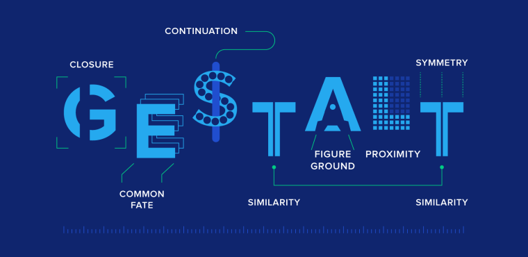
- Consider human psychology. Visual design and Gestalt principles make a good combo when it comes to winning over a website user. There are over 10 Gestalt principles, including Closure (Reification). According to it, the human eye tends to complete images visually when seeing distorted lines and abstract shapes.
Okay, but how will it help you create a web design layout? There are three possible scenarios:
- You focus on details, which may lead to exponential user engagement growth.
- You pay less attention to details and focus more on shaping the global view of the website. Users will find a way to navigate themselves.
- You ignore details on purpose and choose to bring originality into play. Users will not only find a way around the website but also find it memorable.
How to Choose the Right Website Layout
- The first step is to figure out which layout type will be the most suitable for the site. One way to do this is to research the competition, niche leaders, and their website layout ideas.
- Next, try to visualize several layout ideas based on different designs and see which way to present information and content is a bigger success. Please mind it’s best to take into account survey data and usability testing (A/B) results when choosing a layout.
- It’s not necessary to stick to a single webpage layout and use it consistently on the website. You can use up to three different layouts for different page types. When done smartly, it helps users understand what page they are currently viewing and its purpose.
- Do not forget to watch the layout’s adaptability – it should be mobile-friendly and responsive. When building one, make sure the web layout design remains usable and accessible for all users across all devices.
- If the brand/company/agency already has a specific color palette, be sure to use it. This will help it remain a recognizable brand in the market.
Top 5 Website Layout Types
The modern world welcomes creativity, and so does web design. There are many different website layout types out there, but you know what they say – everything new is well-forgotten old. So, prepare to learn more about the five most popular and time-proven layouts (and check out the website layout examples).
Single-column layout
Number one on the list is a proud all-timer – the single-column layout. It presents the content as a vertical scrollable column, which makes it the simplest layout type. It is suitable for minimalist websites, where the design itself is laconic and doesn’t steal the spotlight from the visual part. Surrounded by white space, the images appear larger and look crisp and clear, and the scrolling experience is seamless.
As you can see, the evenly spread white space makes the primary content vibrant yet not overwhelming and pleasant to look at. Besides, such a layout is easy to view from mobile devices.
When to use:
- personal blogs and micro-blogs;
- minimalist design;
- long-form articles;
- mobile-friendly design.
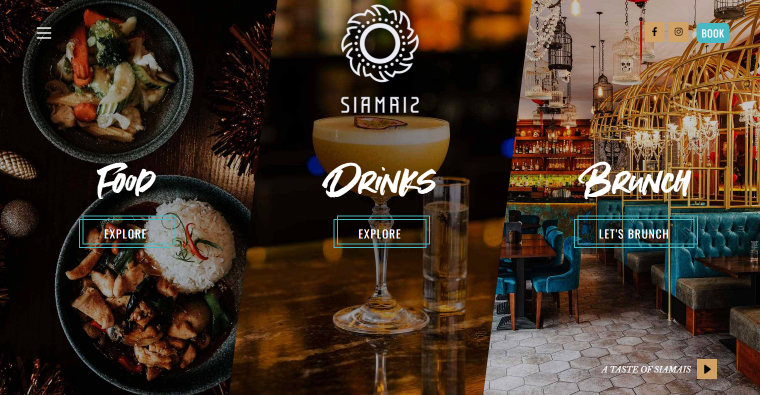
Split-screen layout
There are two types to it – horizontal and vertical. A vertical split-screen website layout type will be the optimal choice when you want to convey dual importance to two or more content areas. It helps to offer quick choices, better user experience, and higher engagement.
In the example above, the screen is split into two, but possible variations include three, four, and even five-column screens. When done logically correctly, a multi-column split-screen can secure a second-to-none viewing experience:
- it helps to keep all the important page content above the fold;
- it makes the transition from one picture to another smooth and consistent;
- you can choose a flattering color scheme to accentuate the choices without taking the focus from the targeted action.
When to use:
- multiple equally important options to choose from;
- side-by-side webpage layout;
- the contrast between content areas;
- the static image next to a video/animation;
- highlight a vertical image.
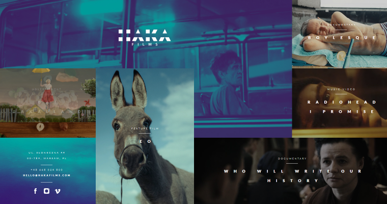
Asymmetrical layout
Asymmetry can be a good website layout idea because it upends the standard layout rules and promises to offer something beyond perfection. The asymmetrical layout type is about compartmentalizing the website content into small logical chunks and placing them unevenly on the page.
Such a trick can help you create active space, which directs the sight from one spot to another, and make white space lively.
When to use:
- maintain visual balance;
- advanced image gallery;
- portfolio presentation;
- balance out contrasting colors;
- too many content types and visual elements.
Modular grid layout
Otherwise known as card/block layout, it is excellent for content-heavy websites, where elements are hierarchically made equal. Another way to explain the concept: every content unit, be it text, picture, video, button, etc., is included in a separate card and has its own space.
You can choose to include gaps (the so-called gutters) between images, like in the example above. When done properly, symmetrical grids can give the website content a unique look and feel – streamlined, well-organized, and eye-pleasing.
In addition, the modular grid is a flexible and responsive layout type since columns can adjust to the screen size, and users get a nice browsing experience from all devices.
When to use:
- business websites;
- blogs;
- clean-looking archive pages;
- media gallery.
Zigzag layout
It’s the second most popular website layout idea after the single-column layout. The zigzag layout basically repeats the way a human eye scans the webpage content – following a Z-letter pattern:
- The eye goes from left to right.
- Then, the eye goes down and back to the left.
- From there, the eye moves to the right again.
Such a layout is perfect when you need to direct the user’s attention to specific points using well-placed visuals, text, and CTAs.
When to use:
- symmetrical and smooth scrolling;
- different website types.
Bonus: full-screen media layout
Full-screen media always looks “juicy” and complements the immersive user experience. Once the users first visit the website, they are immediately captivated by the authentic brand-relevant visuals, which helps to establish trust. The text sections, menu, and CTAs are there to support the “living” image.
A full-screen media layout has many benefits:
- it provides a rich user experience;
- easy to design and implement;
- well-suited for responsive design;
- cultivates the visitor’s curiosity to scroll down the page;
- despite being a simple design choice, it’s impactful.
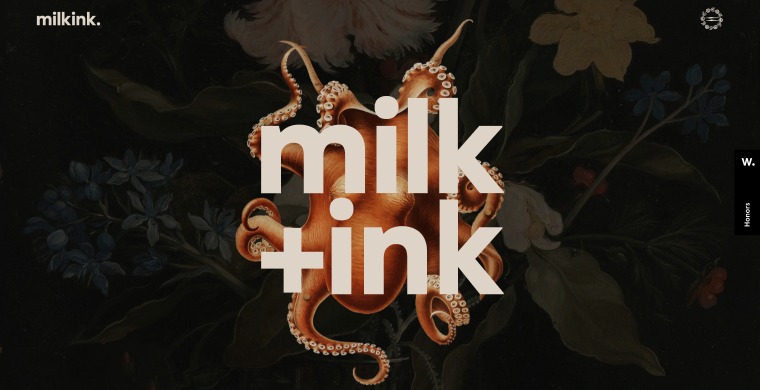
By choosing a full-screen media website layout type, you inform the site visitor about the services you can provide and the brand’s specialty. For example, Milkink is a creative studio, and its website illustrates what the team can deliver. Mind the colorful foreground images, animations, parallax effect, moving pictures, stylish logo, and harmonious color scheme.
When to use:
- strong branding strategy;
- increase conversion rates;
- emphasize #1 offered use case;
- faster decision-making for users.
Website Layout FAQ
It is a framework (mockup) defining a website’s structure. The main purpose is to organize the website content and make the hierarchy and navigation clear for the users.
A website layout typically consists of four parts: a header, a navigation menu, the body (website content), and a footer.
Here are the most widely used web layouts: a single-column, zigzag, split-screen, asymmetrical, modular grid, and full-screen media layout.
Wrapping Up
When designing a website, it is incredibly important to draft a wireframe first, a mockup if you will, where you’ll mention all the vital website parts, their content, and section placement. Having a ready-to-follow web page design layout will save you time during further development.
Which layout to choose? It depends on the goal you wish to achieve. There are many layout types, each having its own peculiarities and suitable for particular niches. Among the most common layouts, I’d like to point out single-column, split-screen, zigzag, modular grid, and asymmetrical. These are time-proven and creative methods for organizing the site content.
I hope the article helped you find more website layout ideas and inspiration. ✨