Updated: May 10, 2023 By: Dessign Team
Bootstrap is an open-source front-end framework that takes the hassle out of web design. With a collection of pre-built components, Bootstrap makes it easy to create responsive, mobile-friendly websites. In this guide, we’ll explore the ins and outs of Bootstrap, delving into its features, benefits, and real-world applications.
So, what is Bootstrap used for? It’s an essential tool for web developers and designers to create visually appealing, functional websites without starting from scratch. From navigation menus to responsive grids, Bootstrap offers a wide range of components that streamline the web design process. Ready to dive in? Let’s get started with this comprehensive guide to understanding Bootstrap and its myriad uses.
Understanding Bootstrap
Bootstrap is a popular and widely used front-end development framework that allows developers to create responsive and mobile-first designs. It is an open-source toolkit that includes HTML, CSS, and JavaScript components, making it easy to create responsive web pages and applications.
What is Bootstrap?
Bootstrap is a free and open-source front-end development framework that was created by Twitter in 2010. It is designed to help developers create responsive, mobile-first web pages and applications, without having to start from scratch. With Bootstrap, developers have access to a comprehensive set of HTML, CSS, and JavaScript components that they can use to build modern and responsive web pages and applications.
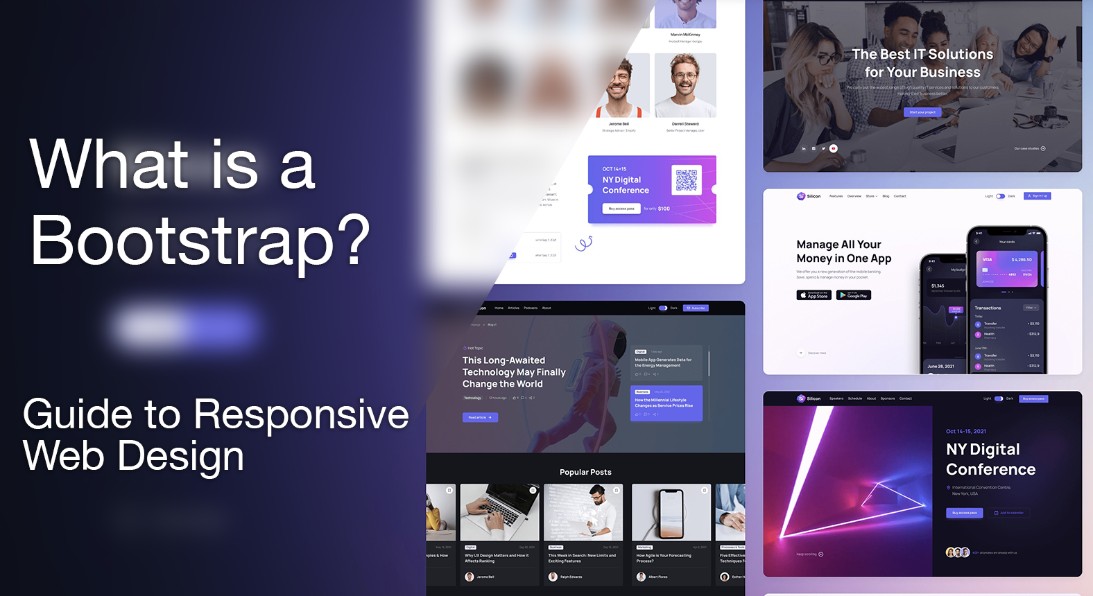
Examples of Bootstrap Websites

If you need to get some inspirations for your next Bootstrap website we put together a list of the best and most innovative websites built on top of the Bootstrap framework. The examples should help you get more visually creative and understand how you can build your own fully responsive website.
History of Bootstrap
Bootstrap was created by a designer and a developer at Twitter, who were looking for a way to streamline their workflow and improve the consistency of their designs. They realized that they were repeatedly writing the same code for different projects, so they decided to create a framework that would allow them to reuse their code and create new projects faster.
Bootstrap was released as an open-source project in August 2011 and quickly gained popularity among developers. Today, Bootstrap is one of the most popular front-end development frameworks in the world, with a large and active community of developers contributing to its development and improvement.
Advantages of Using Bootstrap
There are many advantages to using Bootstrap for front-end development. One of the biggest advantages is its ease of use. Bootstrap provides developers with a comprehensive set of HTML, CSS, and JavaScript components that they can use to create responsive and mobile-first designs quickly and easily. This saves time and ensures consistency across different projects.
Another advantage of Bootstrap is its responsiveness. With Bootstrap, developers can create web pages and applications that look great on any device, whether it’s a desktop, tablet, or mobile phone. This is because Bootstrap’s components are designed to be responsive and adjust to different screen sizes and resolutions.
Bootstrap is also highly customizable. Developers can easily modify and customize Bootstrap’s components to fit their specific needs and requirements. This allows developers to create unique and customized designs without having to start from scratch.
Finally, Bootstrap is constantly being updated and improved. The Bootstrap community is large and active, and developers are constantly contributing new components and features to the framework. This ensures that Bootstrap remains relevant and up-to-date with the latest web design trends and best practices.
How to Use Bootstrap
Bootstrap is an open-source front-end development framework that allows developers to create responsive and mobile-first websites. In this section, we will discuss how to use Bootstrap, including downloading and installing it, understanding the basic structure of Bootstrap, and learning about common Bootstrap components.
Downloading and Installing Bootstrap
Before you can start using Bootstrap, you need to download and install it. The easiest way to do this is by visiting the official Bootstrap website (https://getbootstrap.com/) and clicking on the “Download” button. You can choose to download a pre-compiled version of Bootstrap or customize it to suit your needs.
Once you have downloaded Bootstrap, you need to add it to your project. You can do this by linking to the Bootstrap CSS and JavaScript files in your HTML document. You can also use a package manager like npm or Bower to install Bootstrap.
Basic Structure of Bootstrap
The basic structure of Bootstrap consists of a grid system, which allows you to create responsive layouts and a set of CSS classes and JavaScript plugins that you can use to enhance the functionality of your website.
The grid system in Bootstrap is based on a 12-column layout, which can be customized to suit your needs. You can use the grid system to create rows and columns, and then add content to those columns. Bootstrap also includes a set of responsive utility classes that allow you to hide or show content based on the screen size.
Common Bootstrap Components
Bootstrap includes a wide range of components that you can use to create responsive and mobile-first websites. Some of the most common components include:
- Navbar – a navigation bar that can be customized to suit your needs
- Jumbotron – a large callout area for showcasing key content
- Carousel – a slideshow for cycling through images or content
- Forms – a set of styles for creating forms
- Buttons – a set of styles for creating buttons
- Icons – a set of icons provided by Font Awesome
These are just a few examples of the many components that are available in Bootstrap. By using these components, you can save time and effort when creating your website, and ensure that it is responsive and mobile-friendly.
In conclusion, Bootstrap is a powerful front-end development framework that can help you create responsive and mobile-first websites. By downloading and installing Bootstrap, understanding its basic structure, and learning about its common components, you can quickly and easily create professional-looking websites that are optimized for all devices.
Bootstrap Grid System: An Introduction
The Bootstrap Grid System is an essential component of creating responsive and mobile-first web designs. It provides developers with a flexible and efficient way of structuring web pages, which can adapt to different screen sizes and devices. In this section, we will delve deeper into what the Bootstrap Grid System is, how to use it, and its advantages.
What is the Bootstrap Grid System?
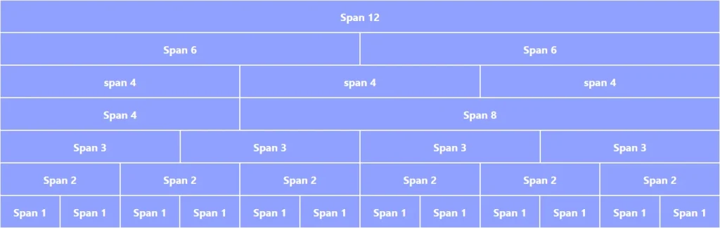
The Bootstrap Grid System is a 12-column grid, which is used to define the layout of a web page. It is based on a mobile-first approach, which means that the layout is designed for small screen sizes first and then scaled up for larger screens. Each column in the grid is given a percentage width, which adds up to 100% for each row. This allows developers to create different layouts for different screen sizes, without having to write custom CSS for each scenario.
How to Use the Bootstrap Grid System
The Bootstrap Grid System is easy to use and can be added to your project by importing the Bootstrap CSS and JavaScript files. To create a grid, you need to define a container element with the class “container” or “container-fluid”. Inside the container, you can add rows and columns using the “row” and “col-*” classes respectively. For example, to create a row with two equal-width columns, you can use the following code:
<div class="container"> <div class="row"> <div class="col-md-6">Column 1</div> <div class="col-md-6">Column 2</div> </div></div>
Here, the class “col-md-6” specifies that each column should take up six columns out of the 12 available in the grid. The “md” part means that this layout applies to medium-sized screens and above. You can use different classes for different screen sizes, such as “col-sm-*” for small screens and “col-lg-*” for large screens. You can also use offset and push/pull classes to create more complex layouts.
Advantages of the Bootstrap Grid System
The Bootstrap Grid System offers several advantages over traditional CSS layouts. Firstly, it saves time and effort by providing pre-defined classes for common layouts, which can be easily customized. Secondly, it ensures consistency across different pages and devices, as the same grid can be used throughout the project. Thirdly, it simplifies the process of creating responsive layouts, by eliminating the need for media queries and custom CSS. Lastly, it is well-documented and widely used, which means that developers can find plenty of resources and support online.
In conclusion, the Bootstrap Grid System is a powerful tool for creating responsive and mobile-first web designs. Its simple syntax, flexibility, and efficiency make it an essential component of modern web development. By mastering the Bootstrap Grid System, developers can create beautiful and functional web pages that work seamlessly across different devices and screen sizes.
Bootstrap Themes and Templates
Bootstrap is a popular open-source framework for building responsive, mobile-first websites. It provides a wide range of CSS and JavaScript components that help developers create a consistent and professional-looking website. Bootstrap themes and templates are pre-designed and pre-built layouts that use Bootstrap’s components to make it easier for developers and designers to create a website.
What are Bootstrap Themes and Templates?
Bootstrap themes and templates are pre-designed and pre-built layouts that use Bootstrap’s components to make it easier for developers and designers to create a website. They are like starting points for website building that provide a consistent and professional-looking design. Bootstrap themes and templates can be customized to fit the specific needs of a website.
How to Use Bootstrap Themes and Templates
Using Bootstrap themes and templates is easy. Developers and designers can start by finding a theme or template that fits their website’s needs. They can then download the theme or template and customize it to fit their specific needs. The customization process can include changing the colors, adding images, and modifying the layout of the website.
Where to Find Bootstrap Themes and Templates
There are many websites that offer Bootstrap themes and templates for free or for a fee. Some popular websites include BootstrapMade, ThemeForest, and WrapBootstrap. Developers and designers can also find Bootstrap themes and templates by doing a simple search on Google.
In conclusion, Bootstrap themes and templates are a great starting point for website building. They provide a consistent and professional-looking design that can be customized to fit the specific needs of a website. There are many websites that offer Bootstrap themes and templates for free or for a fee, making it easy for developers and designers to find the right theme or template for their website.
Free Bootstrap Template

It’s much easier to start with already pre-made free bootstrap templates to help you understand how it’s built and get a starter, we put together a great list of the best bootstrap templates so you can find them in one place.
Bootstrap for Responsive Web Design
Responsive web design is a design approach that ensures websites adjust to the size of the screen or device used to access them. This means that the layout and content of a website will change based on the device used to access it. Responsive web design is important because it ensures that users have a seamless experience when accessing your website from any device.
What is Responsive Web Design?

Responsive web design is an approach to web design that aims to create websites that provide an optimal user experience on any device or screen size. This design approach ensures that websites are easily accessible on mobile devices, tablets, laptops, and desktop computers. It involves creating website layouts that adjust to the size of the screen or device used to access them.
How Bootstrap Can Help with Responsive Web Design
Bootstrap is a popular front-end framework that helps developers create responsive and mobile-first websites. Bootstrap is a set of pre-designed CSS and JavaScript components that can be easily customized to create modern and responsive web designs. Bootstrap provides a responsive grid system that allows developers to create flexible and dynamic layouts that adjust to different screen sizes. Additionally, Bootstrap also provides pre-designed UI components such as forms, buttons, and navigation menus that can be easily integrated into any website design.
Best Practices for Using Bootstrap for Responsive Web Design
- Start with a mobile-first design approach: Since Bootstrap is designed to be mobile-first, it’s important to start your design process with a mobile-first approach. This means designing your website for mobile devices first and then scaling up for larger devices.
- Customize the components to fit your brand: While Bootstrap provides pre-designed components, it’s important to customize them to fit your brand and design style.
- Avoid overusing the pre-designed components: While the pre-designed components can be helpful, avoid overusing them, as this can make your website look generic.
- Test your website on different devices and screen sizes: It’s important to test your website on different devices and screen sizes to ensure that it looks and functions correctly on all devices.
Bootstrap is an excellent tool for creating responsive and mobile-first websites. By following best practices and customizing the components to fit your brand, you can create a modern and responsive website that provides an optimal user experience on any device.
Conclusion
Bootstrap stands as an advantageous framework for web developers and designers alike. Its ease of use, responsive design capabilities, and extensive component library streamline the development process. By implementing Bootstrap, professionals save time and effort, resulting in a more visually appealing and functional website.
As technology evolves, the importance of optimizing websites for various devices cannot be overstated. Bootstrap’s adaptability ensures a seamless browsing experience, fostering user satisfaction and engagement. Furthermore, its open-source nature encourages ongoing improvements, guaranteeing that Bootstrap remains a relevant and valuable tool for the web development community. Ultimately, investing time and effort into understanding and utilizing Bootstrap brings forth substantial benefits for web projects of all sizes and complexities.
Yes, beginners can use Bootstrap as it comes with many free templates to help you get started, it has many free online tutorials and resources to help you learn and design your website.
Yes, Bootstrap is the perfect framework to use when it comes to building your fully responsive websites, it comes with a pre-build grid system to help you create mobile-friendly sites.